After reading my detailed guide on typography you should have a good chunk of knowledge on what typography is, the basic principles and how to implement it in your designs.
However, typography for web developers/designers is quite different.
There are many of the same rules and principles we will apply such as leading, tracking and contrast but we’ll also look at the back-end of some website’s designs.
This article should give you an idea on how typography is different for web developers and give you a good idea of the dos and don’ts of good typography.
Note: I will use the terms Web designer and Web developer interchangeably. This is because I have seen many people doing both nowadays; that shouldn’t change the context of what I’m discussing and all the below will be applicable to both.
Typography on the Web
Typography is the art of making text legible. Back in the day typography was about making print readable however as times advanced text started to appear on the internet as well.
In print design, text is written in ink whereas digital screens use pixels to display text.
This requires designers to take steps to display text properly on a variety of screens so it isn’t pixelated when zoomed in or out.
Which brings us to our first point on how the typography process is different for web designers;
Responsive Text
In print design, the text will display the same as you design it, it will have a fixed width, length, spacing, kerning and leading.
This ensures that the formatting would show exactly the same to every person out there.
This is great for printing, but the World Wide Web isn’t accessible through only one screen.
Web designers need to make their text responsive so it caters to all users on the internet.
This would mean the design of a website might look different on mobile compared to desktop. It is done to keep the text proportional to the dimensions of the screen leading to a good user experience (UX).
There are a number of ways web designers and developers can do this using CSS.
CSS is a programming language that stands for Cascading Style Sheets which is responsible for styling elements on the web.
Nowadays, due to advancement in technology and tools, you don’t necessarily need to learn how to code to be a web designer. However in my article, Do Graphic Designers Need Coding Skills? I highlighted all the benefits web designers could achieve if they do learn to code.
Media Queries
Developers can use media queries to add specific instructions for different screen sizes.
Media queries are a CSS property which allow you to include a block of CSS attributes only if a certain condition is true.
In this case, that “certain condition” is the website being displayed on mobile.
So an appropriate media query would look like:
/* If the screen size is 601px wide or more, set the font-size of <div> to 80px */

@media screen and (min-width: 601px) {

div.example {

font-size: 80px;

}

}

/* If the screen size is 600px wide or less, set the font-size of <div> to 30px */

@media screen and (max-width: 600px) {

div.example {

font-size: 30px;

}

}
Explanation: The above code will change the font size of 80px (on desktop) to 30px when displayed on screens that have a max width of 600px. This happens because the media query specifies a breakpoint when the screen size changes.
Fluid Typography
Developers can use responsive units known as relative units for their font sizes so it automatically detects the screen size and adjusts accordingly.
Relative font units include:
- Percentages (%)
- Em
- Rem
- Viewport width (vw)
- Viewport height (vh)
To make text responsive, developers use responsive font units whilst traditional graphic designers would use absolute units such as pixels (px) or points (pt).
These responsive units make the typography fluid and responsive to the viewport (screen).
These new potential font sizes can then be put into the calc() function which would allow you to perform mathematical operations with a combination of different CSS units.
Example:
h1 {

font-size: 2.25rem;

}

@media (min-width: 414px){

h1 {

font-size: calc(1.3rem + 3.6vw);

}

}

@media (min-width: 1440px){

h1 {

font-size: 4.75rem;

}

}
This lets you experiment with some of the em, rem values until you seem to get a size right for you.
Web Safe Fonts
Web safe or standard fonts are the default fonts that are used by most systems. Web developers might refrain from using various fonts and rather utilize web safe fonts for a better user experience.
By using web safe fonts web designers have better control over how their text would look across multiple devices and in different layouts.
Here are some common web safe fonts accessible for all systems:
- Arial (sans-serif)
- Verdana (sans-serif)
- Helvetica (sans-serif)
- Tahoma (sans-serif)
- Trebuchet MS (sans-serif)
- Times New Roman (serif)
- Georgia (serif)
- Garamond (serif)
- Courier New (monospace)
- Brush Script MT (cursive)
By using any of the above fonts, web developers ensure their design would not be switched around when showing on different devices.
You might be wondering what happens if you don’t use a web safe font.
If you don’t use a web safe font you risk your website not displaying properly.
For example, if a website is using the font “Poppins” then the system would have to download that font as it’s not a default font.
While the font is downloading, users would be shown a fallback font which is also implemented by the designer.
Fallback fonts are fonts that are displayed to users as a backup if the original font is corrupted, does not show correctly, is not parsed or is slow to respond to the server.
So, even though our main font is Poppins, the back-end code would look something like this:
body {

font-family: Poppins, Arial, sans-serif;

}
Explanation: The above code would display Poppins first however if that is not available it would display Arial or a default sans-serif font to fall back on.
We use these font stacks so that the user’s experience is not compromised, even though they won’t able to see our beautiful fonts they would still be able to see the content, which should be the main priority.
Importing Font Styles
In print medium selecting and using fonts are easy.
You download a font you like, you install it on your device, go to your editor and from the drop-down menu select your newly downloaded font and start typing.
In web design, the process is different.
CSS3 specs allow users to use CSS to import/host web fonts with the @font-face attribute.
To use web fonts, each form of the font family must be declared using the @font-face rule;
For example, to use both regular and italic forms of Jos Buivenga’s Delicious font, you would put the following in your stylesheet:
@font-face { font-family: Delicious; src: url('Delicious-Roman.otf'); } @font-face { font-family: Delicious; font-weight: bold; src: url('Delicious-Bold.otf'); }Then call it using font-family:
h3 { font-family: Delicious, sans-serif; }Improving Web Typography
Now that we know the basics of typography on the web and how it’s different from print we can work on improving and optimizing it for websites.
There are 2 things web designers should focus on in their typography:
- Optimizing for speed
- Optimizing for user experience
Optimizing for Speed
Web designers would be collaborating with web developers often so they have to play by some their rules.
Web designers have to optimize their designs for web developers so they can manage to display it on the website correctly.
Developers prioritize speed a lot and they have a sharp eye for render-blocking CSS and inefficient font family placements.
The best option for designers to have an efficient line of code would be to use the default system fonts as they won’t cause much technical issues.
However, as designers we know that isn’t always possible as our typography should match the brand’s image and goals which may mean we have to use fonts specific to them.
Another option is to import fonts into the back-end.
There are 2 ways in which we can achieve this.
First, is to use the link attribute in the HTML file of your website.
Let’s take an example by importing the Urbanist font from Google fonts.
<head>

link rel="preconnect" href="https://fonts.googleapis.com">

<link rel="preconnect" href="https://fonts.gstatic.com" crossorigin>

<link href="https://fonts.googleapis.com/css2?family=Urbanist&display=swap" rel="stylesheet">

</head>
These links will be placed under the head section of the html.
Next, we have to set the CSS properties to specify the font family:
h1 { font-family: 'Urbanist', sans-serif; }The other way is to use the @font-family rule that we discussed above.
The benefit of using this attribute is that it’s flexible.
For example, when using the @font-family attribute you can add an extra line of code to set up local sources.
Local sources are used to tell the browser to check if the user already has the font available in his browser. This means the browser won’t have to download the font and can just retrieve it from its own source.
Let’s take an example:
@font-face {

font-family: Delicious; src: url('Delicious-Roman.otf'); }

}
Now, let’s add local sources:
@font-face {

Local(“Delicious font”),

Local(“Delicious-font”),

font-family: Delicious; src: url('Delicious-Roman.otf');

}
The reason we add two different kinds of local sources are to further clarify to the browser which font we are trying to retrieve.
We first specify that we need to display the Delicious font however, if the browser is unable to find that then we tell it to check for Delicious-font (with a hyphen.)
We do this to increase the chances of the browser finding the right font to display.
Optimizing for User Experience
User experience is a broad term, the above steps taken to optimize the speed of the fonts also contribute to good user experience. This is because users don’t like to wait for websites to load and too slow websites can lead viewers to bounce.
So, we would be looking on how to optimize the visual aspect or the front-end of the site.
Here are 7 tips and tricks to help you achieve better, cleaner looking typography for your website.
1. Don’t Use Too Many Fonts
You should always try to keep your fonts at a minimum.
Using 1 – 2 fonts is always sufficient for any kind of website as soon as you start going over that number the text will begin to look cluttered and not very user-friendly.
Keeping fonts at a minimum will also give you a more consistent look and have symmetry.
Google’s Material Design utilizes the use of a single font for all header, paragraph and caption texts; Roboto. This gives them a clean and consistent look throughout every single one of their apps and websites. You can take a look at any of their interface and say, “that’s made by Google.”
Also, specific to web design, using too many varying font styles can break your layout and make your text seem asymmetrical.
2. Use Simple Fonts
With a huge library of fonts and total control of the user interface, it’s easy to get carried away by adding a lot of fancy looking fonts to make your website “pop” more.
However, it is always best to keep your fonts simple for a more professional and “put together” look.
Designers should keep in mind that their main goal with typography isn’t to make the text look nice but rather readable so the user focuses on the content itself more than the text.
An exception to this might be if the fonts are being used to create an immersive experience or for branding purposes.
A good example could be Forward You’s homepage:

Here you can see they use a brush script font for their headers and even though it might not be best suitable for every website it seems to give us an insight of the branding of the company.
3. Limit Paragraph Line Length
If you are serious about typography you might have read The Elements of Typographic Style by Robert Bringhurst.
In his book he outlined the optimal size for a paragraph;
“Anything from 45 to 75 characters is widely regarded as a satisfactory length of line for a single-column page set in a serifed text face in a text size.”
Robert Bringhurst
A cool trick I learned from Fireship is to get the optimal size for every paragraph using the clamp function in CSS.
To achieve the effect we would also have to be using the character (ch) relative font unit to make the code responsive.
p {

Width: clamp(45ch, 50%, 75);

}
This line of code will help us get the perfect paragraph length every time no matter which device the content is viewed from.
4. Establish a Visible Hierarchy
Hierarchy is one of the basic principles of design yet so many designers disregard its importance.
Establishing a visual hierarchy improves scannability of the text which allows users to go through the content quickly and help in distinguishing what’s most important and helps create a consistent layout.
5. Use Optimal Spacing between Text
In typography, the space between lines is called leading. Increasing or decreasing the leading means to size the vertical white space between two lines.
While managing the leading of your text the leading shouldn’t be too big nor too tight.
A text’s line height is proportional to its type size so a general rule of thumb to follow is to make the leading 30% more than the character height.
Good leading is important for user experience, Dmitry Fadeyev pointed out that an increase in white space between paragraphs improved comprehension by 20%
6. Create Contrast
Contrast is essential in all fields of design and having a sufficient amount of it will help distinguish your text and make it more legible.
A problem I see with some beginner web designers is that they don’t have sufficient color contrast. This is when the text starts blending with the background making it harder to read the text.
The World Wide Web Consortium (W3C) recommends the following contrast ratios:
- Small text should have a contrast ratio of at least 4.5:1 against its background.
- Large text (at 14 pt bold/18 pt regular and up) should have a contrast ratio of at least 3:1 against its background.
7. Use Distinguishable Fonts
If you’ve been browsing the millions of fonts available online (like I have) then you might notice that some fonts have certain characters that are difficult to work out.
The most common example is distinguishing between the “I” and “L” letters.
When using the Myriad Pro sans-serif font you’ll notice that the letters ‘I’ and ‘L’ look very similar to each other.
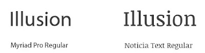
You will also come across some serif fonts that have wide serifs that make the letters mix with each other also causing legibility issues.
Whenever you use a font for your website be sure to check how it looks on multiple devices and check whether users have any issues with reading the text.
Want to see the detailed guide on the difference between graphic designers and web designers? Check out this article comparing the two.
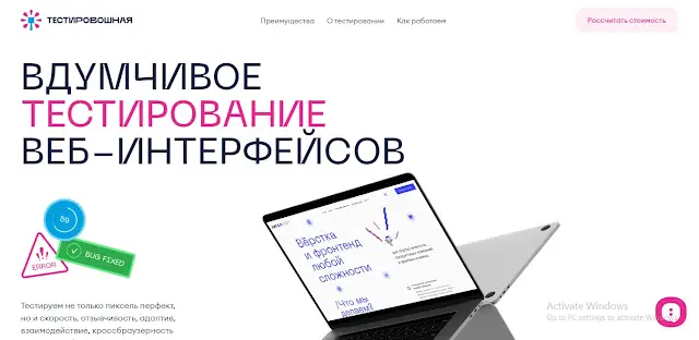
Some Examples of Websites with Great Typography
Now that we know some of the essentials of web typography we can look at some design inspiration to gather some ideas for your next project.
Alexander Sakhnenko Portfolio
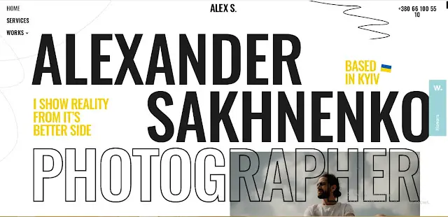
Alexander Sakhnenko has one of the most impressive portfolios I’ve ever seen. He uses a single font for all the main hero text which gives it a nice consistent look there is enough white space and he experiments nicely with different font variations.
Coloring the text yellow also highlights it by making it unique and stand out.
30ua


30ua features a very special design celebrating the 30 years of independence in Ukraine.
The typography is great, it has a lot of white space allowing the type to breathe freely, it uses color efficiently by highlighting the text. The colors also complement each other which increases contrast.
Bertani

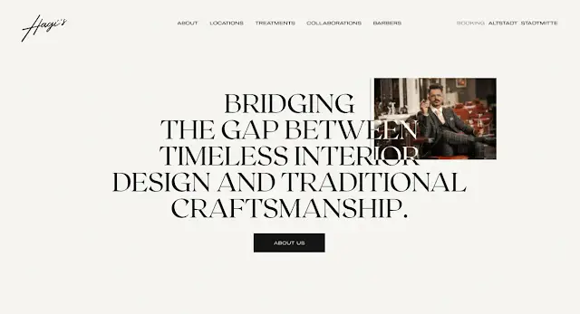
Hagi’s Barber Shop

Norda

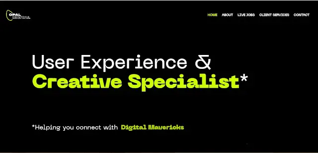
Opal Digital
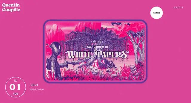
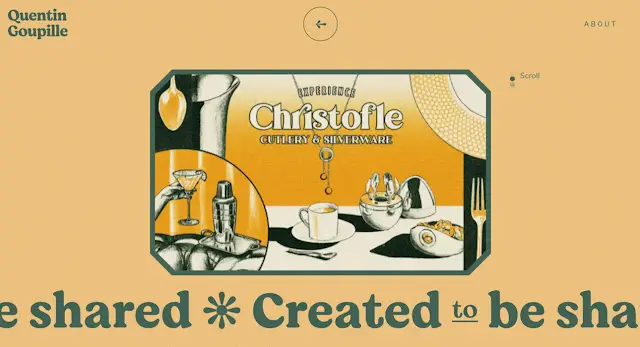
Quentin Goupille
Testim Agency