Once you go down the graphic design rabbit hole, you’ll discover a range of topics, concepts, and fields which you might never have heard of before. But, with the passion of learning still burining inside you, you’re probably reading post after post trying to grasp the fundamentals of graphic design.
After reading this article, you’ll understand everything you need to know about typography. But, I must warn you, after reading through you’ll never look at a piece of text the same way again.
So, let’s get started.
What is Typography?
Typography is the art of arranging letters and numbers in such a way that they are appealing, legible, and clear to the user. Typography involves certain techniques to convey a message or to invoke certain emotions. It includes the use and knowledge of font styles and their selection, combining fonts to give a better visual appeal, tracking, leading, kerning, layout, alignment, etc. All terms we will discuss below in further detail.
The use of typography is very common in our day-to-day lives, you practically see it everywhere, on cereal boxes, on posters, wedding invitations, birthday cards, etc.
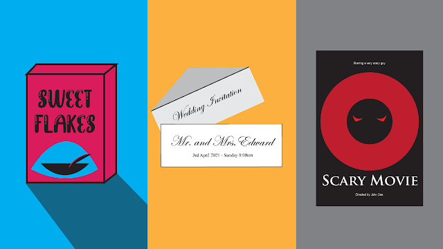
In the above image, you can see clearly how different typography can give off a different vibe and convey a message.
Typography also goes hand in hand with human psychology with sans serif geometric fonts showcasing a more modern appeal and serif fonts, such as times new roman, giving off a more traditional and professional look.
Typefaces & Fonts
There is this confusion between typefaces and fonts, many people think they are the same, they’re not but this knowledge wouldn’t really affect your career as a graphic designer.
I myself didn’t know the difference for a very long time and I don’t see any benefit even after knowing it. However, it might be important to distinguish between the two if you are going towards specializing in typography, becoming a typographer.
If you plan on making and customizing fonts with your own personal spin knowing the difference between a typeface and a font might help you to answer the question Bill always ask you every morning when you come to work
“So, you working on a new typeface or just going to be focusing on making fonts for your previous typefaces?”
So, the main difference is that a typeface is a collection of fonts whereas fonts are just the variations of a typeface.
Confused? No problem, this image below will clear it up:
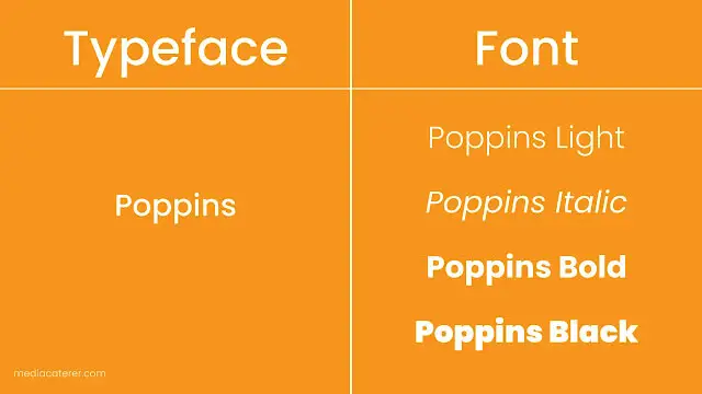
The above example is shown using a popular font called, “Poppins” which you can download here for free.
Poppins in itself is a typeface however its fonts are the different variations in weight, height, style, etc. Poppins and all other fonts are not limited to the fonts shown in the example. Helvetica, an iconic typeface, for example, has 51 total fonts including 9 weights in 3 widths.
The reason this difference is usually overlooked is that many professionals in the industry have adapted to using the word, “font” to describe both the typeface and the fonts itself and even design programs today do not specify between the two and keep it simple by referring to all kinds of type as a font.
Types of fonts
There are 4 basic types of fonts which include serif, sans-serif, script, and decorative
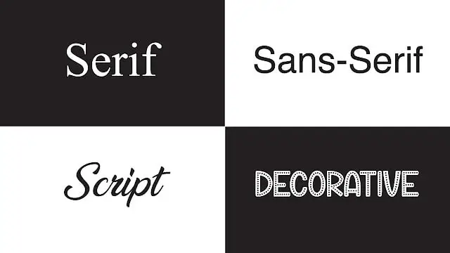
Every typeface can be categorized into one of these 4 major font types however, these font types have further styles sometimes called, subcategories.
Serif

A serif font consists of serifs, those are the little feet on the end of the text as seen in the highlighted image above. The serif typeface can be categorized further into 4 sub-categories:
Humanist serif
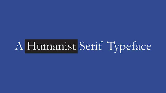
The humanist serif typeface, also known as the old-style typeface, is one of the first serif typefaces that were inspired by classical calligraphy, as evident by its contrasting strokes and lower x-height. The font used in the example above is Adobe Jenson Pro.
Transitional serif
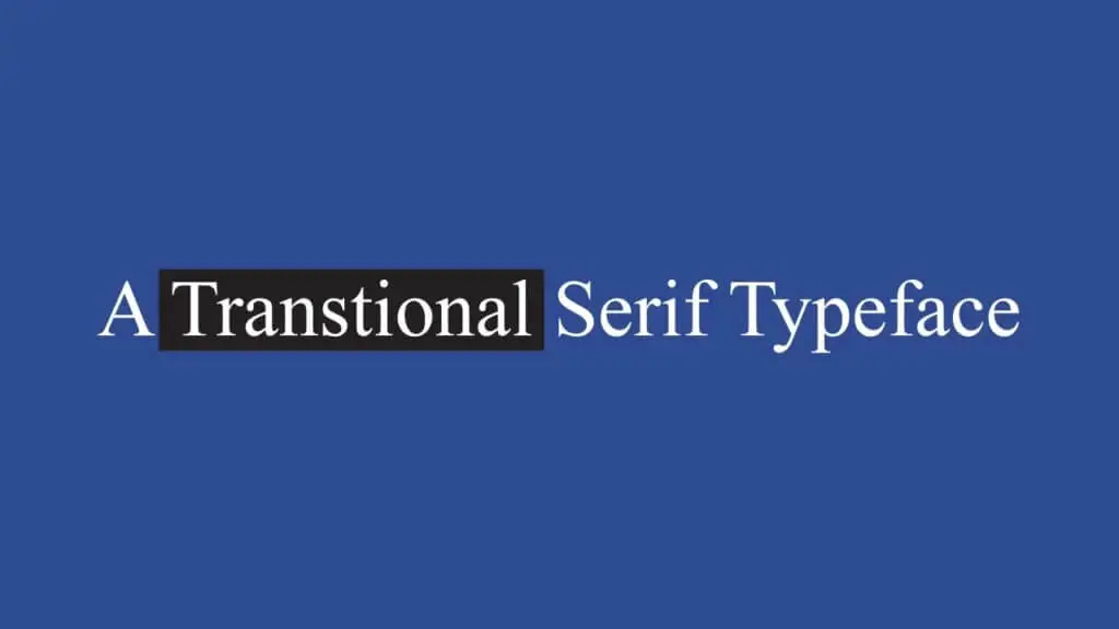
The transitional serif typeface came about when serif type was transitioning from a more classical approach to a modern approach, the fonts in between this phase are known as transitional fonts. Transitional fonts are the most common serif type.
These are a mixture of both the styles and can be recognized by its ample contrast of thick and thin strokes, wider serifs, and that the letters stand upright. The transitional fonts include a lot of popular serif types including, Baskerville, Georgia, and Time New Roman (the one used in the example above.)
Modern serif
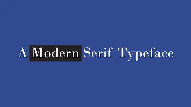
By the late 19th century a new type of typeface started to evolve, the modern. A modern typeface is most notable for its wide horizontal and thin serifs and its clear contrasting thick and thin strokes. The font used in the example above is Bodoni.
Slab serif
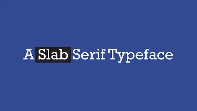
Due to the rise of commercial advertising during the 19th century, the slab serif font quickly gained popularity as its bold appearance strikes the viewer’s eyes. The slab serif is one of the easily recognizable serif font types because of its thick and consistent strokes and bold, slab, serifs.
Sans Serif
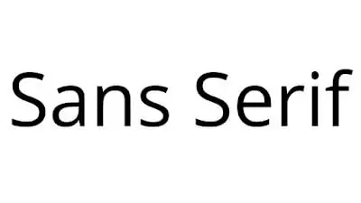
Sans is the French word for “without” which means sans serif is a font without serifs. Sans serif quickly became the new norm of typography as they are much more legible and easier to read on screens compared to serif fonts which makes them the go-to font for many brands as technology and the use of more electronics have risen significantly. Sans serif fonts are known to give a more friendly vibe and having a no-nonsense attitude, they’re clean design also gives them a modern appeal.
Sans serif fonts can be divided into 3 further subcategories:
Humanist sans serif
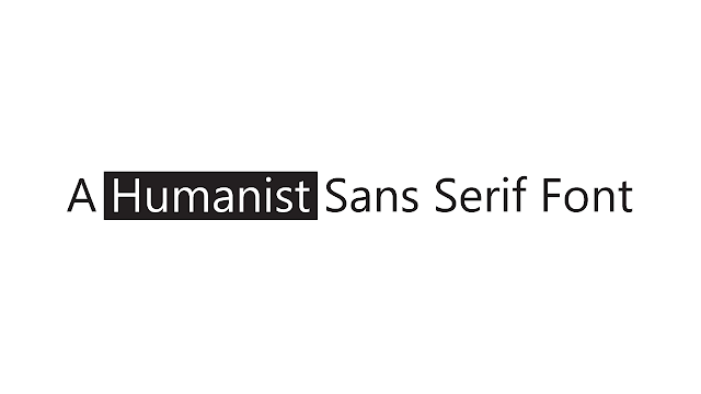
Sans serif fonts started to become popular in the 20th century and also had a calligraphic inspiration which is why we also call these types of fonts Humanist. It has an overall warm vibe with a hint of professionalism.
Transitional sans serif
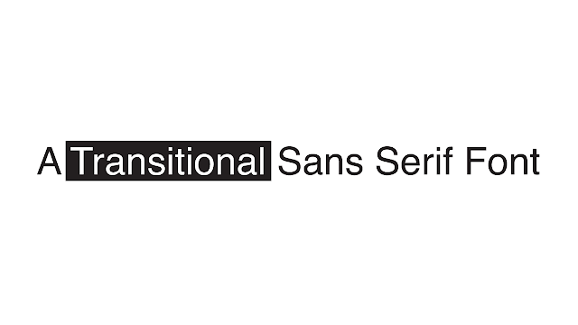
When Sans serif started to become increasingly popular people started experimenting and then Helvetica came into existence. These were distinguished from their humanist counterparts due to their more symmetrical structure as they lost the handmade element from them.
Geometric Sans Serif
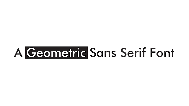
Geometric is the latest sans serif type and is considered a modern typeface. It has perfect symmetry such as the “O” being a perfect circle other than having varying strokes and is overall a very strong and bold typeface to use.
Script

Script fonts are recognized by their fluid strokes and over-the-top curls and swashes extending from the serif that replicate handwriting.
These can be further divided into 3 distinct subcategories:
Cursive/Script
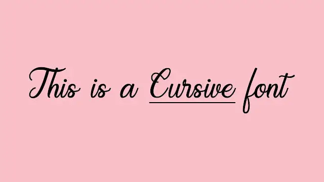
The script font, also known as cursive, is fonts that replicate handwriting or calligraphy. The variation of the strokes can depend on the type of tone you want to communicate as script fonts could either be all over the place or done very professionally and display a touch of luxury.
Brush
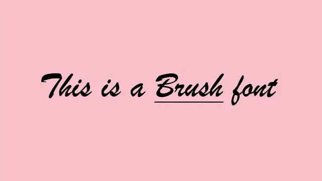
These kinds of script fonts are intended to imitate the texture of brush strokes and are joined together with each other. These are bolder with consistent strokes and considered more casual and friendly as compared to script which is why you may see them most on fruit/ice cream stands.
Gothic/Blackletter
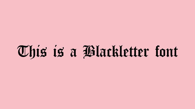
The Blackletter font dates all the way back to the 12th century and has a traditional felt tip calligraphic style. The style was developed from Carolingian Minuscule. As time passed the traditional blackletter font evolved into having more sharp and angular lines.
Decorative
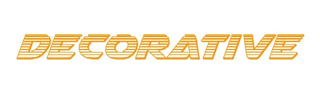
Finally, the decorative or display fonts.
To be honest, there’s no set sub-category for this one as these can be passed around as cute, fancy, LED, ornaments – the list goes on and on.
Whilst using these just keep one thing in mind, try to only use these display fonts for headings such as on greeting cards or posters and you’ll be fine.
Anatomy
The anatomy of typography can be quite confusing because there are so many terms to know and understand, every small thing has its own name and usage, however, Google went through the effort to create this simple and easy to understand chart to refer to:

Now that you probably know a lot about fonts & typefaces let’s look at how we can use this knowledge to help us in our designs.
Typography Usage
There are various ways you can use typography in your designs, it’s also essential to keep some rules in mind. Some of these are absolutely essential for you to have legible type that appeals to your viewers whereas some of the tips below would just help you enhance your skills.
Font Combinations

Many times graphic designers get super excited for having access to a mega-collection of fonts this is often due to the millions of free fonts out there and so many variations of already present fonts which can quickly pile up and just catch dust in your “untitled folder.”
However, don’t get too excited, as using fonts is best described as less is more.
There are a number of ways you can combine different fonts together however these are some rules of thumb:
- Choose complementary fonts
- Mix different font types together such as serif with sans serif
- Don’t pair fonts that are too similar to each other e.g. times new roman with nimbus roman
- Add contrast with weight variations e.g. thick fonts with thin fonts.
Contrast
The rest of the rules have one common purpose when it comes to pairing fonts together and that is to add contrast. Below are some ways to add contrast to your text:
Complementary fonts
Complementary fonts are referring to fonts that complement each other’s mood. Some fonts are considered cheery, joyful, and friendly whereas, some are professional and formal so combining these two will make them stand out and catch the viewer’s eye.
Mixing different font types together

To create a natural contrast between your text you can pair together 2 different font types such as serif and sans serif. Since these two are totally different from each other in nature and structure they will make your text stand out.
Use different weight variations

As discussed at the start typefaces come with many different fonts including weights. By using different weights of fonts such as bold with light, a general rule of thumb here to create better contrast is, is that you should always skip a weight when assigning different weights to your text e.g. Other than choosing a regular font with a bold font you should choose a light font with a bold font.
Alignment
In typesetting, alignment refers to the setting of text flow and/or arrangement of text with an image accordingly to a page, column, row, or table. This is also sometimes known as text alignment, text justification, or type justification. First, let’s discuss some terms associated with alignment;
Margin
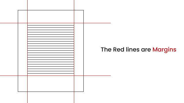
Many of you might already know what a margin is, it’s the edge of a page that you keep blank to keep your design/type neat.
Gutter

A gutter is the space between two columns… yeah that’s pretty much it.
Now, for text alignment, there are 4 main variations:
- Flush left – text is aligned to the left
- Flush right – text is aligned to the right
- Justified – Text is justified with appropriate spacing to keep it symmetrical and leveled on both sides
- Centered – text is aligned in the center and space is the same width on both the right and left margins.

Flush left
Flush left, also known as left-aligned, is when the text is aligned along the left margin and is read from left to right with the right side of the text ragged (uneven.)
Nowadays, many websites on the internet have adopted flush left as the standard of text alignment as many English readers read left to right so it makes more sense as it would be more comfortable to read through.
Flush right
Flush right, also known as, yup you guessed it, right-aligned, is when the text is aligned along the right margin with the left side uneven. It’s an uncommon type of alignment for reading and is usually used to state the author of a quote from a book or event.
However, flush right might be more commonly used for languages that are read right to left such as Persian, Urdu, Arabic, etc. Flush right is also sometimes utilized when it is used alongside an image placed on the left side of the text.
Justified
Justified text is when the left and right ends of the text are equal. This is done by increasing or compressing the space between letters and glyphs in order for it to fit into one line of text.
Justified text adds symmetry to your typographic alignment and makes the overall text look much neater and uniform. Justified text is usually used in books, magazines, and newspapers.
However, the problem with justification text is that it sometimes creates very odd and uneven spaces between the text which ruin the overall formatting of the text.
Centered
Centered text is when the text is aligned in the middle of a column or page with uneven edges on both sides.
Centered texts are usually used for titles, poems, signs, and flyers and not for reading, this is because the uneven starting and endpoints make it difficult for the reader to keep track of the text and reduce readability. It is used mostly in the title to create contrast between text.
Tracking
In typography, tracking is known as the spacing between the letters and is used to adjust the visual density of a word, phrase, or paragraph.
Kerning
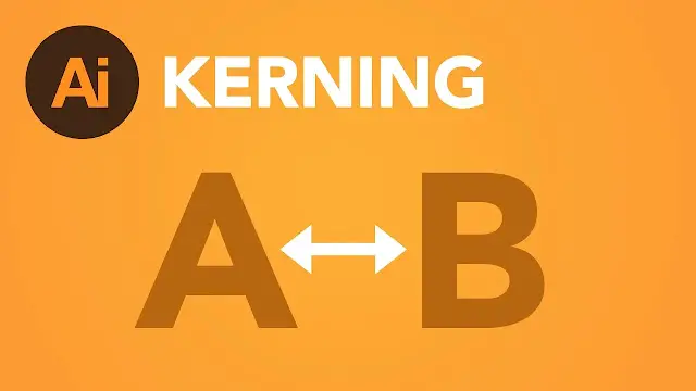
Kerning is the spacing between characters or letters, this is different from tracking as tracking adjusts the spacing between all the characters of a word whereas kerning adjusts the spacing between individual letters.
Leading

Leading, in typography, is the vertical spacing between lines of text. This adjusts the space between the baseline of texts.
Hierarchy
Hierarchy is one of the most important concepts of typography as it helps guide the viewer’s eye, it’s so important that it was bad typography that caused the popular Oscar’s mix up in 2017 when it was accidentally announced that “La La Land” won the best picture before revealing the actual winner, “Moonlight.”
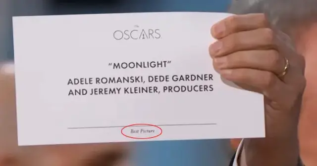
What do you see first when you look at that card?
You might look at the logo first, then “Moonlight” then the names of the producers, and at last that tiny text highlighted by the red circle, “Best Picture.”
This is a prime example of bad typography as the main text, “Best Picture” should be noticed first in order to give context to the rest of the text then the name of the winner, “Moonlight” and the logo at the end as it is least important (everyone knows this is the Oscars award ceremony no need to put your logo in the spotlight.)
Benjamin Bannister gave a solution to this, “fixing” the design:

You can take a look at his interview with Vox and other examples of bad typography in this video from Vox below:
You can see that the revised card design uses color and size to add a sense of hierarchy and guide the viewer’s eye to the most important elements of a design.
To add hierarchy into your designs you can adjust the typography so that the most important element is the biggest in size or in a contrasting color so it catches the eye and make the smaller details a smaller size and give them a lighter color.
Contrast
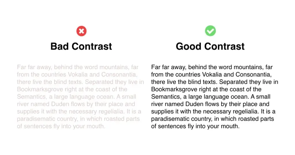
Contrast is important for both hierarchy and combining fonts together as discussed above. Literally, contrast means to appear distinct or different from something. In typography, however, we use it to distinguish two typographic elements from each other by using different methods such as making the text bold, giving it a different color, making it a bigger size, etc.
Now that you know about all the essential typographic elements it’s time to up your game by educating yourself with the best resources. Remember, if you’re just starting out you don’t have to focus too much on having the “right preparation” as the best teacher is experience however if you want to excel further you might want to take a look at the following free and paid resources (if you buy from an affiliate link I might get a commission with no extra cost to you.)
Best Typographic Resources
Let’s start with some great books;
Thinking with type: A Critical Guide for Designers, Writers, Editors & Students
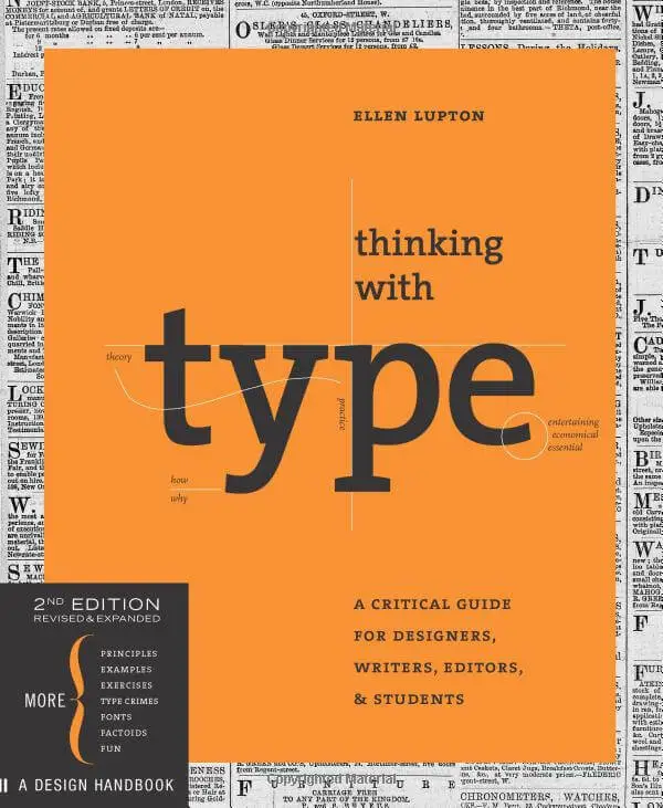
This first book is a great book for learning about type including how to arrange fonts and the best formats and includes a lot of history of the fonts and how they were used. It’s also appealing to many designers especially beginners as the book is very visual and includes a general perspective to typography giving different perspectives fit for an all-around typographer. However, there are 2 main issues with this book.
- This book is not for beginners but rather intermediate graphic designers or people who have some background working with type before.
- If you plan to read this on your Kindle device it’s best not to buy this book as the Kindle version has many bugs and glitches with people reporting that they either couldn’t see the text properly, wouldn’t zoom in and the design elements were all over the place.
So if you plan on buying this book you should have a moderate background in typography and should opt for the paperback version of this book.
The Elements of Typographic Style
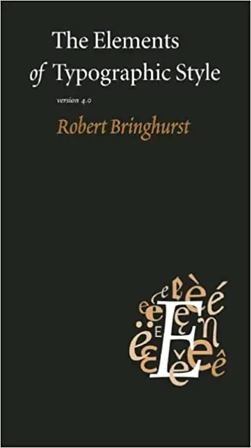
This next book is a goldmine for people wanting to specialize in typography. This piece by poet Robert Bringhurst is a well-explained handbook for people to use as a guide. It covers everything from layout to composition to proportions. Many satisfied buyers were also impressed with the extensive detail of the book covering all the main and most important elements of typography.
The main drawback for this book might be that it’s not very visual as its plain texts and examples might not attract a lot of eyes. Also, the writing can be a bit difficult to understand as Robert Bringhurst seems to bring his poetic style into his writing which some people might not be able to understand.
This book has however gotten universal approval from graphic designers all over the world and is a top 3 for everyone in the industry. If you want to learn typography this is the first book I would recommend.
Why Fonts Matter
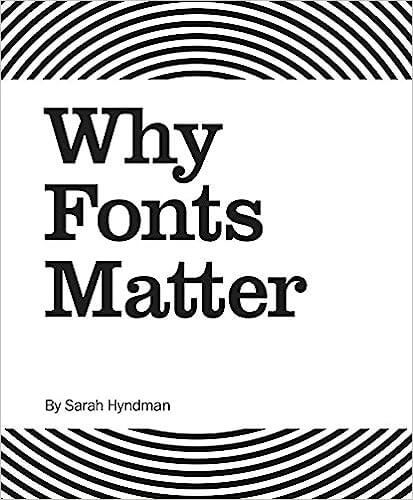
This next book from Sarah Hyndman is a great resource for graphic designers entering the field of marketing and branding. The book goes through the psychology behind fonts and discusses the emotions and personalities a certain font may convey to its audience and thus guarantee a better impact on the audience.
The main criticism this book receives is that it can be repetitive which may be annoying for some readers as they might experience some deja vu going through the book.
However, I personally feel that this book will help you make a big impact on audiences and branding design.
Free Resources for Typographers
Now for some free resources, These are some great websites with a huge collection of free for commercial use fonts meaning you can use them for your designs without the police knocking on your door.
Conclusion
Typography isn’t as simple as it seems and it’s definitely not just limited to playing around with fonts but rather there are many elements that go into making text appealing to viewers. By improving your grasp on typography people would actually want to go through your designs as it’s legible, clean, and produced in a way that is attractive rather than big blocks of boring text making them lose interest.
Typography is one of the foundations of graphic design and it is essential to learn about it in order to excel as a graphic designer.
Obviously, Graphic design isn’t just limited to this and also includes a lot of other sub-niches, the most popular being logo design, take a look at the 8 types of logo designs and how to use them in your designs.