Typography is the art of arranging letters and numbers in such a way that they are appealing, legible, and clear to the user.
Good typography isn’t as easy as selecting a font and start typing.
There are many rules when it comes to typography which ensures you have a legible design consistently.
There are some major mistakes that many designers, beginners and professionals, make when it comes to typography.
Below are 10 beginner mistakes of typography with helpful illustrations and tips on how to avoid them.
1. Using Too Many Fonts
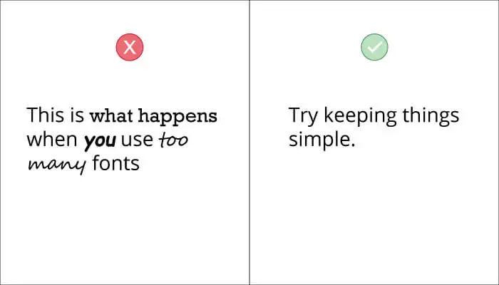
You should always try to keep your fonts at a minimum.
Using 1 – 2 fonts is always sufficient for any kind of website, as soon as you start going over that number the text will begin to look cluttered and distracting.
Keeping fonts at a minimum will also give you a more consistent look and have symmetry.
Google’s Material Design utilizes the use of a single font for all header, paragraph and caption texts; Roboto. This gives them a clean and consistent look throughout every single one of their apps and websites. You can take a look at any of their interface and say, “that’s made by Google.”
2. Not Choosing The Correct Typeface
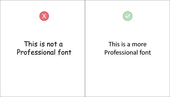
Choosing the correct typeface is essential to deliver your message effectively.
Fonts, like people, have different personalities and convey emotions.
A cartoony-looking font would be more appealing to kids whereas a professional serif font would be more suitable for formal audiences.
Before choosing a font you should find out what kind of a vibe you are going for.
In the example above, you can see that Comic Sans (on the left) isn’t suitable for a professional setting. However, Calibri (on the right) seems like a much more appropriate choice because it has a professional and simple look.
3. Poor Contrast
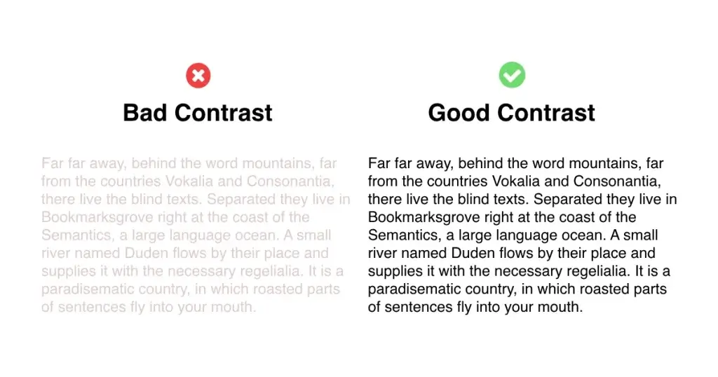
One of the most common mistakes beginners tend to make is having poor contrast.
Good contrast helps your text become more legible by distinguishing it from the background. Having poor contrast means your text starts blending in the background and will be harder to see.
4. Not Establishing Hierarchy
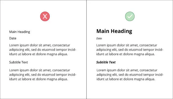
Hierarchy is the foundation of good typography.
Without proper hierarchy, people won’t be able to distinguish between different types of text. Peoples’ eyes need to be guided towards what’s most important and what’s least important when looking at a piece of design.
By having proper hierarchy you can easily tell the viewers which elements to look at first and what is most important.
5. Making The Text Too Small
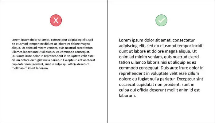
When designing for legibility you need to make sure your text is readable to all audiences.
Not everyone has perfect vision, so it’s important you size your text in a way that it is comfortable to read on small and big devices.
If you know how to code and are designing for the web you might need to make sure your text is responsive so that it can cater to a specific audience.
For example, you might have text of 12pt on mobile devices but that would look too small on desktop. Responsive type will allow you to show 12pt on mobile and 16pt on a desktop through the use of media queries. This will ensure the text remains legible no matter the size of the screen.
To learn more about this, check out my article: Typography for Web Developers and Designers.
6. Improper Kerning, Tracking, and Leading
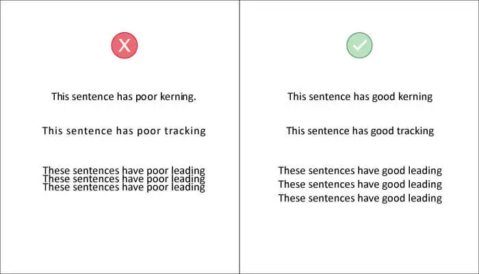
Bad kerning, tracking and leading can easily ruin your typography.
Kerning is the space between two letters within a single word. Although many typefaces come with good kerning you shouldn’t always rely on the default settings. you should manually adjust accordingly if any letters look too tightly or loosely spaced.
Tracking is the space between words. This is usually fine but you have to make sure that none of your words are lying on top of each other or are too close together to the point you can’t separate them.
Leading is the vertical space between lines of text. Leading is the most common typography issue in text-heavy designs like menus and brochures. Bad leading makes the whole text look off and is distracting. Tight leading is difficult to read and illegible. If your leading is too loose it may confuse viewers as they may not be able to establish a proper relationship between the lines of text.
7. Having Very Long Paragraphs
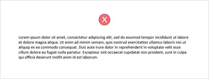
Halfway through the text, the reader may start to lose focus of the words and it may be a turn-off to see such long paragraphs.
This causes readers to turn away from reading what you have to say, even if it was the answer to his question.
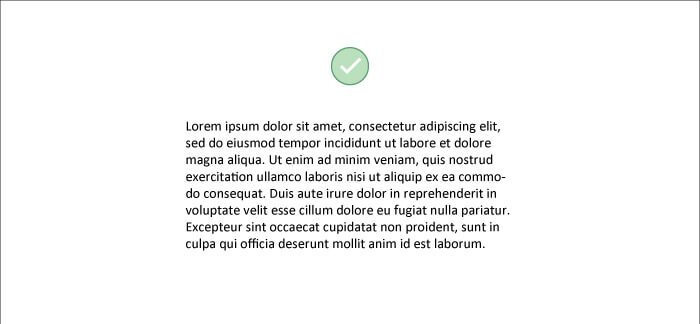
A good fix for this is to find the optimal size for your paragraphs and stick with it.
You can measure your paragraph lengths in words or characters. In my opinion, characters provide a more accurate measure because the length of words can vary.
If you are serious about typography, you might’ve read The Elements of Typographic Style by Robert Bringhurst.
In his book he outlined the optimal size for a paragraph;
Anything from 45 to 75 characters is widely regarded as a satisfactory length of line for a single-column page set in a serifed text face in a text size.
Robert Bringhurst
This is an optimal paragraph text size.
8. Using All Caps
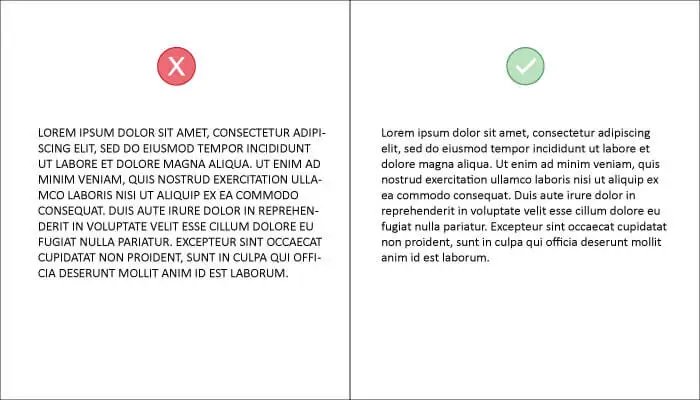
Although the uppercase text is great for adding extra emphasis to a phrase or word, too much of it is irritating and distracting for the user.
Continuous use of all caps text in your typography could disturb the rhythm of the reader and cause them to lose focus. All caps text is also considered very aggressive as it resembles the same tone as shouting.
You should always use a combination of upper and lower case text (called sentence case) and Title case for titles.
9. Not Having Enough White Space
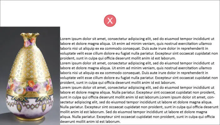
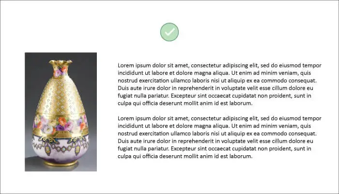
You should always give your text and other design elements enough space to breathe.
This is done by effective utilization of white space. White space or negative space is the excess space of the document that is not used and is kept empty (white.)
Having more white space in your designs will make your text look much cleaner and legible.
10. Not Tidying Up Widows and Orphans
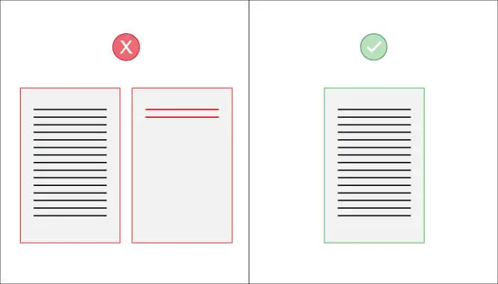
Widows and orphans are awkwardly placed text that harm the overall look of your design.
A widow occurs when the text of a paragraph cannot fit on the page so it transfers to a new page. This gives you a whole page with just some little text which is not only unappealing but inconvenient.
An orphan is the opposite of a widow. It is when the first line of a new paragraph sits on the end of a page. This leads the viewer distracted and confused as they don’t have a clear idea from where the paragraph is starting and might miss some words.
There are multiple ways to adjust your text to remove widows and orphans from your text.
- Adjust the margins so that all text fits correctly
- Adjust the alignment of the text so it takes up less space (use justify text)
- Adjust the spacing between words
- Reduce the leading between text
- Reduce the tracking between words
- Forcing earlier page breaks
Orphans are usually easier to clear up, you can just force the starting paragraph on the next page by inserting a space between the paragraphs or forcing an early page break.
That was pretty helpful. Thanks man!