It’s time to make logos great again!
To do that, we need to get back to the basics and look at some rules that make a great logo.
This list won’t go over the general logo basics like “a logo should convey the brand’s identity” rather we’ll look at the actual design process.
Here are 10 Golden Rules you should follow to make exceptional logos.
1. Sketch First
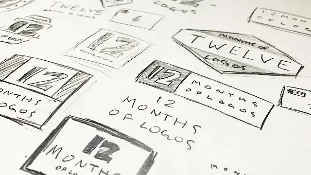
Doing this will give you different options to work with until you find one that sticks. Also, by doing the rough work first you’ll find out which elements work well and which to not include.
2. Keep It Simple
In design, less is more, and you should learn to keep your logo simple. It should be simple so that the audience can remember it easily. Take a look at the Apple logo it is a simple shape of a bitten apple.
It may be tempting to add in complex details or subtle messages in your design which convey your brand’s message. However, this can distract your audience from the actual brand and would make it difficult for people to understand.
It’s better to keep your logo simple and try to convey the main brand message.
3. It Should Be Scalable
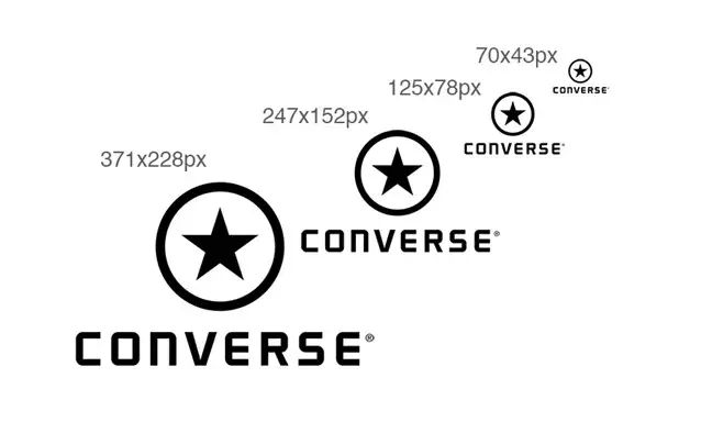
A logo has to be versatile which means it should look good in small and large sizes. This is because logos are usually used in a variety of ways. Letterheads, cards, websites, apps, billboards and business cards will be displaying your logo so it has to be legible in different sizes.
This one is tied to the previous point of keeping it simple. Logos that have too much detail in them might look great when previewed in bigger sizes but when scaled down it will lose most of its details.
This is why when you are designing a logo you should be mindful of the scaling. When designing a logo, preview it in different sizes to see if it is legible when scaled up or down.
4. It Should Be Flexible
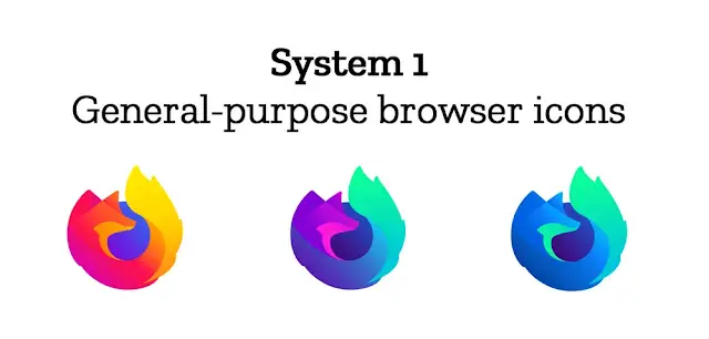
Along with being legible across different sizes, your logo should also be able to adapt to changes in trends.
This is exactly why design systems are becoming more and more popular. According to the Nielsen Norman Group:
“A design system is a complete set of standards intended to manage design at scale using reusable components and patterns.”
NN Group
These design systems have one major benefit to brands, they’re reusable. Which means it makes their logo flexible making it adapt to certain events, promotions or minor changes in the brand’s overall message.
Take a look at the famous design system of the Hilary Clinton logo by Michael Bierut:

5. Keep It Relevant

As a graphic designer you are constantly learning new things
Design trends are evolving, more free courses are being available to people and there are a number of great books out there.
With this set of skills and knowledge at your disposal it can be tempting to make an awesome logo design, something that nobody has seen before.
However, you should always focus on the task at hand. Many beginner graphic designers tend to focus too much on creating an amazing logo but lose sight of the brand’s vision.
Your logo design should always represent the company and resonate with its audience. The colors, font and shape of the logo should be relevant to the brand’s main focus, message and goals.
6. Make It Appropriate

Before designing the logo you probably have to brainstorm some ideas. The first thing you should think of is what kind of logo would be the most suitable for the company.
There are around 8 types of logo designs so you have to decide which one is going to best represent the brand. Will it be a Wordmark, Pictoral mark or the famous combination mark?
Choose the appropriate type of logo and then start looking for a font and color that would match it.
If it’s a more luxurious brand you might use the colors gold or purple with a serif font.
If it’s a logo for a gaming crew a mascot logo with more striking colors would be more appropriate.
7. Make It Unique and Memorable

There are millions of brands out there and even if brands try to niche down they would still be faced with tons of competition. This means in order to stand out, companies need a unique logo that resonates with their audience and can stand the test of time.
To design a unique logo you have to take a good look at your competitors and try to distinguish your design from there’s without losing relevancy.
8. Minimize Special Effects

You might think that adding some special effects to your logo design would make it look totally rad but in reality, it’s just distracting and doesn’t look very good.
As discussed in the previous points above, your logo has to be simple, flexible and versatile. By adding special effects the design loses its professional appeal.
Using special effects to enhance a design is like shading your drawing with poor line art.
Sure, the design might look pretty nice and realistic but there will always be something missing.
9. Design in Black & White

By designing in black and white you focus on the overall concept of the design rather than things that are easy to change, such as a font or color.
Removing the colors would allow you to make the logo as unique as possible. People should be able to recognize your logo instantly with or without color. It’s the silhouette of the logo that makes it original.
For example, if somebody took the windows logo and made it a different color or changed the font people would be able to call out the brand for plagiarism or copying Microsoft’s logo. That is because the symbol itself is original and unique despite the colors.
10. Add Colors at the End
After finalizing your logo in black and white you should add colors at the end. You should make sure that your logo works in one color so that it could remain flexible. When adding colors be mindful of color theory and branding psychology to choose the colors appropriate to your client.
Conclusion
In the article, we looked at 10 golden rules of logo design. These rules help create the foundation of any successful logo, be it of a small business or a fortune 500 company. By keeping these rules in mind I am confident you are going to rock every logo you make leaving your clients impressed and your audience interested.
If you found this article helpful, be sure to check out my guide on how to price your logo design.