Kentucky Fried Chicken. Just hearing that at first glance all you can think of is their mouthwatering chicken, their Zinger burgers and those big red and white buckets with even more chicken!
But, other than their delicious food a familiar face also pops up in your head. He’s an old man wearing glasses with a very joyous face and a warm smile insisting that you come on down to your favorite fast food restaurant and order his bucket of chicken.
His bow tie looks stylish and quite frankly, suites him well and matches his red and white apron.
Even though you can instantly recognise the fast food logo you might not really know who he is.
Maybe your friend who’s fond of throwing random facts to break awkward silences might have mentioned his name and you might have it in the back of your head but who is he really and why is he so closely associated with the worldwide famous fast food chain?
Well, firstly, it’s not a fictional character…
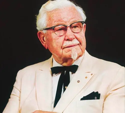
That is Colonel Harland David Sanders who is the founder of the fast food giant. Col. Sanders was an American business man who first started selling chicken in a roadside restaurant in, you guessed it, Kentucky during the great American depression. Over there he developed his ‘secret recipe’ and discovered a unique method of cooking chicken using a pressure fryer.
Sanders started to notice great potential in the restaurant franchising industry and thus started his own restaurant in 1952 with the name of ‘Kentucky Fried Chicken’ in South Salt Lake, Utah.
KFC Logo History & Evolution
As you can see all the logos from 1952 to 2018 show Colonel Sanders as the symbol of KFC.
From 1952 to 1978, designers Lippincott and Margulies, created the original logo using a monochrome black and white color palette stating the brand as classic and timeless. in 1978 Colonel Sanders tidied up his hair and his stylized portrait was sized bigger, whilst shortening the length of the bowtie. The font also changed making it look much more symmetrical.
In 1991 came a major change to the overall logo as this was the first time the name was changed from “Kentucky Fried Chicken” to the well known abbreviation, “KFC” It’s said that the company decided on this change as they were keen to remove the word “fried” from their logo as customers will view it as an unhealthy food choice. They also added a red color to make it look more appealing.
After that we start to have a much more consistent look going with Col. Sanders being given a different hair style and a warmer expression to welcome customers ensuring them good hospitality. And the logo started getting simpler as time passed.
The Story Behind Sanders’ Famous Style
Here’s the story behind his famous goatee and bowtie style. In 1950 Governor Lawrence Wetherby recommissioned Sanders as, ‘Kentucky Colonel‘.
Sanders began to ‘dress the part’ where he started growing a goatee, wore a white suit, a bolo tie (which is a type of necklace) and started calling himself, “Colonel”. His closest associates played along jokingly at first but later started taking Sanders’ title more seriously.
Sanders was very dedicated to his role as he never made a public appearance for 20 years till his death while wearing something else, he even bleached his mustache and goatee white so that it matched his hair.
Conclusion
By the end of this article you might have a clear idea of who the man on the KFC logo is and his significance. You also looked at the evolution of the logo and it’s history including some interesting meanings within the logo.
From a career point of view you might have understood how logos evolve and how the stories and thoughts become part of the logo. Col. Sanders is and will always remain an icon and the symbol of KFC.
And that’s finger lickin’ good.