Graphic design can include many mathematical concepts to help aid your designs. One of those concpets is the golden ratio or golden spiral.
However, since I’m a graphic designer myself I’m gonna do my job right and (hopefully) try not to bore you with long blocks of text and try to make it as visual as possible.
Okay so,
What is the Golden Ratio?
Simply put, it’s a shape with the ratio of 1:1.6 (that is all you need to know when it comes to design, for a maths exam though, you might need more details)
The golden ratio is also known as the golden mean or the golden rectangle.
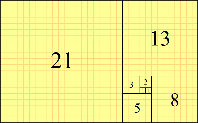
It’s also known as the Fibonacci Number as it was developed by the mathematician, Fibonacci. And from that he formed the Fibonacci sequence, which states that every next number is a sum of the previous two numbers, this is what it looks like;
1, (0+1=) 1, (1+1=) 2, (1+2=) 3, (2+3=) 5, (3+5=) 8…
Which gives you a shape (grid) like this:
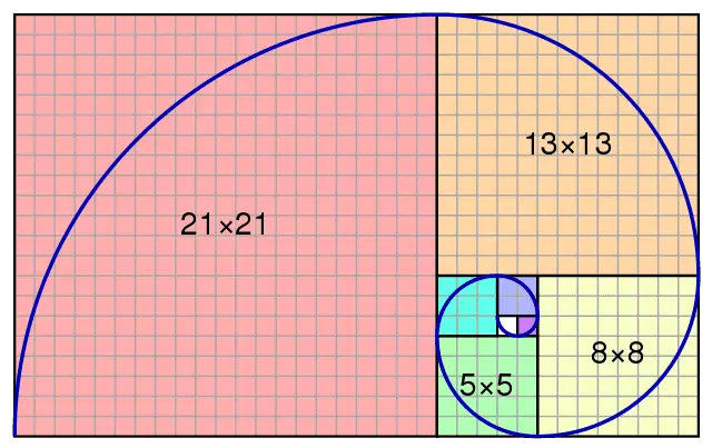
And by connecting them all together you will get the golden spiral that looks like this:
The reason the golden ratio is admired is because of its very precise proportions. These proportions seem to put things in balance in such a way that it is aesthetically pleasing to the eyes of the viewers.
If you like cartoons, interestingly, there was an episode of Donald Duck in which they explained golden ratios in a very beginner-friendly manner. Take a look:
Now for the important stuff…
How Do We Use the Golden Ratio in Our designs?
Good question, glad you asked it.
Firstly, it’ll help to know where you could apply it.
To be honest, it’s up to your creativity. Personally, I’ve applied it to typefaces, and logo designs but it also applies to web design (UI/UX) and flyer design as well.
When it comes to Typography you might have heard some “rules of thumb” think of this as one of mine.
Have you ever struggled to want to balance the header and body text? Sometimes the heading seems too small and the body text seems way too big and you just can’t find that “sweet spot?”
The Golden Ratio might help. If you divide your heading text’s size with the ratio (1.6) you will get a nice balanced size for your sub-heading. Meaning, if the size of your heading is 40px divide that by 1.6
40/1.6 = 25px
25px is our sub-heading size, this is what it looks like;
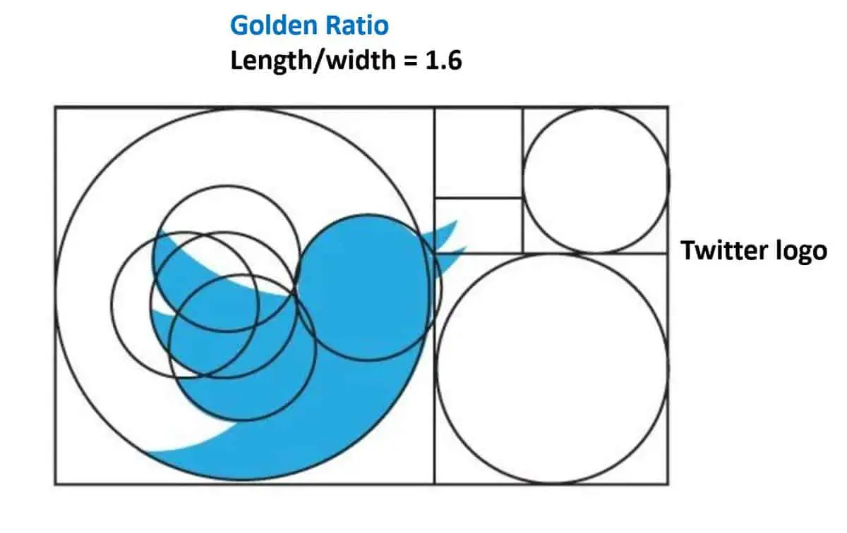
As for logos, the golden ratio is used to achieve accurate measures and proportions making the logo look more clean, neat, and well-balanced.
Conclusion
Design will always be subjective, it’s living proof of the phrase, “beauty is in the eye of the beholder” but when it comes to perfecting proportions and balancing your design, the golden ratio is as far as you will come from a mathematical point of view
It’s not absolutely necessary for you to apply the golden ratio in every design you make but it might be a thing that you should consider if you want to know about more advanced graphic design.
Bookmark this page so you can come back to it in the future.
I’m still learning from you, as I’m trying to achieve my goals. I definitely liked reading everything that is written on your blog.Keep the information coming. I loved it!