People go to they’re favorite fast food joints as soon as they’re craving some good and delicious food, the infinite number of choices, the ever-changing menus and the convenient drive thrus keep people coming back for more but, what gets them there in the first place?
Especially when there are millions of options out there what gets them to choose one specific restaurant?
An eye-catching logo
A logo that instantly grabs people’s attention and stands out from the crowd is usually the secret ingredient many good restaurant owners hide when it comes to making a globally recognised fast food chain.
Today in this list we’ll be looking at the most famous and well-recognised fast food restaurants’ logos.
If you run a very formal, professional 5-star restaurant or just a local fast food burger joint the same rule applies, ‘You Need an Attractive Logo, that Stands Out’
The list is compiled to give you a sense of what famous fast food logos are doing right in order for you to get ideas and inspiration regarding your own logo design process.
Now, let’s dive into the list
1. McDonalds
Obviously the first on my list are the infamous “Golden Arches”. The two golden arches come together to make up the ‘M’ in the McDonalds’ logo.
The fast food giant has over 34,000 restaurants in 119 countries worldwide making it the most well known and famous brand on Earth! And to make things even more interesting it’s logo doesn’t have your usual origin story.
The logo’s history dates back to 1952 when founders, brothers Richard and Maurice McDonald were planning on designing a restaurant for their fast food brand in San Bernardino, California. The brothers had met with LA based architect Stanley Clark with the idea of designing a roadside restaurant that can be made to franchise. Richard already had some ideas in mind and sketched out 2 half-circles that were attached with the restaurant’s exterior and lit up so they could attract the passing by motorists to dine in.
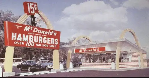
After the McDonald brothers sold their franchise to Ray Kroc, an American business salesman, for $2.7 million. In 1968, Kroc had incorporated the golden arches of the restaurant in their logo graphically becoming a great part of McDonalds Logo Evolution.
2. Kentucky Fried Chicken (KFC)
The KFC logo has also remained an iconic logo in fast food history. The warm expression of Col. Sanders on the logo has customers coming back feeling welcomed every time.
The logo wasn’t always this bright looking and after many changes evolved into the logo we all recognize today.
It started off in 1952 as a very bland black and white logo with a very serious expression of Col. Sanders.
It stayed that way till 1991 where color was introduced for the first time. Red was chosen to attract customers and the full brand name was transformed into the abbreviation, “KFC”.
Finally as years passed by, the serious expression of Col. Sanders was turned into a very welcoming smile and got a shorter, neater hairstyle.
3. Burger King
Burger King, an American established fast food chain, has 3 main colors, red, yellow and blue.
Personally for me the main shining star here is the typeface as it beautifully captures the restaurant’s food identity.
It’s big bold and round which is a great description for a burger the color red also entices excitement. The blue semi-circle wraps everything together nicely making the logo look very symmetrical.
4. Starbucks
The first logo on our list that is a great fast food logo without a name, is the Starbucks logo. The Starbucks logo is so unique that there has never been a fast food brand that came close to this logo design.
The symbol features a double-tailed mermaid, a Greek medieval character, known as a Siren (it gets weirder, you can read the full history here, since this article is just to give you some good fast food logo design ideas).
5. Pizza Hut
Another great logo that uses the colors yellow and red, the pizza hut logo is a very bold and stylized wordmark logo that uses a handwritten typeface.
The logo is tilting on the side and the font was created to give the logo a casual and informal vibe which is the exact vibe pizza chains have, seriously, would you host a business meeting in pizza hut? I don’t think so, unless your boss is pretty chill and calls you ‘bro’ from time to time.
6. Taco Bell
The Taco Bell logo represents a festive bell as it’s symbol that is identified to call people to it’s stores. It’s color scheme includes 3 main colors, pink which is very unique as it’s very rare to find a fast food brand with such a color logo, blue and yellow.
The word ‘Bell’ in Taco Bell is actually the founder’s surname but the designers did a nice job incorporating it into the design itself.
The Taco Bell logo had actually changed in 2016, the reason I included the 1992 one is how iconic and unique it is and is probably the first image that pops into your head when you hear the brand’s name.
The new logo even received a lot of backlash where people stated that they had ruined the logo.
The new logo is very simple and flexible and it’s wordmark is a ‘gothic bold’ font with a very modern appeal. It ditched it’s previous 3 color scheme for an all purple.
7. Hardees
That happy star can be recognised from a mile away. Using the very common red and yellow color scheme you might think Hardees might find it difficult to stand out but it’s unique ‘happy star’, where it’s smile is literally the shining star, sets it apart.
The wordmark is a cursive font with a tagline, “Charbroiled ThickBurgers” which is what they’re popular for.
8. Nando’s
Unlike the other fast food logos we have seen, the Nando’s logo has remained the same throughout it’s history other than some minor changes like the smoothness of the strokes etc.
The logo was created by South African Consultancy, Sunshine. Sunshine works in collaboration with some local craftsmen and artists even the rooster on the logo was given the silhouette of an African wooden figurine.
The logo features a pictorial mark with a black rooster with a dotted tail to give it an African ring, a big red heart in the middle showing value to it’s customers and it’s typeface is a bold, italicized font.
9. Chick-fil-a
Chick-fil-a has a great wordmark logo that plays around with it’s letter.
The logo is very creative as it incorporates the symbol (the chicken’s head) within the typeface which is a bold, rounded and clean looking cursive font.
Red is used to entice a strong response from it’s consumers and entice feelings of passion and excitement which are closely related to hunger.
10. Wendy’s
The Wendy’s logo is another logo that has a face as it’s logo, otherwise known as a Mascot logo. The logo is very memorable as face logos are really unique.
The Wendy’s logo has a nice bold wordmark using a script font in red.
11. In-n-out Burger
In-n-out is another famous fast food chain in it’s country, even though it has a nice, clean and clever looking logo there is one thing that personally bugs me a bit.
It’s adjustment is a bit strange for me. The trademark ‘R’ is in a very odd place unlike other popular brands in it’s industry and the font of the word, ‘burger’ seems slightly modified due to it’s decreased size, this makes it look inconsistent as two fonts in one logo, especially when there’s not much text, are usually a big deal breaker. Let me know in the comments what you think.
The unique point in this fast food branding identity is the yellow colored arrow that defines the word, “In-n-out” visually. It suggests quickness that fits in as it’s a common trait of good fast food brands, they gotta be fast!
The wordmark is a bold sans serif font which suggests friendliness and simplicity.
12. Popeyes
The Popeyes logo is also a great logo with it’s playful wordmark which I think is it’s strong point.
The logo uses a 3 color scheme orange, red and white. Popeyes wanted it’s logo to appeal to the younger generation as the logo makes the brand’s visual identity look optimistic and inviting. The color of the orange can also be linked to fried chicken which is the best item on their menu.
The wordmark uses a custom font called ‘dancing letters’ which was made by, famous design agency, Pentagram. I ABSOLUTELY LOVE Pentagram’s logo designs as they have a lot of creativity as they prefer to use their own handmade resources such as custom fonts etc.
13. Dunkin’ Donuts
The Dunkin’ Donuts logo does a great job to visualise the brand’s identity as it’s plump round letters suggests friendliness and are perfect for a company that specialises in donuts.
The symbol is a styrofoam cup with steam coming out of it with the abbreviation ‘DD’. The brown outline of the cup is intended to add contrast to the cup.
The colors have a very ‘candy’ appeal to them making them look almost edible.
14. Domino’s Pizza
Domino’s has a very clean, modern looking logo and it’s different from it’s pizza making competitors which incorporate a playful and stylized wordmark whereas, domino’s uses a very simple sans serif font.
The three dots on the logo represent the first ever 3 stores that domino’s opened in 1965, which was when the first concept of the logo was made. Because of the dots the logo also looks like a domino.
Red, white and blue are the colors used and the typeface is ‘Pluto Sans Heavy’ created by Hannes Von Dohren.
15. Johnny Rockets
Johnny Rockets has very stylish and cool looking logo. It goes well with the brand image as it is a brand that’s trying to attract the younger generations and implementing modern styles into their type.
The color scheme consists of red, blue and yellow (grey as the outline). The yellow gives off the shape of a burger bun and the font is a very nice and bold handwritten script font.
16. Subway
Subway’s logo is another instantly recognisable logo. Rare for a fast food brand to use the color green in their logo but that’s what sets subway apart.
Subway uses colors of nature such as green and yellow which suggests their food is fresh and healthy. The logo also has a very clever meaning incorporated into the design. The arrows on the ‘S’ and the ‘Y’ pointing left and right, respectively symbolize the entrance and exit of a subway and the logo is communicating that you can have food on the go.
17. T.G.I Fridays
TGI Fridays’ logo evolution wasn’t a very satisfying one as it lost it’s personality. The logo you see above was made in 2016 by Jane MacDowall and her creative team in Scotland. The design is very simple and has a minimalist style.
The logo features red and white diagonal lines and it’s wordmark uses a very bold sans serif font and the ‘TGI’ is placed on the left of the word ‘FRIDAYS’ with a vertical type orientation.
18. Arby’s
Seeing the Arby’s fast food logo at first glance might seem like the hat has a deep meaning to it, maybe it was run by cowboys or was the go to place for gunslingers, but in reality it doesn’t really have that much drama.
The hat symbol on the logo design is used as a element of design. The reason behind this was that when the fast food chain was first established it was most popular among the westerners and that’s where the idea of the cowboy hat was born.
The font used for the logo is Sanchez Black, however, it was significantly modified to suit the design. The color used is a scarlett red.
19. Dairy Queen
The dairy queen logo was made in 2007 and showcased an italicized serif font with abbreviation, ‘DQ’ which also became the company’s official name in 2001.
The logo also has 2 arched lines on it’s top and bottom. The top orange arc represents their ‘hot’ food such as their famous grill items and the bottom blue arc represents their ‘cold’ items meaning their ice cream cones.
20. Papa John’s Pizza
Papa John’s is an American pizza restaurant franchise and is the 4th largest pizza delivery restaurant in the United States.
It’s logo has a 3 color scheme including red, white and green. Other than the background it also uses green as it’s outline to give it depth/form.
The typeface is a bold slab sans serif font colored in red.
Conclusion
At the end I had some interesting findings regarding fast food brand identity;
- The most common color in fast food logo designs is red
- Scientifically brands are compelled to use the color red as, according to color theory, it is known to invoke feelings of excitement and passion which are both related to hunger.
- Many fast food brands also use the color red as they think it makes people hungry and crave food however this is not proven.
- Many fast food logos use stylized and ‘playful’ fonts to replicate the casual and non formal environment of fast food restaurants
- The color green doesn’t necessarily mean healthy but also to suggest that the food is made fresh
- Faces are very unique as they are near impossible to replicate
- Most of the fast food designs intended to attract the younger generations with it’s playful and colorful designs
I hope these major fast food logos gave you a good idea for your logo designs knowing what works and what doesn’t.