Did you know that around 90% of people make snap judgments about a product based on color alone?
Even if you spend dozens of hours writing the perfect copy and crafting an enticing offer, the wrong color combination can still make or break your ad.
As marketing budgets continue to climb, it might concern you if most of your ad revenue is going to waste just because of the wrong colors.
But, choosing the right colors is an art in itself, as there’s no one-size-fits-all when it comes to creating a color scheme for your ad designs.
In this article, we’ll look at how colors affect your audience and then arm you with some strategies to choose the colors that make your ads stand out.
Key Takeaways
- Colors influence emotions, brand perception, and buying decisions, with reports suggesting they influence 90% of snap judgments on products.
- Select colors strategically to evoke desired emotions in your audience, stand out amidst competition, and align with your brand’s message.
- Understand your audience demographics, industry norms, and marketing objectives to choose colors that resonate with your target market.
- Experiment with color combinations, A/B test different color schemes, and avoid common design mistakes to optimize ad effectiveness based on audience response.
The Power of Color In Advertising

Many marketers believe that, although color does play a role in ad conversions, it’s not a crucial component. Elements such as the copy of the ad or the platform on which the ad is shown seem more important.
In reality, color plays a major part in your ad’s design.
And I don’t mean that it only helps you stand out from your competitors. It also has psychological effects and helps you maintain a consistent brand image across your campaigns.
Reports in the retail industry suggest that 85% of shoppers cite the color of a product as a primary reason for buying.
So, what makes color such an important element in designing effective ads?
Colors Influence Peoples’ Emotions
Color affects people’s emotions and can evoke certain feelings in them.
This allows marketers to target their audience effectively and make the product emotionally appealing to the visitor. For example, many fast food brands use the colors red and yellow in their logos (McDonald’s, Chick-fil-A, Pizza Hut…)
Why?
Because the color red stimulates appetite and desire while yellow symbolizes joy and excitement. When paired together, they come to evoke the desired feelings in the customer’s minds, which makes them stop and grab a bite.
In fact, the combination of yellow and red is so common in fast food chains that marketing experts have dubbed it the “ketchup and mustard theory.”
Colors Help Your Brand Stand Out
Using bright bold colors helps you stand out from the sea of competition.
The average person’s attention span is getting shorter due to platforms like TikTok, Facebook, and Instagram. They all promote the idea of endless scrolling while providing an almost infinite amount of content.
To stand out in such a platform, where people’s attention is so limited, you’d need to make a bold statement.
Using vibrant colors with a high contrast can help your ad design stand out from the noise.
Think The Home Depot.
Browse through a few home improvement retailers online and you’ll quickly be able to make out the color schemes.
Oftentimes, the color blue, black, red, and yellow are noticeable when looking for these retailers.
Contrast to The Home Depot which uses the color orange for its logo.
This allows The Home Depot to stand out as it differentiates itself from other brands.
Colors Guide People’s Decision-Making
We’ve discussed how colors evoke certain feelings in people. And if you know a thing or two about marketing, you’ll know that consumers often make decisions based on emotions.
People are more comfortable buying from brands they resonate with and can relate with.
This means your ad should be able to effectively match your target’s emotions and relate to them beyond a rational basis.
“Colors are the mother tongue of the subconscious.”
Carl Jung
Let’s look at an example:


Focus on the colors of both the ads above. Now, answer these questions:
- Which car do you think is more expensive?
- Which car is manufactured by an established brand?
- Which car caters to a higher-income audience?
- Which car is more luxurious?
You probably answered the “ad on the right” to all those questions.
But what makes the ad design on the right more luxurious than the left one?
Apart from the use of white space and the geometric typeface, the black color makes the car on the right look affluent. This is because the color black is often associated with elegance, formality, sophistication, and power.
But, black is also used to represent death, grief, and darkness – so remember that context is always important. For a car ad, it’s unlikely you’d be talking about the death of someone unless, you know… you’re advertising for a hearse.
You may ask yourself, “Why is this important?”
Because when people are scrolling through social media/browsers and are coming across hundreds of ads every day, you have half a second to grab their attention… and even less time to hold it.
If you’re designing an ad for a luxurious car brand, but you end up using colors similar to the previous blue-colored ad we looked at, there’s a chance your ideal customer will scroll right through.
First impressions matter.
If they think that the ad for the car looks like it’s a budget option, while they’re looking for an elite vehicle, they’ll walk right past you.
They wouldn’t even second guess your offer nor try to figure out what you’re actually selling before writing you off.
People don’t want to waste their time looking into something that doesn’t appeal to them.
Think of it this way:
If you want to buy some high-class business oxfords and you come across a shop that has a rainbow-colored sign – would you believe it has what you’re looking for?
No.
Why? Because the signage doesn’t look professional, sophisticated, and modern.
If you had given them a chance they might’ve had the best collection of business shoes you’ve ever seen. But just because the exterior of the shop didn’t match your expectations, you made up your mind without putting your foot through the door.
The same goes for your brand online.
People won’t give you a chance to prove your offer. If it appeals to them, they’ll stop and take a look, otherwise, they’ll pass.
Choosing the Right Color Palette for Your Audience
Context is extremely important when working with color for your ad designs.
Despite that, there are some feelings that most people associate with color. These were highlighted by Carl Jung, a Swiss psychiatrist and psychoanalyst in the early 20th century.
Jung said, “colors express the psychic functions of man”
Based on that he made a theory that suggested personality types can be linked to colors. These were red, blue, green, and yellow.
Here’s a representation of those personality types along with their color symbols:
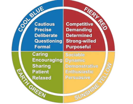
Jung’s theory was criticized as it didn’t have strong evidence, which he himself agreed with.
But, nowadays many marketing researchers have gathered great evidence to prove that colors do affect people.
The catch is that, although some colors have a universal effect, most depend on the cultural, social, and behavioral context of the interaction.
Why am I telling you all this?
Because I’m trying to really drive the following point home:
There’s no such thing as the perfect color palette to use for your marketing campaigns.
Every color you use should be guided by the goals of your company and the needs of your audience.
I can say that if you’re running a luxury watch brand, you should use the colors black and gold.
But if your main goal is to stand out from the competition and do something different, then using a black and gold color combination while every one of your competitors is doing the same, won’t help you achieve your goal.
So, how do you choose a color palette that’s perfect for YOUR product/service?
1. Learn Color Psychology

Before starting, you need to find out what colors convey the feelings you want your audience to have when they see your offer.
To do that you need to first understand what emotions people associate with certain colors.
Here’s a breakdown of some of the most common color symbolism:
- Red – Red signifies anger, passion, desire, and love. It warns and signals danger. In branding, red stirs excitement and passion in consumers’ hearts
- Blue – Blue embodies calm, trust, and intelligence, linked to water, skies, and cool landscapes like overcast days.
- Yellow – Yellow embodies happiness, hope, and youth. It symbolizes hope through the sun, signifying the promise of a new day after every dark night. Warm and vibrant, it echoes the brightness of a sunny day.
- Black – The color black symbolizes death, evil, power, and luxury. Black is worn at funerals in the West, villains usually wear a black cloak, and a black suit represents elegance and power. Luxury is also represented by black.
- White – White embodies simplicity, purity, and cleanliness. In the West, brides wear white to imply virginity, while in the East, it’s a color for mourning. In design, white signifies cleanliness, modernity, and minimalism.
- Green – Green symbolizes envy, money, nature, and growth. The color green is everywhere in nature. Darker shades can be linked with money and thus greed and envy.
- Purple – Purple is associated with royalty, independence, mystery, and magic. Lighter shades suggest feminine qualities whereas darker shades, mixed with blue, can show frustration
- Gray – Gray in branding often conveys neutrality, sophistication, and balance, offering a modern and timeless feel without overwhelming or distracting from other brand elements.
- Pink – Pink symbolizes love, compassion, softness, and femininity. It’s associated with traditionally feminine qualities.
Again, how your customers react to your brand’s colors depends on who you’re going for. This leads us to our second point…
2. Assess Your Market
Once you have a good understanding of what colors symbolize you can then try to align them with your ideal customer.
This will enable you to figure out how your audience will perceive the colors you choose for your ads.
Now, think about what kind of customer would be the ideal buyer for your product or service and what’s already happening in the industry.
Here are some things to look at:
- Audience Demographics – A person’s age, gender, religion, culture, and class all play a major part in how they perceive colors. E.g. feminine products usually use pink and purple, whereas masculine products use the color blue.
- Industry Norms – Explore how your competitors use colors and how people perceive them. For example, if fast food brands use the color red to stimulate appetite, then a restaurant using green might suggest healthier options.
- Marketing Objectives – Based on your marketing goals, you may want the audience to feel something different. You’ll notice that when companies are running a sale they often use the color red to show a sense of urgency. This usually causes people to stop and, if the offer is convincing, consider buying the product before the sale expires.
Once you’ve got an idea of your market, and how you want them to feel about your ad, you can start experimenting with different color combinations.
3. Experiment with Color Combinations
I say “experiment” because it’s unlikely you’ll come up with the right color palette the first time.
You can use a tool like Adobe Colors, which helps you quickly put together a color combination based on well-known color schemes.
There are a few color schemes that you can base your colors off of;
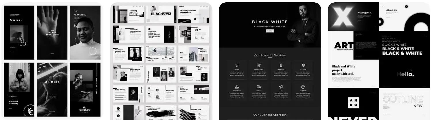
- Achromatic colors – a simple black-and-white color scheme. Brands usually limit themselves to B&W to create a simple yet powerful statement.
- Complementary colors – colors on the opposite ends of the color wheel. These include two colors that create contrast when combined together and can be used to make your creative stand out. Marketers typically use complementary colors for their CTAs so they stand out from the rest of the content.
- Analogous colors – colors created by using the adjacent colors to your primary color on the color wheel.
- Monochromatic colors – this color scheme includes only one color and its shades/tints.
- Triadic colors – this color scheme is created by picking three colors that are equally spaced around the color wheel. These work together in harmony and can alone be enough to create a nice, vibrant color palette.
If you’re using something like Adobe Colors, you can pick and choose from the color schemes you want. You just input a primary color and then choose the color scheme, and it’ll create a color palette for you based on the above-discussed techniques.
4. Test Your Ad Designs
Once you’ve created your ads and applied a splash of color to them it’s time to test them.
This means that you see which platform and ad design performs the best through A/B testing.
This is crucial as you need to find out which color combination resonates best with your audience. Even if you do all the research in the world, or are a color expert, getting first-hand data from your potential customers will give you a better competitive advantage.
Run tests of around 2-3 different ads with various color schemes. Then run those campaigns and gather feedback on what works and what doesn’t.
Common Ad Design Mistakes to Avoid
Many marketers don’t have an eye for design.
Like most, you’d be able to tell the difference between a good and bad design, but you might not be able to specify what exactly you do/don’t like about it.
That’s why when you don’t have much experience in advertising design, it’s common to make some mistakes. Even if something looks off to you, you may not be able to pinpoint it.
So, here are some common ad design mistakes and how to avoid them:
1. not having a clear goal
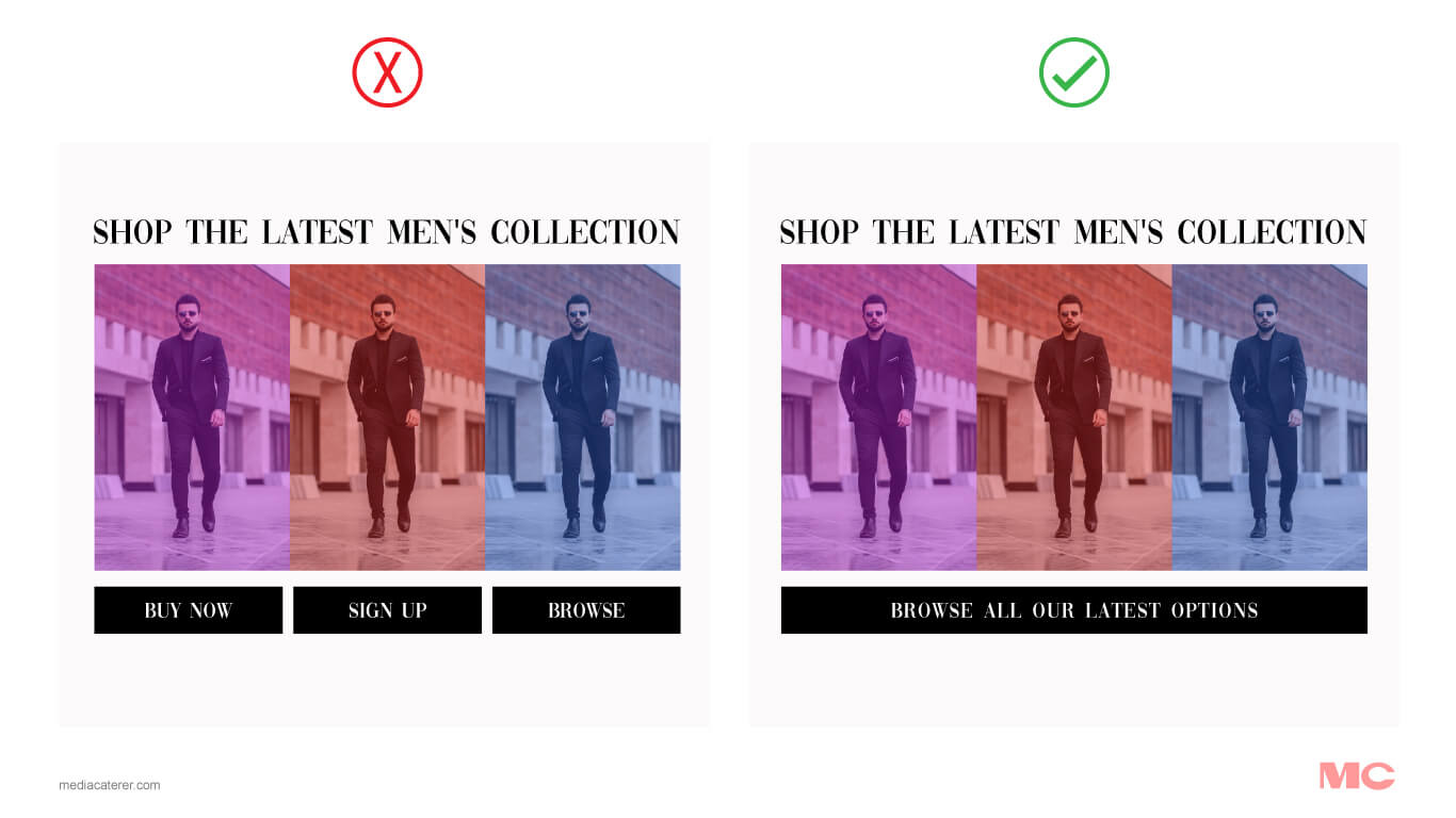
Many marketers often make the mistake of wanting their customers to do everything all at once.
They need them to sign up, book a call, buy a product, and upsell to them – all in one ad!
This clearly shows that some of these marketers have no clear goal of what they want to achieve with their ad designs.
Oftentimes, having only one CTA for an ad is more than enough. But, how do you figure out what CTA to include?
Take a step back and think about the broader objectives, also known as the corporate objectives, of your company.
These can be improving brand awareness, getting more leads, or increasing sales.
To know which to choose, see what is a top priority given your company’s current situation. Like, you can’t increase sales if nobody knows your brand yet. So for a startup, improving brand awareness and putting your name out there would be a better goal to focus on when just starting out.
Choose one goal and reverse engineer it.
For example, you need to improve brand awareness. Most marketers use the AIDA principle to naturally navigate customers through the buying process.
To get their attention you may use bold and vibrant colors, allowing yourself to differentiate from the competition. You’d also want to keep your colors consistent across your ads so people start to associate those colors with your brand.
Once you’ve got relevant traction, you can start to focus on another goal and adopt your ad campaign’s design accordingly.
2. Using too many colors
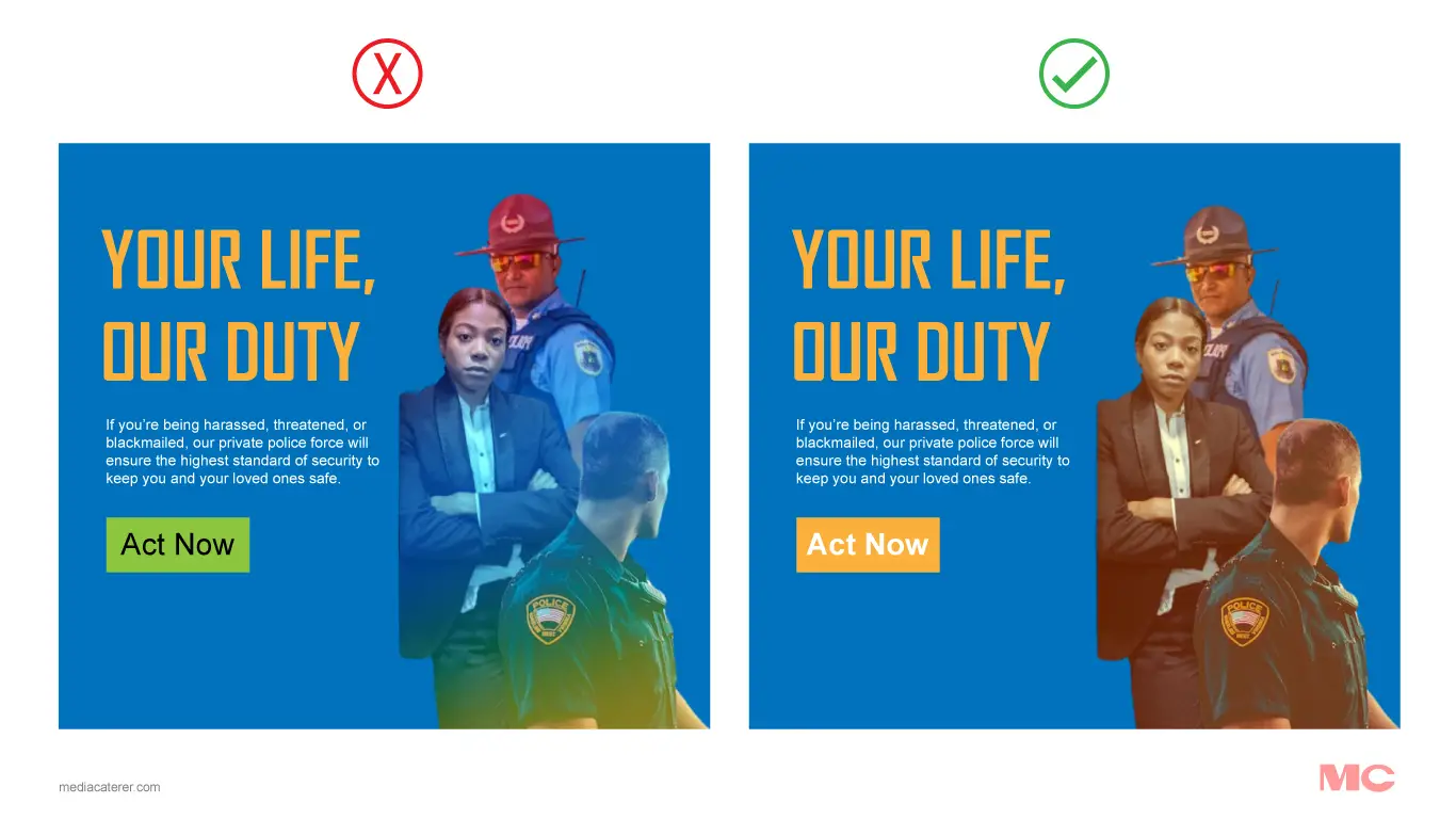
Using a lot of colors can confuse or overwhelm your audience.
Firstly, it confuses them as using too many colors is irritating to look at. Not only do they decrease the visibility of your design they also leave people scratching their heads as to who the ad is for.
This happens because, as we stated earlier, people associate various meanings with color. If you’re using multiple color schemes, it can deteriorate your brand’s message.
Secondly, too many colors can also make your brand image inconsistent.
Many times we business students are taught that you should think of your business as a separate entity. A totally separate personality with its own interests, likes, dislikes, goals, etc.
So, when you think of your brand you should instantly be able to tell what color would be associated with it.
When you think Coca-Cola, you think red.
When you think of Dr. Pepper, you think of a darker red.
And if you think about Fanta, you think orange.
This extends to even non-physical products.
Facebook is Blue, Pinterest is Red, and Snapchat is Yellow.
To have a consistent brand image you need to keep your colors limited and consistent.
using too few colors
Marketers have the habit of jumping on any new emerging trend, even if it doesn’t align with their brand’s objectives.
One of those trends is minimalism.
Although minimalism isn’t bad, it should be used strategically. If a minimalistic approach doesn’t align with your goals and target audience, even if the big brands in your industry are doing it, you shouldn’t follow suit.
It’s very common to see companies using the colors black and white for most of their marketing material.
Logos, ads, cover letters, merchandise… The list goes on and on.
Truth is, colors make your ads stand out. Not only that but we as human beings like to look at colorful things.
Sure, we might not like walking into a room looking like a unicorn threw up in it, but even if a room is colorful, and those colors work in harmony, it would make you feel much better than a dull black-and-white room.
This is also backed by research.
A 2020 study by the Iranian Journal of Ergonomics found that using color in the workplace led to better mood, well-being, and performance.
Not only that but even if you look online at popular graphic designers’ Instagram pages, you’ll notice they tend to post a lot of colorful designs. It helps their board/page look vibrant and colorful, leading to better engagement.
Try to use a good balance of colors, not too much nor too little.
testing too many color schemes at once
Successful marketers agree that A/B testing your ads is an excellent way to optimize your ad campaigns. It helps you figure out what type of ads work well with customers.
However, some marketers might get too enthusiastic and test a wide range of ads.
This causes two major problems.
- It burns your ad spend. You only have so much money to throw at running ads, so it’s best to use it sparingly on promising campaigns rather than ideas you aren’t confident about.
- It spoils your brand image. This is the same issue caused by using too many colors. When virtually every person sees a significantly different colored ad, it’ll confuse your audience and reduce the efficiency of your ad campaign.
A best practice is to keep your split tests limited to two or three different color schemes. Create ads around those and then monitor their performance to see which one is performing well as well as why they’re performing well.
You might even snuff out some cultural concerns that other color choices might not have highlighted. So, you’ll thank yourself for testing out different colors in your A/B testing.
Conclusion
Color choices are more than aesthetics; they’re a game-changer in advertising. By understanding their emotional punch, fitting them to your brand vibe, and testing smartly, you’ll create ads that stop the scroll and speak directly to your audience’s hearts.