There are many elements that come together to create a design that not only communicates your message but also makes it visually pleasing to look at.
Many of you work with a range of different documents and have also come across many great looking designs, but what is it about them that make them look balanced, clean, sleek, and modern?
White Space – The Most Overlooked Design Element
Given how white space can make or break a design, it’s concerning how many people overlook this crucial element. So let’s first define white space.
White space, also known as negative space, is the space in a piece of design that doesn’t include any text or media. It’s basically a blank space.
Despite its name, white space doesn’t have to be white, it just has to be an empty space. This means it could also be any color, texture or background image.
You’ve come across this many times, even if you didn’t notice it.
Here’s an example:
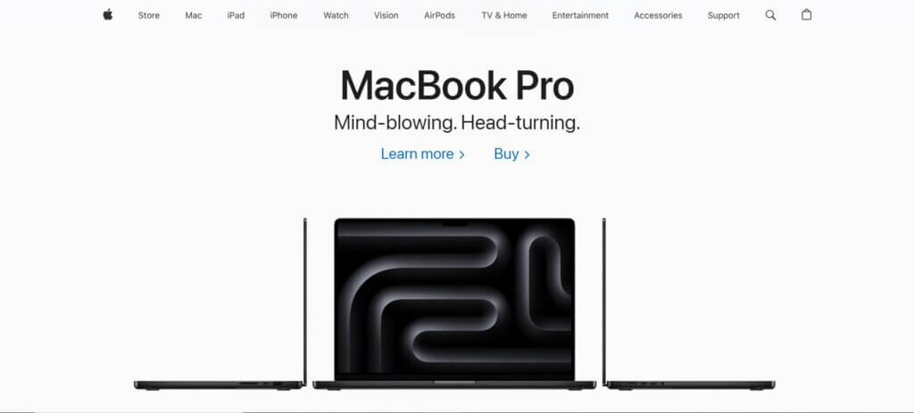
Above is Apple’s official homepage. The homepage works because it’s easy to read, bold, and clean. It clearly looks like a modern brand.
Why? The secret is white space.
Graphic designers don’t need to cram every design element that they can think of to fill the space. Rather, Apple here has clearly left a lot of empty space on purpose.
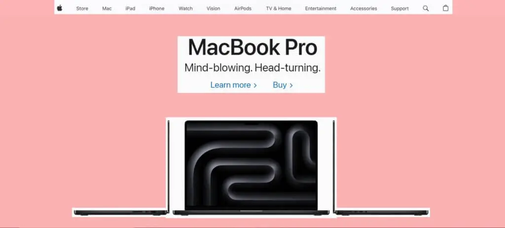
So, how does this “work?”
The role of white space is to divert a person’s attention from the rest of the page to the main elements on the screen. When you don’t have anything else to look at, you’ll be less distracted and more focused on the elements that are visible.
This emphasizes the main message of a brand, in this case, Apple wants you to focus on their latest Macbook Pro.
This pattern continues further as you scroll down the page.
Not only does white space enforce the main message, it also improves the legibility and readability of the design. Since there is ample space within and around the text, it makes it easier to read and digest.
This is crucial as it can be the difference between a person staying on your page and reading it through or bouncing early just because they were overwhelmed.
And what’s the one thing that overwhelms people the most online?
Long walls of text.
Why do people prefer to read shorter, 400-word articles on the web compared to a 50,000 word book – when the latter is clearly much more informative?
People aren’t machines.
We get overwhelmed when we see a huge wall of text, not to mention it’s also difficult to process a lot of text together. Reading an extremely long piece of text, from start to finish seems like a never-ending battle. This is why laymen don’t read scientifc reports and would rather just share 1 or 2 facts from the actual report.
You may have heard people talking about “scientific reports” that prove the benefits of certain foods or exercise. Have you read any of those reports? Probably not. But you’d gladly share those facts with others.
Adding white space in between walls of text can help break them down into chunks, which are easier to digest for the reader.
Even this article is an example of it. If I were writing this in a typical college essay format, I wouldn’t be making this many paragraphs.
There are certain rules when writing an essay, and one of those is that each paragraph should be discussing a separate idea or point, that would mean for each benefit we’d discuss here, I’d have to confine it into a single paragraph, but I don’t.
Look at the following two pieces of text, both have the same amount of words. Which one are you more likely to read through from start to finish?
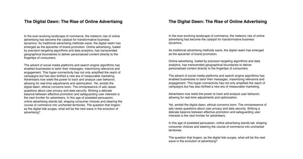
Although the one on the left seems smaller in length, the long blocks of text makes it much more difficult to keep your focus. With all those characters grouped together, it makes it seem as if there’s a lot of text, when in reality, it’s the same as the one on the right.
The piece on the right is easier to read as after every paragraph you read, your eyes get a break. Not to mention that reading 8 short paragraphs is easier than reading two long paragraphs.
It’s the same way how people view films as oppoesed to seasons. If you’re a Netflix user, there’s a high chance you’ve spent hours watching episode after episode of your favorite series. At the same time, watching an entire 3-hour movie in a single sitting can seem daunting. That’s how white space it works. That little break you get when transitioning from one episode to another is what keeps you going to view the entire series.
Finally, there’s another major benefit of white space, and that is to create a visual hierarchy and balance.
Arranging your design elements in a visual hierarchy is pinnacle to the success of your projects. Having a hierarchy in place helps guide people where to look first, then second, then third, etc.
This is easier to explain taking the example of management hierarchies.
When you look at a company’s hierarchy, you clearly know who’s the CEO, who the directors are, their subordinates, and then their subordinates, etc. This makes it easier to work out who does what and what the position of each employee is. It’s also easier for employees to figure out who they have to report to and, equally important, who they don’t have to report to.
Take the example of this cocktail recipe poster by graphic designer Tugba Ozcan:
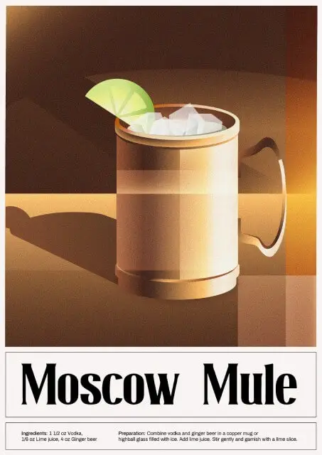
It’s clear what the designer here wants the viewer to look at first. First your eyes fall on the big image of the cocktail itself, then it’s name “Moscow Mule” and then you read the text on the bottom. Since many people read from left-to-right, you’ll probably read the ingredients on the left first, then the preparation instructions – which is the sensible order to read it in.
White space also helps create this hierarchy by distinguishing a design from other elements, making it stand out from the rest.
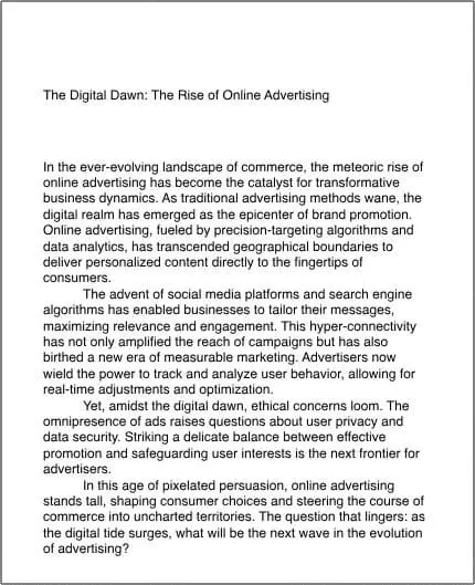
Look at the piece of text above. By looking at it you can clearly distinguish the title from the rest of the body text. That’s the power of white space.
Even though both the title and the body text have the same font, weight, and size, you’re still able to distinguish between the two. This is how white space can be used to establish a visual hierarchy, clearly separating elements from each other and making them stand out on their own.
Active & Passive White Space
Now let’s get into the nitty and gritty of white space. There are two ways to approach adding white space when desigining, active and passive.
Active white space is the concious effort of purposely leaving some areas of your canvas blank. This is the approach designers mostly concern themselves with.
This approach is used for enhancing the user experience and helping people navigate through a design easily. It’s also used to add emphasis to the main message of a design.
Passive white space on the other hand is one that may unintenitionally be added or is included to make the design visually pleasing to look at.
This includes the spacing between letters (kerning), words (tracking) or lines (leading). It can also include the gap between certain glyphs such as the space in the middle of the letter “O”.
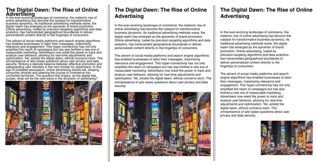
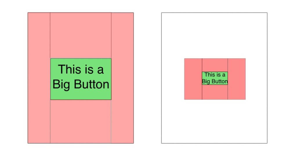
Look at the above example. Over here I’ve designed 3 examples to show you how active and passive white space works.
On the left, there’s no white space. This is why the text is looking compressed and every other element, like the title and image, is cluttered together.
In the middle example, we’ve added some passive white space. There’s much more space between the paragraphs and title, and there is more leading in the body copy, which makes it much more legible.
Finally, in our right example, you’ll see an active approach to white space. We’ve added a lot more space on the right and left of the body copy and the image, respectively. There’s also a much bigger space between the title and the body, which makes the title stand out more.
Macro & Micro White Space
Another concept that closely ties in with passive and active white space, is macro and micro white space. These two are self-explanatory.
Macro white space is usually the result of an active approach as you purposefully leave a lot of space empty.
Micro white space on the other hand is the result of a passive approach and includes the space between glyphs and lines of text.
This would be better illustrated with an example.
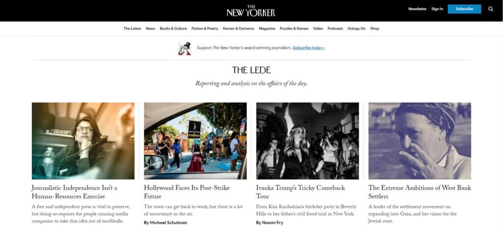
The above is the homepage for The New Yorker. They have a nice clean layout with an emphasis on their news stories. They also make good use of white space, but let’s look at how they mix both macro and micro white space to achieve a visually balanced look.
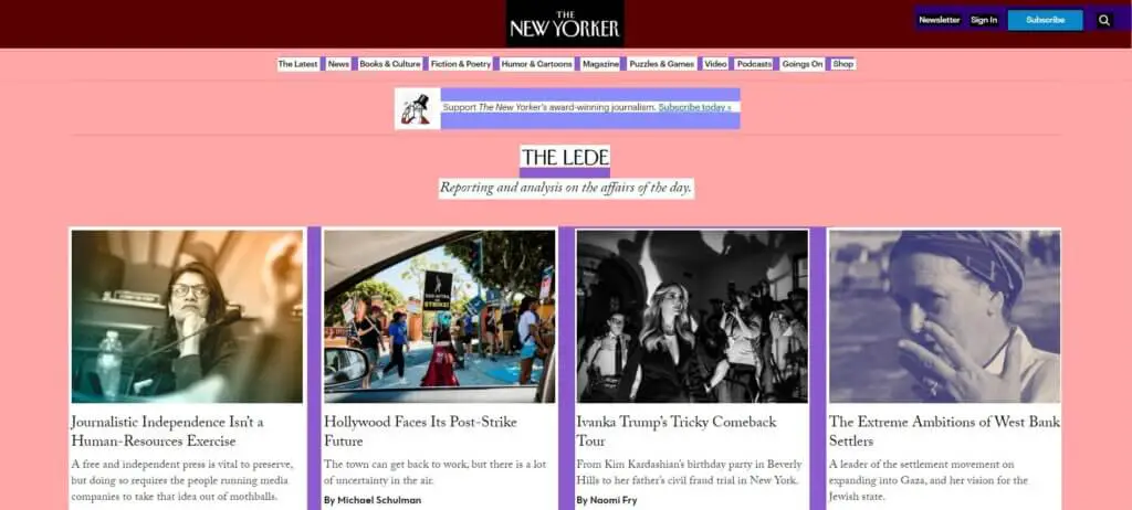
In the above image, I’ve highlighted the macro white space in red and the micro white space in blue. Hopefully, now you can clearly tell what we mean by “macro” and “micro” white space.
Over here, the micro white space is the gap between menu items in the header as well as between the categories. The margins between the posts is also white space as it lets the posts breath.
The macro white space is evident mainly because it covers the larger part of the site. It’s also clear that the designer purposefully added ample space by adjusting the margins and padding as well as the centered text. The content/copy writers also did a good job keeping the heading text minimal to stay consistent with the intended design. Another aspect is the logo and categories. The categories could’ve been placed within the header near the logo, but the designer separated the two and gave them each their place on the page.
How to Design With White Space
We’ve learned enough about the concept behind white space and how it works, now let’s look at some practical ways you can add white space in your designs.
Margins
Margins are going to be one of the first things you set up when getting started. You can control the margins to give you ample amount of white space however you need to consider the breif you’re working with first.
No doubt you’ll be adding margins regardless of what project you’re working on, but the brief would guide whether or not a macro or micro approach would be better.
Remember the Apple homepage we analyzed. It was clear that the macro white space conveyed a sense of minimalism and modernity, so you should keep in mind the tone you’re going for when using margins for your design.
Padding
Padding is the space within an element. Padding and margins are often confused so here’s an illustration that would clear up any confusion:
Margins are outside of the element and extend from the boundaries of the page, whereas padding extends from the boundaries of the design element that you’re adjusting the padding of.
Hope that clears it up.
You can use padding to add space within elements and make them “breathe” better.
Leading
Leading is the vertical space between lines of type. I mentioned leading earlier when I was explaining passive white space.
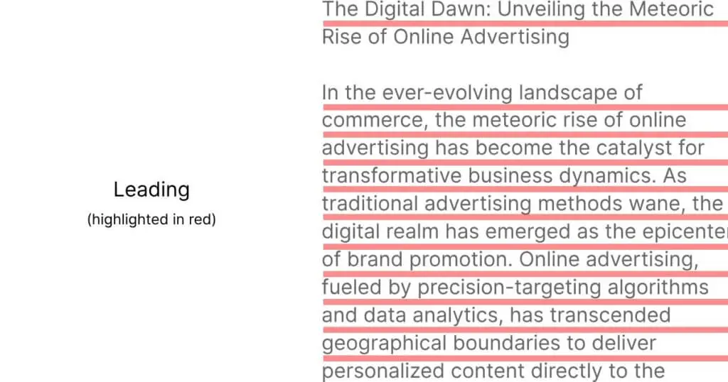
Having optimal leading makes your text look cleaner, legible, and improves readability. It also helps readers scan the text, which is crucial if you expect people not to read word by word and rather skim through the text.
You can easily adjust the leading of any paragraph in most design tools by selecting your text and adjusting it through the font/paragraph tabs. Most design tools have the leading set to auto by default, which is typically fine for most text-based docs.
However, for some settings you may want to adjust the leading for the text to flow better.
Takeaways
White space plays an important role in graphic design. It allows your designs to breath, develop a visual hierarchy, improve legibility, and make them look aesthetically pleasing.
When designing with white space you can approach it two main ways, active or passive, macro or micro. No matter the nuances, getting started with white space is easy.
With a slight adjustment of margins, padding, and leading, you can easily improve the visuals of your projects. As with anything though, mastering white space is difficult and once you design more and more, you’ll slowly understand what works and what doesn’t.