Banner ads have been around since 1994.
Given how quickly trends change today, marketers are quick to dismiss banner ads as a part of their marketing strategy.
But, banner ads are still a great way to reach people, increase brand awareness, and get traffic.
At the same time, the only way to guarantee success is to design an effective banner ad design.
Considering that the average American sees around 347 ads a day, it’s crucial to make your banner ads stand out.
In this article, we’ll explore 10 actionable tips to improve your banner ad design.
10 Banner Ad Design Tips to Make Your Banner Ads Get More Clicks
1. Define Your Objective
Having a clear objective for your banner ad is the first step to designing effective web banners.
You must have a clear objective of what you want your customers to do when they see your banner ad.
What do you wish to achieve with your banner ad? Some common examples include:
- Getting more sales
- Generating sign ups
- Increasing brand awareness
- Offering promotions
- Driving traffic
Without a clear goal, you risk spending time designing an ad that is irrelevant to your customers. Or, it may even end up confusing your audience as they can’t tell what they need to do.
2. Keep It Simple

Most viewers will view your ad for less than a second.
Remember that a banner ad is just to grab the attention of the viewer. It hardly ever converts to a sale on the first impression.
For this reason, you should try to keep your banner ads simple.
Showcase only one product or deal and have a single CTA for viewers to take action.
Also, use eye-catching visuals with simple and easy-to-understand text.
This means you’d want to avoid crafting an extensive sales copy, and rather write a concise description of your offer. You should look for ways to say what you want with images rather than text.
3. Choose Colors Wisely

Colors affect people’s emotions. This happens as people assign colors various meanings based on their cultural and social contexts.
This is known as color symbolism (cultural context) or color psychology (emotional).
Choosing the colors that resonate with your audience will help you get your message across effectively. It’ll also enable you to evoke the desired feelings in your audience.
Here’s a brief overview of what certain colors represent:
- Red: Represents strong emotions like passion and love. It’s a color that often signals caution or danger. In branding, it tends to excite or provoke feelings.
- Blue: Evokes calmness and trust, like looking at a serene sky or water. It’s associated with intelligence and a cool, composed vibe.
- Yellow: Brings a sense of happiness and hope, much like sunshine. It symbolizes optimism and youthfulness.
- Black: Often linked to serious things like death and power. It’s also considered elegant and luxurious, and used in high-end branding.
- White: Represents simplicity and purity. It can mean different things in different cultures, like purity or mourning.
- Green: Symbolizes nature and growth, sometimes connected to money. It can also evoke envy or greed.
- Purple: Often associated with royalty and mystery. Light shades feel gentle, while darker ones might express some intensity or hidden feelings.
- Gray: Has a neutral and sophisticated feel. It’s used in branding to maintain a modern and balanced look.
- Pink: Symbolizes care, softness, and love. It’s often related to traditionally feminine qualities.
Apart from knowing how colors impact your audience’s emotions, you also have to factor in your brand’s colors.
When possible you should have your brand’s colors within every ad you produce. This helps people associate a certain color with your brand, making it memorable.
It also promotes consistency as your branding aligns with a preset choice of colors.
The point to take home is that the right color choices can significantly improve the effectiveness of your ad designs. So it only makes sense to choose them wisely.
4. Choose the Best Banner Ad Sizes
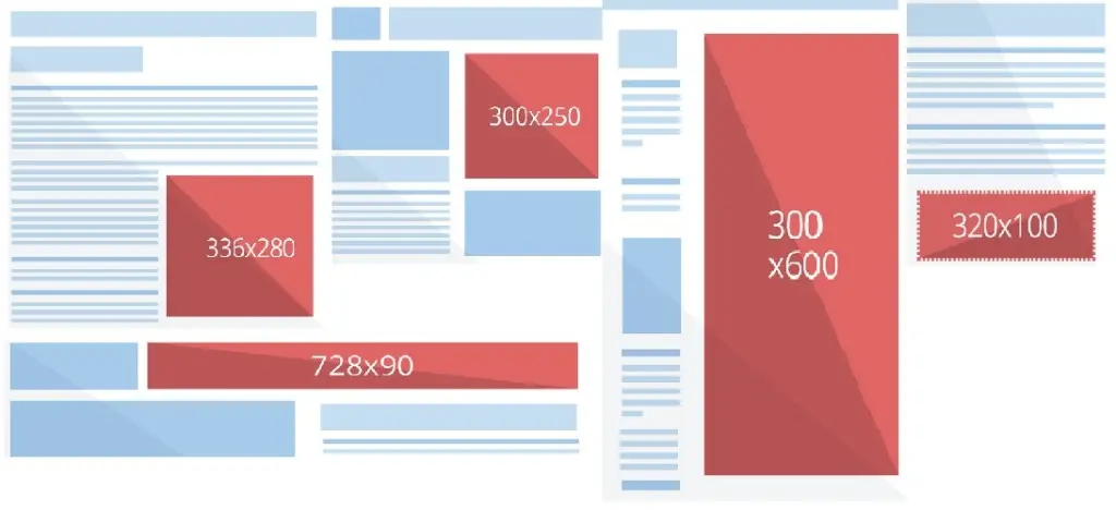
Web banners come in all shapes and sizes but there is such a thing as the best ad banner sizes.
There are certain sizes that advertisers prefer that perform the best based on impressions and clicks.
These dimensions typically include the following, as suggested by Google Adsense:
- 300×250
- 336×280
- 728×90
- 300×600
- 320×100
Here’s a table summarizing each ad size and how it’s used:
| Banner Ad Size | Description | Appearance | Device |
|---|---|---|---|
| 300×250 | Medium rectangle; has a good level of ad inventory | Embedded in-between and at the end of articles | Desktop, Tablet, Mobile |
| 336×280 | Large rectangle; has a good level of ad inventory | Embedded in-between and at the end of articles | Desktop, Tablet |
| 728×90 | Leaderboard ad; has a good level of ad inventory | Placed above the fold, in the header, and usually on forums | Desktop |
| 300×600 | Half-page banner ad; growing ad inventory and high user engagement | Placed in sidebar | Desktop |
| 320×100 | Large mobile banner ad; has a good level of ad inventory | Placed above the fold and embedded in-between and at the end of articles | Mobile |
Adhering to these best practices when selecting the dimensions of your banner ad will ensure you get the most amount of impressions. It also allows you to avoid your ads being flagged as obtrusive.
5. Use Animations
View post on imgur.com
Adding animations to your banner ad design can make them stand out.
This is no secret.
A 2022 study by Creatopy showed that 63% of display ad designs were animated. This makes them every marketer’s best choice.
Why do animated banners grab attention better than static ones?
Well, since we’ve been seeing static banner ads for the longest time, we humans have developed something called “banner blindness”.
That and, animated ads, combined with static content, tend to make us stop. If we’re fixated on a piece of content – whether that’s an article, image, or video – seeing something moving from the corner of our eye compels us to look.
However, you should also remember that animated banner ads can be much more annoying than static ones. So, keep these best practices in mind when designing one:
- Make sure all your animated elements are in sync
- Choose animations that match your brand’s personality
- Use quick transitions to catch viewers’ eyes
- Make the animation brief, 15 seconds is fine
- Loop your animation; don’t overdo it though
Stick to the above and your animations will work seamlessly!
6. Create a Visual Hierarchy
The elements you use for your ad design should follow a logical order.
There are usually three main things you need to include in your banner ad design:
- Your company logo and slogan
- Your value proposition
- The call to action
Your value proposition is the first thing that the viewer should be influenced by. It’s the thing that attracts them to the ad in the first place. So, it makes sense to make it the most prominent thing in the ad.
If they find you’re offer compelling enough, they’d want to take the next step. For that, you need to have a CTA, which should be the next most prominent thing in the ad. This is usually in the form of a bright-colored button, typically in your brand’s color.
The logo and company slogan help you improve brand awareness. But, don’t make the common mistake of making it very big!
Many brand marketers think the logo should be the most prominent thing on the banner ad as it enforces your brand image.
But remember that your end goal is not just to improve brand awareness, rather you also want customers to click through.
Most customers don’t even look at the brand before considering the offer.
It’s only after the offer is enticing enough that they learn about the brand – to know who exactly they’re buying from.
So, include your logo and slogan, but don’t make it the main star of the show.
7. Choose Your Fonts Wisely
Good typography is key in making your text readable, legible, and aligned with your ideal viewer.
The copy of your banner ad is going to be extremely important in conveying your value proposition.
To ensure success with your font choices, what you need to do is:
- Add contrast – Make your headline and body copy different weights or typefaces to add contrast.
- Use a legible font – Cursive/script fonts are usually a big no-no. If they’re a part of your branding, then you should make sure they’re legible from a distance.
- Use sentence case – Don’t use all caps or lowercase unless you have a very good reason to do so. Capitalize the first letter of each word for your heading.
- Use a big size – Keep the size more than 12pt, and make sure your headline is a big size.
Having good typography is a cornerstone of your ad’s effectiveness. Don’t sleep on the easily implemented best practices above.
8. Include a CTA

When viewers look at your ad and find your offer/brand/deal attractive, you need to give them a way to move forward.
For this reason, it’s essential to have a specific CTA that helps you achieve your goals with the ad.
This is usually in the form of a button.
To design the CTA, you need to go back to your goals for the banner ad. With that in mind, you have to place the CTA in a prominent location and make it contrast with every other element so that it stands out.
This will help improve your click-through rates significantly.
9. Have a Clear Focal Point

When you’re serving banner ads across a range of different mediums, there’s a high chance that the viewer is already distracted by something else.
To get their attention, you need to have a clear focal point that you want them to see before highlighting your offer.
This can be the image of your product, or if you offer a service, a high-quality photo related to your service is also great.
Whatever it is, you should remember that there should be one specific area where you want your potential customer to focus before even reading your copy.
This lets viewers ease into the buying journey rather than give off the impression of being aggressively marketed to. It also simplifies the decision-making process, as they aren’t overwhelmed by multiple design elements.
10. Use High-Quality Photos
Using stock photos instead of your own isn’t a sin, but only if the quality is up to a good standard.
A poor-quality photo can ruin your brand image and tear down the quality of your ad.
Instead either use premium stock photos from well-known websites or use a high-res photo from a reliable site.
This is even more important if the look of your product directly impacts how the audience feels about it.
Like having an image of food in poor lighting can instantly make it look less appealing…
Conclusion
Banner ads have been around for ages, but they’re still effective if you play your cards right. These 10 tips are like the backbone of a solid banner ad design strategy.
Simplify things, use animations wisely, and focus on visuals that stand out.
With clear goals and smart design choices, you’ll create banner ads that catch eyes and drive clicks.