Math is used all the time in Graphic Design.
Things such as measurement, alignment, proportions and ratios are things that are mathematical concepts often used by graphic designers to make their designs well-balanced and attractive.
Graphic designers often don’t go into too much details or complex math whilst designing, you don’t have to be a math wiz to be a designer.
Math is easy, Design is hard
Jeffrey Veen, American author and brand strategist
I had asked some fellow logo designers about the importance of math in graphic design on Facebook, here are some opinions:
Math is essential because we need to use the appropriate ratio and proportions when scaling for media. Also, Illustrator uses math to properly rotate/scale objects.
Facebook User
Eh – that’s what calculators are for…. lol. I’m not much of a math person. Most “creatives” I know aren’t that great at math, it uses a different side of the brain.
Facebook User
Golden ratio is bollocks, nothing but a university task. Maths is important for scaling % also handy to know how to read a tape measure or drawings. But all this fancy stuff is silly, a logo is a logo at the end of the day, it could be as simple as a single letter or a full image. You don’t need to draw circles and lines all over it to justify what you may charge.
Facebook User
As you can see, the opinions were mixed with some saying it was important and others not so much.
Graphic designers usually use “intuitive math” while designing which we’ll discuss further in detail below.
What is the Role of Mathematics in Graphic Design?
In graphic design there are a set of rules that the designer has to keep in mind when working on a project.
As a graphic designer you have to strive to make your designs visually attractive to the viewers and use subtle techniques to catch and guide the viewer’s eyes and communicate your message effectively.
By implementing mathematics in your designs you can create contrast, symmetry, proportions and visually appealing designs – all the things required to have a good design.
Let’s illustrate an example;
Here’s what a page of a book looks like without any kind of math knowledge (including the basics.)

And then here’s the same page with some basic maths applied:
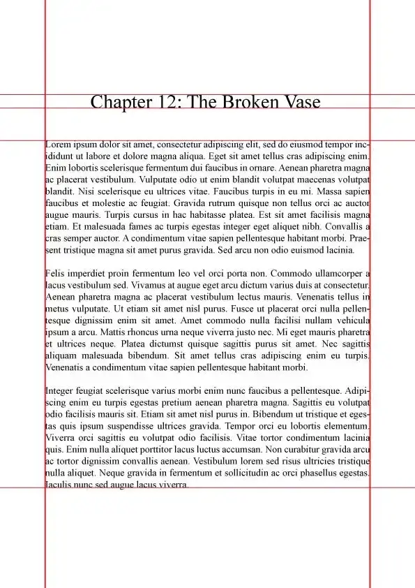
You might notice some graphic design fundamentals in the above like, alignment, margins and contrast however this wouldn’t have been possible without some basic math.
To make the design balanced it was important to have correct proportions which is why both the left and right margins are 68 pixels wide and the top and bottom ones are 154 pixels wide. The text is aligned to the margins creating symmetry and contrast is made by multiplying the text font by 2 which gave us a good size for the heading.
What Kind of Math is Needed for Graphic Design?
Fortunately you don’t have to be good at math to be a good designer as most of the math you’re going to be doing is intuitive.
Intuitive by definition means to use or base something that feels right without any conscious reasoning.
Take our example from above;
When you looked at the first image you must’ve instantly felt something was off, everything looked congested, and of poor quality.
In the next image however, things look better, you can easily distinguish the heading title from the body text. Everything feels more symmetrical, arranged and neat.
Below we’ll discuss in further detail what kind of math is essential for graphic designing and which mathematical formulas are good to know about but not necessary;
- Scaling
- Algebra
- Ratios & Proportions
- Geometry
- The Fibonacci Sequence
- Golden Ratio/Rectangle
- Fractals
Scaling

Scaling deals with multiplying an object with every linear dimension of it. This means the size of the image will be manipulated, not having any impact on the actual shape of the object.
In Graphic design, scale is one of the main fundamentals of graphic design it is used to create contrast, add emphasis and deliver a message effectively.
Scale creates relativity in your designs. Relativity means how small or big an element is compared to the other.
Designer Steven Bradley, from vanseodesign, writes:
A single object has no scale until it’s seen in comparison with something else.
Steven Bradley
Graphic designers don’t work without scale and good knowledge of scaling will help you size images/graphics properly, make powerful compositions and layouts, create hierarchy, add variations and create contrast in your designs.
Scaling is also used to test specific views of logos such as how it would look on mobile, website, letterhead etc. The logo has to be scaled accordingly to the design and maintain proportions to look just right.
Applications of scale
Fortunately, modern graphic design software would do all the heavy-lifting for you meaning you don’t have to carry around a formula sheet with you wherever you go.
To symmetrically scale your designs you click and drag the subject while holding shift and for asymmetrical scaling you don’t hold shift.
Below are some examples of the scale being used:


Algebra
Ah yes, the forbidden relationship of letters and numbers that made almost everyone hate math.
Algebra, by definition, is the part of mathematics that deals with letters and symbols to represent numbers for equations and formulae and rules to manipulate them.
Algebra is helpful for graphic designers to:
- Divide designs into sections – If you made a design and now have to place it on a three-leaf brochure you would need to know the width of the columns, and how much of the design would be placed on it
- Estimate design placements – It is truly frustrating for you to work on a design for so long just to see that it is too large or small for the medium. For example, if you are designing a graphic for the web you may have to convert your measurements to calculate the appropriate proportions. This ensures the design will look okay when you place it.
Applications of Algebra
Algebra can be used to estimate the size of design placements. Ideally you would use it to understand the relationship between the size of the design and its designated medium.
A common example is in publication design where graphic designers would have to know whether or not the design could fit on the page or not.
Algebra can be used to understand the design of three-fold brochures or magazines where the text and images should be set together while being able to deliver the message effectively.
Ratios and Proportions
Good knowledge of how ratios and proportions work is essential for any graphic designer to scale your designs effectively.
Ratios are used to set orientations of your designs for example if you are working on a landscape the most common ratio to be used is 16:9.
Proportions are equally as important and can be considered the same way as ratios.
If you have experience using Photoshop you must have already encountered the use of proportions. Photoshop and other graphic design tools have an option to “lock proportions when scaling.” What this essentially does is prevent your subject from stretching or breaking as all proportions would remain same causing the design to be viewed exactly the way you intended.
Applications of ratios and proportions
Ratios and proportions can and are used everywhere in graphic design.
It is used to scale designs accordingly to the preferred dimensions. For a Pinterest pin you’ll have to set the ratio to 1:3 for Whatsapp and Facebook the optimal size may be 1:1 and for landscape photos the ratio applied may be 16:9.
If you wish to use the same design in multiple formats you have to have adequate knowledge of ratios and proportions in order to maintain the quality and legibility of the design, regardless of where it is to be published.
Geometry

Geometry is the branch of mathematics that deals with relations of points, lines and shapes.
Basically anything to do with shapes.
And we know in graphic design how important shapes are.
Geometry helps us build harmony in designs and is absolutely essential in all fields of graphic design whether that be logo design, web design or even typography.
Geometry is used in a number of ways:
- To create harmony – Geometrical shapes and fonts often have an aesthetic appeal to them and create a flow between design elements
- Shape Psychology – Psychology is an integral part of marketing and design to influence customer decisions and actions. Understanding geometry can help us choose shapes for our designs to communicate with our audience more effectively
- Creating geometric patterns – Geometric patterns are used to add some flair in your designs these can be abstract or simplistic.
Applications of Geometry
Geometry can be used anywhere; brand identity design, logo design, web & app design, stationery, clothing etc.


Complex Math for Better Designs
I believe that the above can help greatly in creating a more solid foundation for your designs but there are other math formulae you can learn if you want to up your game;
- The Fibonacci sequence
- The Golden ratio/rectangle
- Fractals
The Fibonacci Sequence
Developed by Fibonacci, The Fibonacci sequence is a series of numbers made up by the sum of the previous two numbers starting from 0 and 1.
“0, 1, (0+1) 1, (1+1) 2, (2+1) 3, (2+3) 5, (3+5) 8, (5+8) 13, (8+13) 21, (13+21) 34…”
The Fibonacci sequence contributes to proportionally balanced design and can also be seen in nature which is why it is also called “Nature’s code.”
Applications of the Fibonacci Sequence
In graphic designing, the Fibonacci sequence can be used for balanced layouts and composition. You can use the Fibonacci calculator to figure out proportionally balanced sizes for your text, columns and graphics.
The fibonaacci sequence is also a bit popular in web design.
Below is an example from SmashingMagazine of a minimalist style blog using the Fibonacci sequence:

They further give a detailed explanation for their design:
“You can see that the page is divided into three columns. Each column corresponds to a Fibonacci number. For this design, we used a base width of 90 pixels. This base width is then multiplied by a Fibonacci number to get the total width for a particular column.
For example, the first column has a width of 180 pixels (90 x 2); the second column has a width of 270 pixels (90 x 3); and the third column has a width of 720 pixels (90 x 8).
The font size also corresponds to a Fibonacci number. The blog heading has a size of 55px; the article’s heading is 34px; and the content is 21px.”
Golden Ratio/Rectangle
The golden ratio holds the same principle as the Fibonacci sequence.
Simply put, it’s a shape with the ratio of 1:1.6 which forms the golden rectangle
By forming shapes with this ratio we get a grid like this:

And when we connect all the edges of the shapes together we form the golden spiral:

The golden ratio is admired because of its precise proportions that can be seen all around us in paintings, nature and architecture.
Application of the Golden Ratio/Rectangle
The golden ratio can be utilized in almost every graphic design field from logo design to web design.
In web design you might see the golden ratio most commonly in landing/home pages:


The Golden ratio can also be used in typography to divide headings into sub headings and sub headings into body text. The golden ratio ensures a nice balance and flow between the different texts all while creating contrast.

To learn more about the golden ratio check out our article: Golden Ratio in Design: What is it and How You can use it.
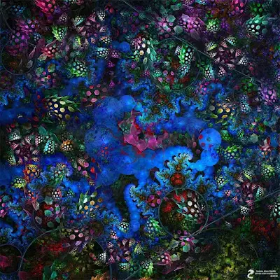
Fractals

Fractals are related to geometry as they are repeating geometrical patterns that form a whole. Fractals are mostly seen in nature such as leaves, flowers, ice crystals etc.
Fractals can be created with today’s graphic design software such as Photoshop and Illustrator using the rotate tool, shape tool, and pattern brushes. Fractals can also be made using mathematical formulas and are said to catch the viewer’s eye effectively due to their unique form.
Application of Fractals
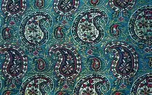
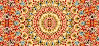
Fractals can be used to imitate nature in your designs, they are used to create visually appealing patterns which are used as backgrounds, design elements or as patterns for clothing.
I’ve seen fractals being utilized in their full potential in eastern designs. Designs such as the paisley, mandala and the designs on Islamic mosques all use fractals to create beautiful patterns.
Is Math compulsory for Graphic Designing?
As discussed above it’s not necessary to dive deep into mathematics to learn graphic design. Graphic designers usually rely on their own instinct to choose which elements should be included in their designs.
Self-taught graphic designers don’t really tap into math nor do they find it important.
However, if you plan on studying in university for a graphic design degree then it depends on your course and where you live.
Undergraduate Programs (Bachelors)
Many graphic design undergraduate programs require the student to study general mathematics. This isn’t something complicated rather it deals with the basics. You can expect to study about perspective, geometry, algebra, calculus and statistics. According to SeattlePi many universities require you to achieve 3 to 4 credits of math for degree completion.
Some educational institutes offer specialized math classes such as Drexel University’s Mathematical Foundations for Design which is mandatory for all students majoring in graphic design.
Graduate Programs (Masters)
People mastering in graphic design do not require any additional math classes as they are expected to have built a strong foundation of the basics in the undergraduate programs.
Conclusion
To conclude, we learned that mathematics holds a fundamental place in graphic design and is truly essential for solid design structure, harmony and consistency. The human eye appreciates consistency and symmetry both of which are achieved using mathematic formulae alongside graphic designing.
It is not absolutely necessary for a designer to learn math as a separate subject alongside graphic designing as most designers tend to use their intuition and sense whether or not something looks good or not.
Even though the basics are only expected from designers some take it to the next step learning and implementing complex mathematical techniques in their design to have a near perfect design. These aren’t necessary and sometimes they tend to be too rigid if you strictly stick to them but do provide a sense of consistency in the design.