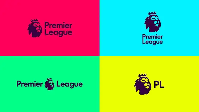
It’s starting to become a trend. Major companies such as Burger King, General Motors (gm) and Nissan have rebranded to a flatter design making their logo more simple and modern.
It implements the classic “less is more” line in it’s design but it usually leaves some of their audiences with a bad taste in their mouth. People on Twitter are usually bashing these rebrands stating that companies have “ruined the logo” or how “less is not always more.”
ill never forgive them for this disrespect pic.twitter.com/Xc2VATz4hJ
— NASH🚫VILLE (@foofloop) January 18, 2021
If God let designers rebrand Earth pic.twitter.com/Vd6SYJViLP
— Skyler (@skyler_fs) December 11, 2020
However, in graphic designing, we see the world revolving around much more simpler and flat designs as they are more appealing and less complicated making them more memorable and as designers we also stick with the old, “less is more” tagline. So, why do people keep hating on them? Why do some people feel the new rebrands are exceptional whereas, others think they are just downright garbage?
Based on my observation I could definitely say it’s because of nostalgia and some other factors.
It’s a fact, many brands are a part of people’s most cherished memories. That time you had your birthday at McDonald’s, the time you won a football tournament and celebrated with your team for ice cream at Dairy Queen or when you used to come home and watch endless cartoons on Cartoon Network. Many people have a lot of deep loving moments associated with brands so they feel heartbroken when these brands suddenly decide to “move on” and change. It is as if the brand “broke up” with them and moved on to a much more minimalist style not thinking about how people would feel with their childhood ruined.
All those good times, moments start to fade as logos change and so do people’s perceptions.
Let me illustrate an example:
The above is the logo of the famous Japanese media company found by Nintendo. The logo has remained untouched since it first debuted in 1998.
Here’s how’d I reimagine the logo if it were made in accordance to modern trends:
Sure, I’m just messing about. But, having a huge fan base with 147 million active users and a gross revenue of $92.121 billion since it’s launch, I can already sense people with torches and pitch forks outside my house.
Being a childhood favorite of so many people around the world they will be absolutely enraged if they found out “Pokemon” had changed their logo.
Why do companies prefer flat designs?
Whether you like it or not brands don’t seem to be backing out of the flat design trend and don’t hesitate to join the bandwagon and replace their current logo design with flat, minimalist logo designs. This isn’t necessarily a bad thing and many businesses have genuinely good reasons and from a business point of view the positives of flatter design outweigh the negatives by quite a lot.
Flat logo designs are much more memorable
It’s no doubt that due to their simple nature they have the power to be ’embedded’ into people’s mind making them instantly recognise the logo at first glance.
As you can see from the above image Instagram had a very successful redesign of their icon making it memorable in viewer’s eyes as they’re were just not as many details to keep in mind.
They ditched the various material of the camera such as the metallic front and the leather trim, and also got rid of the 4 colors lines on the top left.
Flat designs are much more flexible
Times are changing and they are changing fast, it’s not the same old idea where you once create yourself a logo you stick it on the front of your store and you’re done. Nowadays, they’re are a number of different mediums where companies can display their logo for maximum exposure and to ensure a strong brand image.
In order to adapt to these changes it is important that the logo be flexible so it can be applied to all mediums appropriately.
By having a flat logo design companies can manage to make their logo responsive in such a way that it can be used across the web, their social media channels and storefronts without losing it’s quality and it’s voice.
Flat logo designs are much more simpler
Flat logo designs are not as complicated as other logos which means they are much more visually appealing due to their simplistic approach. These simple logos attract more viewers as they don’t have to work their way around what the company’s main message is and can easily identify whether the company would be a good suite for their needs or not.
Flat designs have lower long run costs
This one is especially true for companies that are looking for a logo that they are intending to publish on a number of different mediums, marketing materials, and stationery.
Flat design is much more suitable for print as it is legible and easily readable however more detailed logos might not come out clearly and even if they do they may add up to the printing costs.
They may also not be suitable for marketing materials and stationery such as business cards, flyers and uniforms. Do you think that the old Pepsi logo would be appropriate to use on a uniform for it’s employees? Even if they did manage to print it out don’t you think it would be difficult to manage all that detailing? These all add to the costs of the business.
However, as designers we need to look at both sides before implementing certain “traditions” into our designs.
The Negatives of Flat design
The Nielsen Norman Group has remained a harsh critic of flat design and states that the fundamental flaw of flat design is “that it tends to sacrifice users’ needs for the sake of trendy aesthetics.”
Which brings us to our first point;
Reduced User efficiency
This one resonates with UX designers the most as they have to ensure that all the elements of their design are incorporated in such a way that the user has maximum comfort and convienece while navigating through the site.
However, the growing trend of flat design is actually making it harder to achieve this objective as it is limiting viewers to “guess” what is clickable and what is not.
See, most elements that are clickable usually have some hint that they can be clicked such as a drop shadow or an underline etc. but with flat design that isn’t the case their is no visual clue given to the user whether or not something is clickable.
Lack of Excitement
They’re are many logos out there that turn your head and keep you looking at the fancy details and subtle beauties but with flat design, designers are restricted in many aspects regarding decorating the logo if they want a truly flat design.
This may lead to boring logo designs that don’t have the power to engage the viewers emotionally.
Flat design may be too simple
Flat design’s uniqueness is it’s simplicity and minimalism but some argue that it’s too simple to the point that it would be difficult to convey a complicated or abstract message. Sometimes to convey meaning into a brand’s logo you have to add certain design elements that would resonate with the brand e.g. the nickelodeon splash used to add an element of fun to it which is perfect for a cartoon channel, but after they rebranded to their clean new modern logo it seems a bit plain and even angered a lot of long time fans.
What can designers do about this?
For graphic designers it is important to learn about all the pros and cons of certain aspects of design and to find balance in their designs.
When it comes to flat design innovative designers have made, and are continuing to make, efforts to tackle the issues of flat design with emerging trends such as skeuomorphism, flat design 2.0 (or semi-flat) and adding subtle realism to the already flat designs.
Since this post was just about why some people liked flat designs and some didn’t We will discuss Skeuomorphism and flat design 2.0 in full detail later on. To get updated on that consider subscribing to our mailing list so you are notified.
Conclusion
Flat design is responsible for bringing oversimplification to the graphic design game but it isn’t all that bad. Flat design is widely discouraged because of it being too simple, boring, and not very efficient when it comes to user experience. However, despite this, flat design is known for it’s sleek and clean looking design and not stressing too much over the details.
Flat design is a trend that is here to stay and will continue to grow but, personally, I think many designers will be willing and able to challenge this trend and they might succeed.