Walking by a shelf in your local store and getting hooked in by the magazine section every time? Thanks to its eye-catching design and enticing headlines; magazines are read by millions of people all around the world. But, what makes a great magazine?
It’s no surprise that the most important part of a magazine is its cover. Many people buy a magazine based on its cover alone. That’s because the cover is the first thing people will glance at and if it doesn’t catch their attention they’ll walk by.
In this article, I’ll go over some tips on how to make a magazine cover from scratch and give you some helpful guidelines. By the end, you should know the design elements of a magazine and some golden rules for your next magazine design.
What is the Purpose of a Magazine Cover?
A magazine cover should be able to catch the viewer’s eye through stunning visuals. The magazine cover basically has 2 purposes. Firstly, it should be attractive so people would want to buy it and second it should inform the reader what it’s about.
Both these purposes should be achieved to have a successful magazine cover design. Most designers get the attractive part – attract the viewers through engaging graphic design and text. However, it’s not that simple and we’ll later look at how to actually make your magazine cover engaging so people can’t help but grab it.
The second purpose is to inform the readers what the magazine is about. This will be achieved through article headlines. These headings would give readers a glimpse of what they can expect to read inside the magazine. Engaging headlines that resonate with the audience will get your magazine a lot of readers but, you’ll have to know your audience first.
What are the Elements of a Magazine Cover?

Knowing what elements are included in making a professional magazine is important. You need to know what makes a magazine, a magazine. In order to do this it is crucial for you to understand the layout of a magazine. A magazine has 6 main elements:
- Masthead
- Issue and date line
- Main image
- Lead article
- Cover Lines (or cover articles)
- Price and barcode
Below, we’ll look into these terms in a bit more detail and some best practices for each of them.
Masthead
The masthead (short for master header) is the largest text on the front cover and is used for including the name of the publication i.e. Vogue. The masthead should be the first thing users look at, so it would have to stand out from the rest of the content.
It is important for the masthead to have a consistent theme and placement throughout the magazine issue. Since the masthead is used for branding purposes it is important to get it right. The masthead will be representing your brand and will help potential buyers recognize the publication. Try not to play around too much with the masthead to ensure that it is instantly recognized by people the second they see it.
Some magazines may change the color of the masthead from issue to issue to differentiate it from previous issues or to match the theme of the magazine.
Issue and Date line
Another important section in your magazine cover design is the issue and dateline. This section includes the magazine’s issue number and the date when the magazine was published.
The issue number refers to how many times that magazine has been published during the periodical year. For example, Volume 10, Issue 4 for a monthly magazine would mean that the magazine was issued in the 4th month of the 10th year since its publication.
The term volume is used to indicate that a publication is part of a series. A volume covers a year’s publication. The issue number refers to the magazine version released during the year for that particular series. So, a magazine released monthly might have 12 issues in a year.
Having a date line on your magazine cover is also important. It helps readers know when the magazine was published so they can judge if it would be relevant to current trends. The date would include the month and year but some magazines might add a seasonal date. Other than writing “July 2021” they may write “Summer 2021”.
The issue and date line are usually placed at the top of the magazine cover with the masthead so it is clearly visible. The font of the issue and date line should be kept small so it doesn’t compete with other elements. However, it should also stand out slightly so, making it a different color from the text might make it pop.
Main Image
A magazine cover is supposed to be highly visual so it attracts people and grab their attention. The main image is a photo or illustration and is the biggest element on the cover. Your magazine’s main image can either make or break your magazine cover design.
The image has to be high-quality and professionally taken. Big names in the publication industry such as Time magazine arrange a professional photoshoot for its main image. If you plan on making an illustration it should be professionally drawn or commissioned from an experienced illustrator.
If you want to use stock photos for your magazine cover check out my article on the Top 10 Best Sites to Get Free Stock Photos. All of the sites mentioned have extremely high-quality images with a variety of sizes.
Lead Article
Every magazine issue has a theme that it follows. The lead article gives a good idea of what the main theme of the magazine is. This is supposed to be your most prominent headline and should be emphasized on the magazine cover.
Here are a few ways to make your lead article stand out:
- Use a different font for the headline of the lead article
- Make it a complementary color so it stands out from other elements
- Change the font size to something bigger than the other text
The lead article should also be the most attractive to users. If you are working with a publisher then you might not have much control over the actual headline but good typography can go a long way.
Supporting Cover Lines
The supporting cover lines are other topics of the magazine besides the main topic. It gives a deeper insight into what the magazine is about and its contents. The theme/topic of these articles can be different and might depend on the kind of style you or the publisher is trying to go for.
When designing this section of your magazine cover remember to keep it balanced. All your elements must be in a consistent flow. Since your supporting cover lines aren’t the main piece of your cover it’s best to make them a small size.
Price and Barcode
Obviously, if you plan on selling your magazine you’re going to need a barcode on it. A barcode is usually printed on by the printing company you are working with. Try leaving some space in one of the bottom corners of the magazine for the barcode.
Another thing publishers might do is add the price alongside the barcode. This would give potential buyers a clear indication of what the price is rather than scanning it from the register. The price and barcode can also be placed on the back of a magazine cover. If you have a full cover design you want to show, it might be the better option.
What to Put on the Back of a Magazine Cover?

The back of the magazine cover isn’t the most important part of the magazine but it can’t be ignored. Most publishers would include contact details including address, email and phone number. Some publishers might also include the price and barcode on the back of the magazine cover rather than the front.
If you want to be creative you can definitely include an image/illustration with some text. Even though this might not be a factor in attracting people it could be helpful for branding purposes.
10 Tips on Designing a Magazine Cover
Now that we know what elements are included in a magazine cover the next step is to design it. Here are 10 useful tips to help you make more professional magazine covers.
1. Design for Your Audience
When designing anything it is important to know who you’re designing for. Your magazine cover should resonate with the audience and satisfy their needs. First, you would have to figure out who your audience is. If you are working with a client you would have to ask about their target market. However, if you are designing a magazine cover yourself you would need to do some research.
When doing your research on a target audience you should have clear answers to these basic questions:
- What does your audience like and dislike?
- What age group are you targeting?
- Where is the majority of your audience from?
- What kind of individuals are you trying to target? Students, homeowners, aspiring artists, cooks, designers? Etc.
Once you have a set of answers; you have to put it into action. You should have good knowledge of colors, fonts and images to use to attract the right audience to your magazine.

For example, if you’re magazine is about male fashion it wouldn’t make sense to have a female model on the front cover. You should also use more masculine colors such as dark blue or navy rather than pink and purple.
2. Use Various Fonts and Styles
Varying your choice of fonts and design styles would really make your magazine cover pop. Varying fonts can really catch the eye of potential buyers as it would stand out. Adding a few different font styles would also ensure better contrast for your design.
3. Have a Consistent Design Throughout
When designing a magazine cover remember that consistency is key. All the design elements on your magazine cover should be consistent and give a similar vibe. Consistency can be achieved by following some good rules of thumb:
- Create a color palette with around 3-5 colors. Having a good idea of color theory can help you choose a good color palette. Choose colors that are relevant to your brand and theme and stick to them. Avoid choosing colors randomly or ones that just “look good”.
- Use 2 fonts for a nice consistent design. If you feel like you can’t get your message across with 2 then use 3 fonts at max – no more than that. If you use a lot of different fonts they might clash with one another and really ruin your typography.
- Create a magazine cover template. Having a template to work on your magazine cover designs can help you create a nice consistent design every time. Since you won’t have to make much changes, you’ll usually end up with a similar design.
Vogue magazine, one of the most popular magazines in the world, has a very consistent design. From the 1950s to the 2000s you can see that nothing much changed. Vogue has successfully created a consistent system that they can use for every issue and anybody can recognize; it’s Vogue.

4. Establish a Visual Hierarchy
A visual hierarchy puts the design elements of your magazine cover in order. Having this structure in your design would help guide the users through your design. They would know what to read first, then second, then third etc.
In order to establish a visual hierarchy you have to add emphasis to certain sections of your cover. The most important element such as the masthead should be big, bolded and/or complement from the design – basically, make it stand out. Next follows the second most important element – the lead article. It should also be big but not bigger than your masthead and not smaller than the cover lines.
These varying fonts, sizes, and colors would add visual harmony to your magazine cover and make it flow.
5. Use Grids to Structure your Magazine Cover
Grids are essential for a well-structured layout. By using a grid layout, you can make sure that all your design elements are aligned properly. This will help in establishing a visual hierarchy and make everything look a lot more organized.
A poorly organized magazine layout can lead to irritated viewers. Since your content won’t be properly arranged it might cause the readers some distress. Things might look out of proportion; they won’t be aligned properly and would overall make the whole design look random.
To start using grids you can go with some common grid models like using margins to manage the space around your content. If you are looking for a more advanced guide on grids you can even check out the book Grid Systems by Josef Müller-Brockmann (Affiliate link for Amazon). It’s a great book that guides you through multiple grid examples and how to use them for cleaner designs.
6. Add Contrasting Colors and Fonts
Contrast is the visual difference between two design elements. Having high contrast is essential for better legibility and to make your design stand out.
Complementary color schemes do a good job of adding contrast to your designs as they are opposite of each other on the color wheel.
Using colors that are too similar to each other such as black on grey can lead to poor contrast. Poor contrast would make it harder for the reader to understand the text and would also make the design less appealing.
As for font selection, make sure to add contrast through varying font sizes and weights. By adjusting the weight of your font you can have a nice contrast within the text. This would make it easier to distinguish the text from the content for the reader.
To ensure a nice contrast for your fonts; a good rule of thumb is to skip a weight. Let’s take Roboto for example.
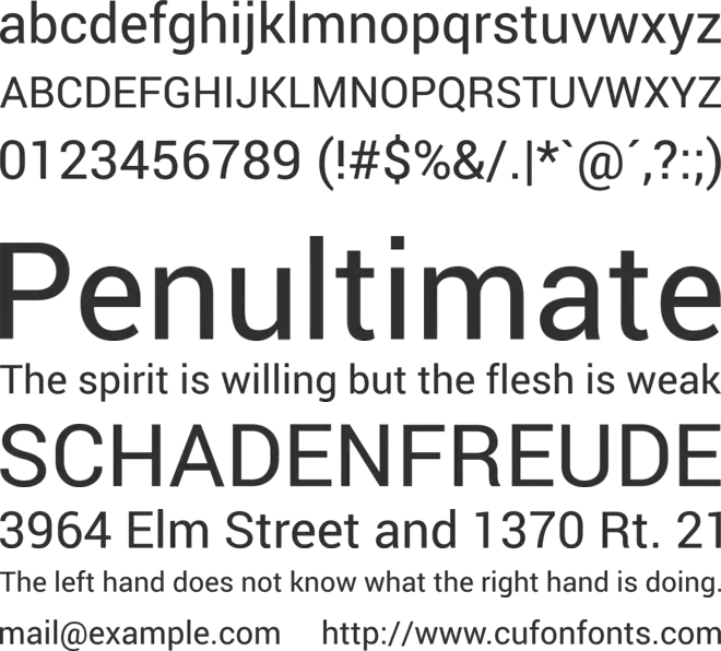
In the Roboto typeface we have a lot of different weights from thin (lightest) to black (thickest). If you chose a bold weight for your heading then you would want to choose a lighter weight for the body text. However, other than opting for the next lighter weight, “medium”, skip that and choose the next weight which is “regular”.
The regular font weight would be two times lighter than the bold weight which would have a better contrast.
7. Include a HQ Portrait in the Center
The first thing that people would notice on your magazine cover is the main image. It’s no surprise the big publishing companies such as Time and Vogue arrange a professional photoshoot for their cover shots.

Having a large high-quality photo in the center of your magazine cover tends to do better with users. Portraits of people that are making eye contact resonate with the audience and engage the user better. If you are confused between including a portrait or an illustration on the front of your magazine cover – go for a portrait as they tend to perform better than illustrations.
8. Avoid Busy Backgrounds
Part of ensuring good contrast, you should avoid having a background that is too busy. Busy backgrounds have too much happening in them – cars passing by, people walking around, too many colors etc.
Unless your main image is the background it is best to keep it minimal. Having a minimalistic background would focus the reader’s attention to your main image. Since their eyes won’t be distracted from the main image they have a better chance to take a deep look at your image and take a peak of your magazine.
9. Play Around with Illustrations
Illustrations, when combined with photos, can really take your magazine cover to the next level. Illustrations are vector graphics of objects, text or portraits. Adding illustrations can add some creativity to your designs and give it a fun vibe.

Although photos generally perform better than illustrations there are times where adding an illustration would actually be better. Magazines focused for kids might need to have illustrations of cartoons to give it a more kid-friendly vibe.
Adding illustrations can also give viewers a different perspective of your magazine. Since magazine issues usually don’t revolve around a fixed theme it can be appropriate to use a photo for one issue and an illustration for another.
10. Use 3D Text for a Nicer Effect
3D text on a magazine can really make your magazine pop. When you add your main image, placing some text behind and in front of it can give it a nice 3D effect.
Look at popular magazine covers of Vanity Fair, New York, and Rolling Stone to get an idea of this effect.

6 Best Free Magazine Cover Design Templates
If you are just a beginner starting out in magazine cover design I’d recommend you start with templates. Designing on a magazine cover template would help you get familiar with the typical design of a magazine and its layout.
Freepik is an amazing resource for graphic designers. It offers a huge library of free and premium graphics, vectors, images and templates. Below I have compiled 6 of the best magazine cover design templates from freepik to get you started.
1. Abstract Fashion

If you are looking to add a creative touch to your magazine cover, this template will get the job done. The magazine cover template features an abstract illustration of a model. This kind of illustration can really enhance the cover of your magazine making it stand out.
The font selection for this cover is amazing. It includes a variety of fonts and weights which add a beautiful contrast between design elements.
Since this design features a modern typeface and illustration style it is best suitable for younger audiences. Women that want to know about the latest fashion trends and styles would be an ideal audience for this kind of magazine cover.
Download it here.
2. People and Culture Design

This is by far my favorite magazine cover design from this list. This design achieves a great contrast and balance between design elements. A variety of shapes and the sparing use of color makes this design stand out. The elements are also nicely spaced giving it enough white space to breathe. Thankfully the barcode is also placed there to give you an idea of what not to cover.
The text is nicely spaced and the font selection is great for a magazine focused on diverse cultures. This magazine cover design is a great choice for culture themes. If you are covering the culture of a specific country then this is perfect. The cover lines can include the names of interviewees, places and specific traditions of the culture.
Download it here.
3. Beauty Illustration Magazine

This fashion magazine cover includes an illustration as a main image. The design is super simple and minimal. Personally, I would vary the fonts a bit to distinguish the lead article from its supporting cover lines.
However, if you have a fairly simple theme and magazine layout this can work for you. Since many modern magazines are bombarded with information on the front cover this one might stand out from the crowd due to its minimal use of graphics.
Download it here.
4. Collection Cover Design

If you are featuring a gallery of something, this cover design will get the message across nicely. Although the thumbnail above might be displaying pictures relevant to fashion I would suggest using this template for more sophisticated themes.
This magazine cover can be great for home and interior design or art displays. This is due to the design being symmetrical and featuring a lot of lines and borders. The font style as well as the text placement also suggests that the magazine might be more fit for other themes than fashion.
Download it here.
5. Business Design

This business cover template is great for aspiring entrepreneurs. It has a clean, modern design with minimal design elements. It also includes a barcode as well as a website banner for you to include your link.
Remember that business-minded audiences are usually highly interested in the main image. Remember to include a high-quality professional photo of your subject.
Download it here.
6. Nature Magazine Cover Design

This free nature magazine designed by FreePik features a modern condensed typeface with a main image of an animal. The elements of the design are fully editable and you can replace the main image with an image of any animal you like.
The whole template has a similar vibe to National Geographic’s magazine cover design. This might be due to the nice color combination of yellow and white. Only thing I would change about this template is the sub-heading beneath “Nature”.
Using 2 fonts would be enough to make this a great magazine cover. Having just the Masthead with the article headings would be enough to make this a stunning magazine cover.
Download it here.
Conclusion
A magazine cover is the first thing people will look at. It is essential to attract your audience with your cover as most readers will make a purchase based on the cover alone. When designing a magazine cover from scratch you need to keep in mind the elements that create the magazine layout. In this article, we learned what those elements were and also went through some tips to create a professional magazine cover.