As more people have started to move online, many people are quick to dismiss the traditional beauty of print design. I don’t blame you. With our mobile phones and computer screens constantly taking up most of our attention, it can be easy to take the beautiful posters, billboards, and print adverts we see around us for granted.
In this post, we’re going to take a step back and look at some of the best print design examples to learn from. Print can be difficult to implement, and if you’ve been planning to become a print designer, you’ll quickly find yourself overwhelmed by the blank white page staring at you on your screen.
So, let’s get your creative juices flowing by taking a look at 10 print design examples that prove creativity knows no limits!
1. Coimbra 2027 Design by Grafema
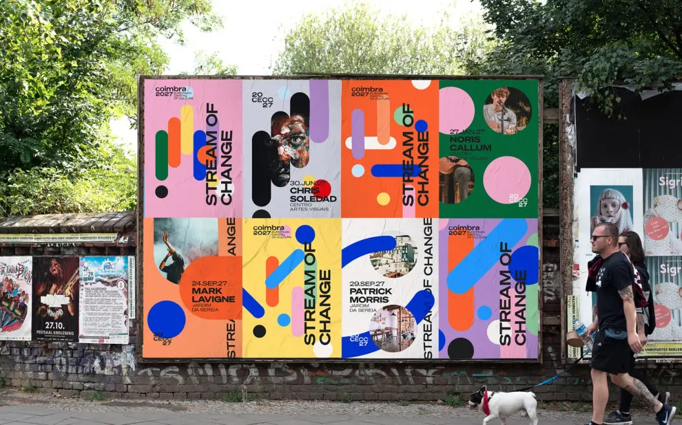
Coimbra is a city in Portugal and is known for its rich cultural landscape and historical landmarks. Every year, the European Union (EU) awards a European Capital of Culture where they organize a set of cultural events to partake in. To cater for these events, individual designers and agencies come together to create a brand identity to showcase the cultural heritage of the chosen city. For 2027, Coimbra is chosen.
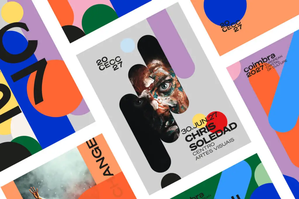
Although there were many designs submitted, one that stood out to us was the design by renowned graphic design agency Grafema. The designers had the goal to showcase the rich history and culture of Coimbra highlighting cultural shifts while appealing to all generations. The result was a vibrant and colorful design featuring a bold typeface with geometric shapes and complementary colors.
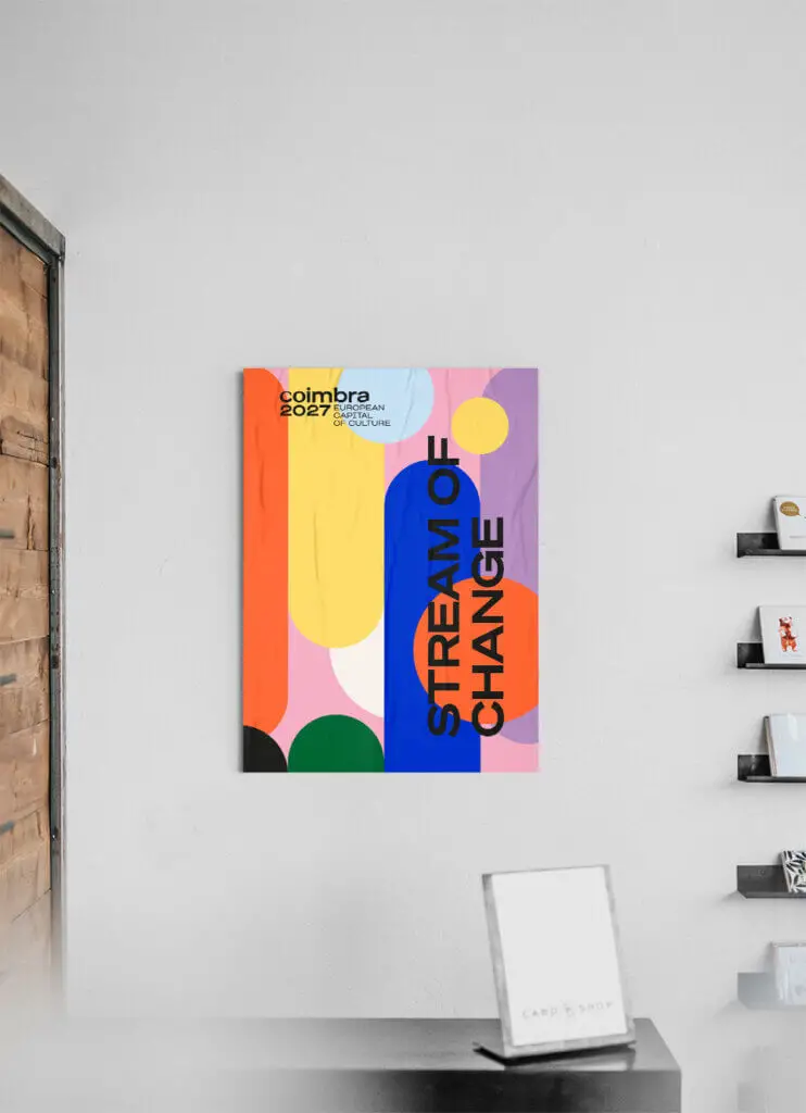
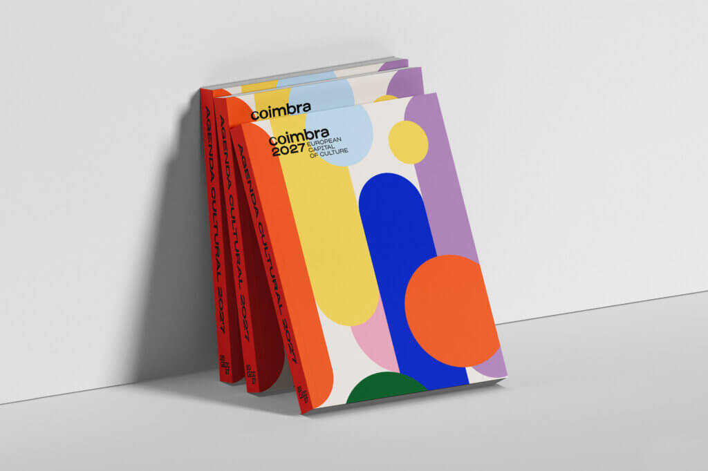
They also managed to intelligently incorporate the designs of different art movements into their print design which goes perfectly with their “stream of change” tagline.
2. Nike Shoes by Nike
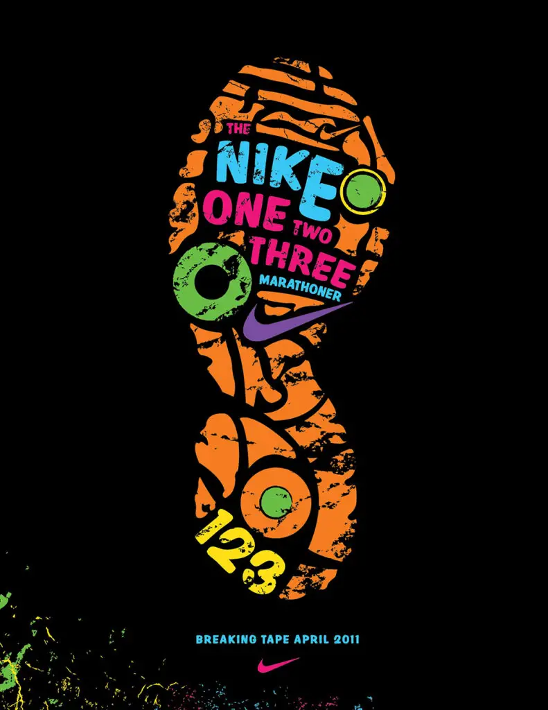
Nike’s print ads are a great source of inspiration if you’re designing for the fitness industry. They seem to understand the customer psychology well and can effectively relate it to their shoes.
Just look at this ad for Nike’s running shoes:
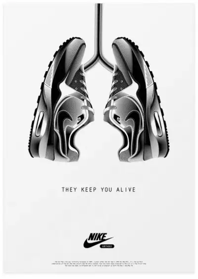
In the above ad, you can see the level of creativity. The shoes come together to symbolize lungs, suggesting to viewers that running keeps you fit and healthy – which in turn leads to a longer life. They then are able to creatively relate this to their shoes, that are displayed in the image.
Look at some of these as well:
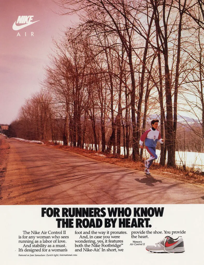
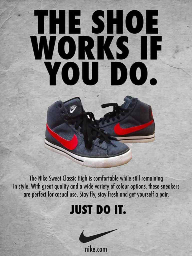
The first thing you’d notice are the bold typefaces and the eye-catching headlines. See how Nike isn’t using some boring headline like “Introducing the New Nike Airs”?
They instantly grab the viewer’s eyes because the headline is unique and instantly establishes a connection with the audience by making some bold statement. This is then followed by a description of the shoes.
Despite including some text, you can still see that the ads are highly visual. Another thing to take note of is the hierarchy. You can quickly distinguish each element from each other.
3. FCK Bucket by KFC
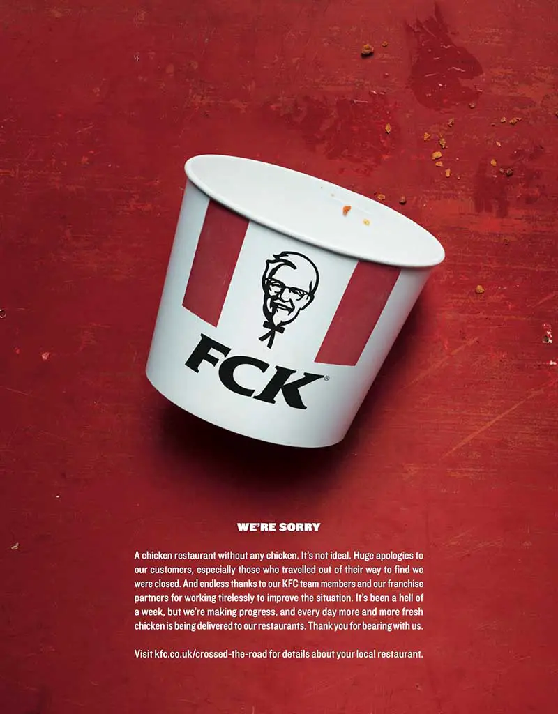
This was a hilarious KFC ad featuring a witty play on words. In 2018, KFC suffered a supply shortage which invited backlash from customers and the media. It was clear that KFC’s popularity was falling, but they were able to save their reputation with this clever campaign.
As you can see in the image above, KFC rearranged the letters “K-F-C” to spell “FCK”. This was in response to the crisis they were facing and how they realized they had messed up. To apologize, they ran this clever campaign that instantly gained traction all over social media.
The creative poster also helped KFC win 1 silver and three gold Lion in Cannes under the Print & Publishing category. It also received the Grand Prix for Campaign of the Year at the Marketing New Thinking Awards in 2018.
4. That’s Nutellable by Claire Heppner
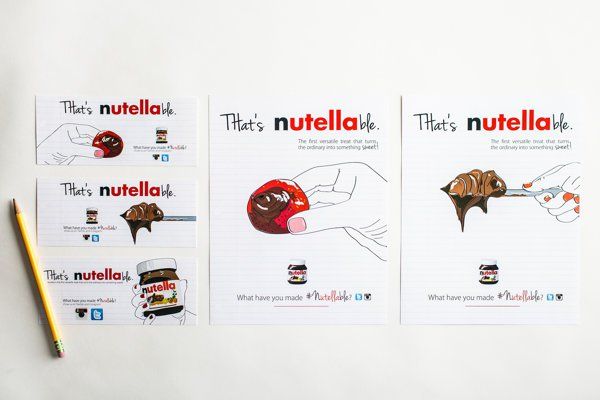
You know a brand becomes popular when it becomes a verb. Designer Claire Heppner dabbled her way into brand verbification for the chocolate spread brand we all know and love: Nutella.
Just like some images are instragrammable or photoshopped and how you Google something, Claire suggested some of her favorite foods to be Nutellable – meaning they go well with Nutella.
What do you think, is it a hit or a miss? Let me know in the comments what you think of Nutella getting in on this idea.
5. Volkswagen Beetle by Volkswagen
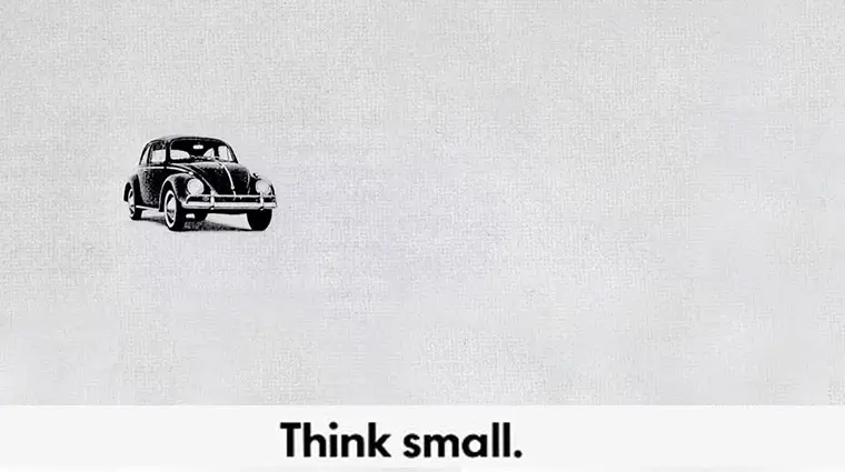
This was one of my favorite marketing campaigns of all time. If you want to understand how a brand uses its perceived weakness as a strength – turn to Volkswagen.
Volkswagen purposefully advertised its cars as small and in their adverts, embraced their weaknesses by admitting things like “…if you’re 7’1″ tall like Wilt, our car isn’t for you” and “Presenting America’s Slowest Flatback”. This added a layer of transparency that no other car company was offering at the time – it was always about having the latest and greatest car – and VW was the first of its kind to present a different view.
Take a look at some of these other ads:
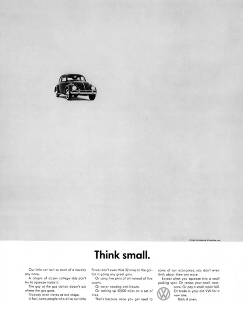
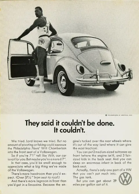
In the above print design examples you can see how they smartly used scale in their favor. To show the car as truly being small, they added a lot of white space, making the car look tiny in the bigger picture. They did the same thing with the other poster. By showing the 7’1″ tall professional basketball player, Wilt Chamberlain alongside the car, they were able to effectively how tiny the car looks compared to his size.
Finally, take a look at the colors. It’s nothing vibrant, it’s nothing bold. They kept it plain and simple because it is what their audience was like. They weren’t targeting people looking for the flashiest, brightest cars in the market, they wanted to market their cars to the more classy people who seemed to value economy over style.
6. World Alzheimer’s Day Print by Simone Mascagni
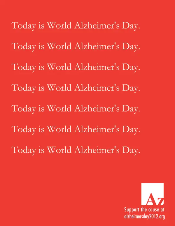
This creative poster by Simone Mascagni on World Alzheimer’s Day highlights the effects of Alzheimer’s disease. For those of you who don’t know, Alzheimer’s is a type of dementia where a person starts to gradually lose their memory and is unable to carry on a proper conversation with others. This poster creatively raises awareness of the issue.
Simone repeats the word “Today is World Alzheimer’s Day” just as a person with Alzheimer’s would repeat conversations due to forgetting what they said.
7. Apple’s Phones and Computer Print Ads by Apple
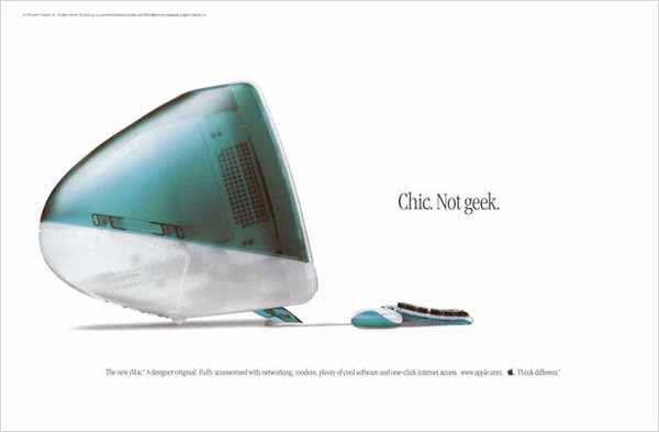
Apple just doesn’t cease to amaze you with its creative marketing and innovative campaigns. You can almost feel Steve Jobs’ confident persona alive in these print ads.
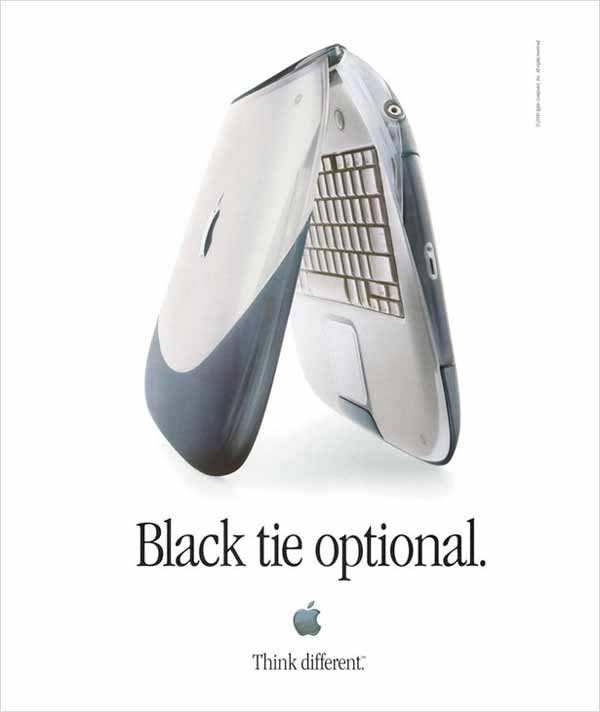
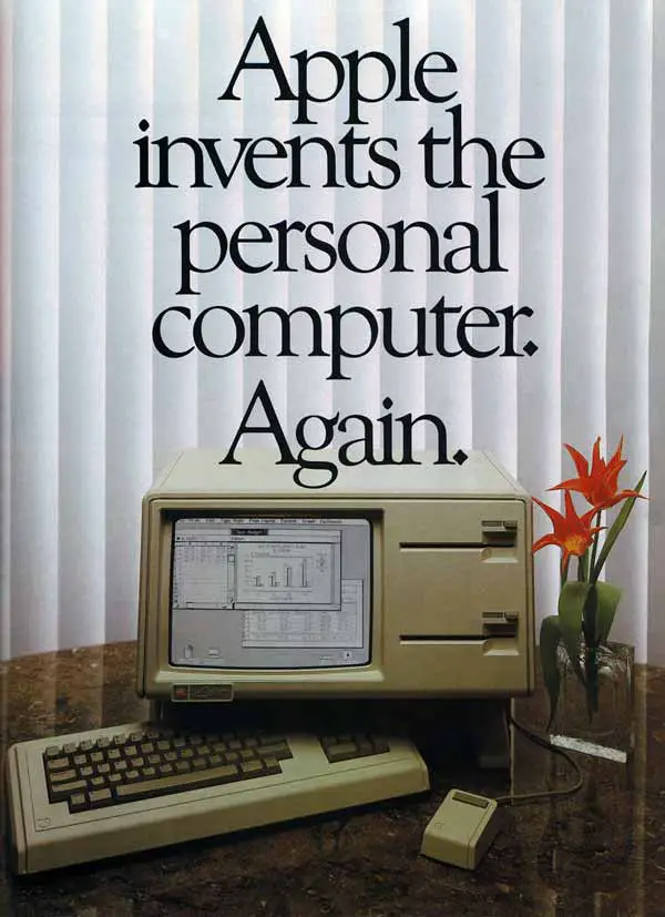
Apple has a bold way of advertising. They don’t use a lot of words and let their products do the talking. What you can also see is how they use layout techniques in their favor. As you can see with the above Apple phone advert, the way they half-opened their flip phone lets you have a complete look at the interior and exterior of the phone.
Another thing you’ll notice in all of Apple’s ads is the ample amount of white space they reserve for their designs. Not only are the ads minimalistic, but they also use white space to suggest a hint of modernism and end up with a clean, sleek design.
8. Sleep Puzzles by Casper
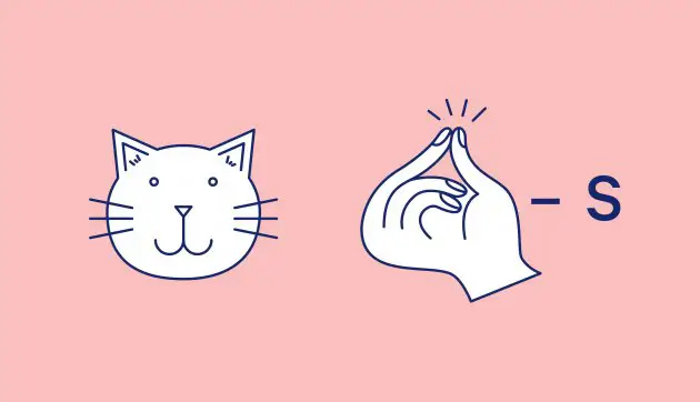
These are some of the more intriguing ads you’ll find at a subway. Casper, a company that specializes in creating comfortable mattresses, posted these fun sleep puzzles along the subway that kept passersby thinking:
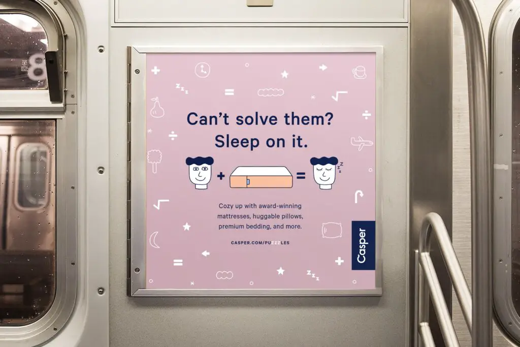
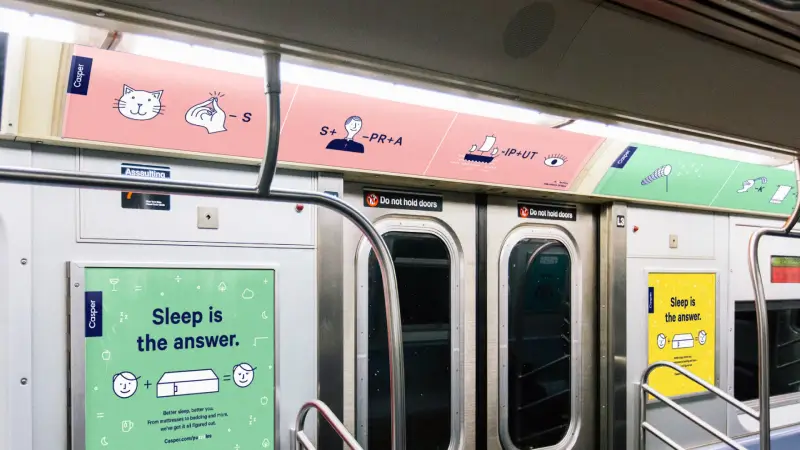
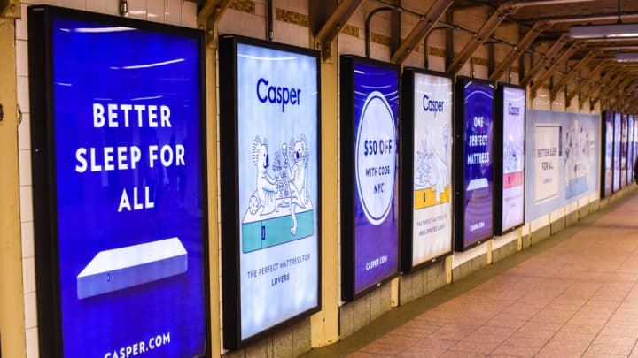
This is an effective marketing campaign because it engages passersby directly. Also, since it’s cleverly placed in a subway, where people often go to commute, many tired, sleepy adults, would be more than interested to hear about a warm cozy mattress.
9. Print Ads With Sound – Coca Cola

Coca-Cola’s launched an innovative ad campaign titled “Coca-Cola: Try Not to Hear This” where they introduced people to the first print ads with sound. Just look at the above and below images, can you look at them without imagining the popping, fizzy sound that Coke makes when opened? I can’t
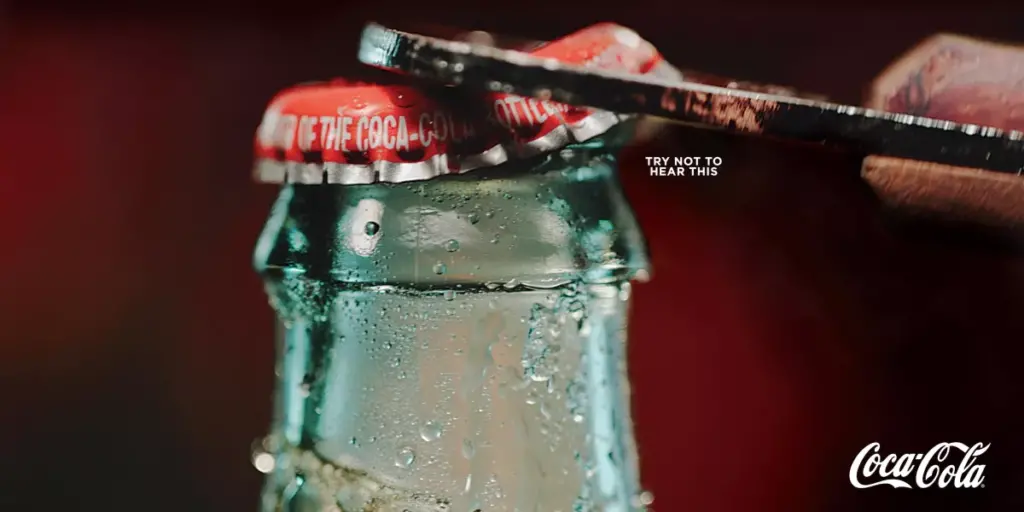
This campaign cleverly plays with the person’s psychology. As people are well aware of what a Coke sounds like when you open it, viewers automatically associate the action of opening a can or bottle with the immediate pop and sizzle it makes.
10. A Short History Brochure by Coca Cola
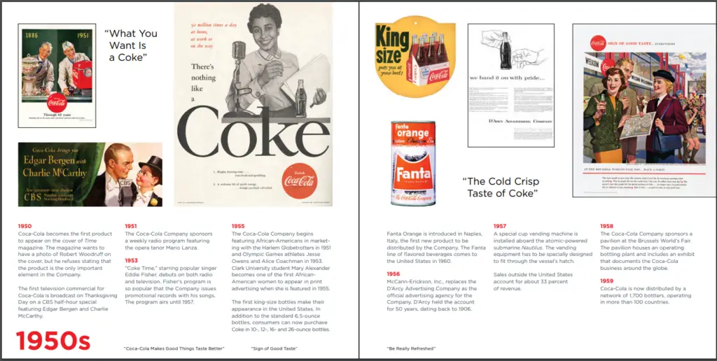
Coca-cola just seemed to have many interesting print design examples that I couldn’t help but show one more. This brochure was published by Coca-Cola under the name “A Short History”.
This brochure highlights Coke’s 125 years in business, telling the story of its inception in the 1880s till the 2000s. Looking back at how Coke grew its global recognition can be a journey and the striking visuals really give you a deep dive into how the brand developed its marketing campaigns as well.
You can download the PDF yourself if you want to view the whole thing.
Wrapping Up
We looked at some of the best print design examples that famous brands have to offer. From KFC to Coke and Nike to Volkswagen, this list should’ve gotten your creative juices flowing and would’ve instilled the creative spark in you – at least more so than when you came in.
Given how so many awesome print ads have existed, it’s safe to say that this list is nowhere complete. Share your favorite print design examples in the comments below and let us know what prints have you come across that made you go wow.