To understand the importance of a design, you must first know the difference between analogous vs monochromatic colors. The success of any work in any creative field is judged by the colors used in it. How well you keep color balance is what real creativity is in creating an appealing aesthetics.
What is Monochromatic Color Scheme

It is important to know monochromatic color definition while studying the color wheel. When broken down, ‘monochromatic’ has ‘mono’ and ‘chroma.’ Mono means single, while chroma means color, and together, they suggest using a single color.
Monochromatic color schemes include different versions of a single color. The term “version” here implies tints (lighter), shades (darker), and tones (variation between light and dark).
In a monochromatic design, you will find color combinations in harmony and in cohesion with each other. Based on color theory, color harmony imparts creativity by making the design more eye-appealing. More simply, by looking at it, you will find the color balance in this design to bring out elegance yet simplicity in itself, and they are trendy.

Monochromatic schemes are used in various aspects, like logos, websites, interior design, and photography. Such examples include the usage of black and white monochromatic colors. In logo designing, such as that of Nike or Apple, such colors are opted more as they offer versatility and create a long-term visual impact on viewers.
The color psychology behind these colors is such that these colors exhibit a sense of calmness in your viewers.
What is Analogous Color Scheme
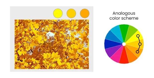
An analogous color scheme uses colors close to each other in the color wheel. Examples of analogous colors on color wheel include shades of pink, red, purple, turquoise, green, etc. Such shades are known to produce color balance. They can capture the audience’s visual interest due to color balance and the effect of analogous color harmony.
Analogous colors in art have been used for various purposes. For example, they are effectively used in advertising, packaging, logos, stationery, fashion, interior designs, and nature-inspired design elements.
With regards to interior decor, analogous colors can put up with color coordination. It helps them to be able to keep the room looking classy yet well-coordinated. These colors are also used in painting scenic views, as these views usually require shades of these colors. For example, sunset views need warm analogous colors like pink, yellow, and orange.
Analogous VS Monochromatic : When to Use Each
As discussed earlier, monochromatic colors in art use a single color or hue and have variation within the same color. In contrast, analogous colors in art are the one that use multiple colors that are different but adjacent to each other.
Monochromatic colors should be used when your audience needs a sophisticated, elegant, and simple design as the end piece. On the contrary, analogous colors should be used when your audience needs harmonious natural or nature-inspired aesthetics in the end design.
Monochromatic colors focus more on form and texture as artistic expression. You can choose colors from an analogous color palette when you want to evoke mood and emotion amongst your audience, all while maintaining a harmonious effect.
To make your design stand out more, you can combine analogous and monochromatic colors for versatility and contrast. It can be done by incorporating different textures and patterns in your design to break down a monotonous color balance. To add depth, you can also experiment with variation of monochromatic colors with analogous color scheme added balance and contrast. But before combining both color schemes, you must consider your audience’s preference and choose according to their desired choices.
Analogous Vs Monochromatic Colors : Real Examples
Brands have used monochromatic and analogous colors and have successfully created the brand identity for themselves. For monochromatic colors, such brands include PayPal, Nike, Apple, Coca-Cola, Starbucks, etc. For analogous colors, such brands include PowerwaterhouseCoopers(PWC), British Petroleum (BP), etc.
Collectively, both colors have been used strategically by brands for themselves, for example, in logo designing, website designing, advertising, packaging, infographics, etc. The brands use them effectively according to their target audience for the required purpose.
Conclusion
Understanding different color schemes from color theory for designing is important. To be able to differentiate analogous VS monochromatic colors is a fundamental aspect of it. Monochromatic colors use variation of single color and up elegance and simplicity in designing. Analogous colors use adjacent colors, adding up the harmonious, nature-inspiring themes and emotional depth in design.
Experimenting and using both colors in creating any piece of art will improve your skills in creating impactful visuals. You must not hesitate to experiment with these colors, either independently or combined. It can lead you to leave an everlasting impression on your audience.