Since you might already have a pretty clear idea of who the K-pop idols are, you can skip ahead on to the logo of BTS, it’s meaning, history and why it’s so iconic below.
For those of you who, somehow, don’t know who BTS is and why they are so popular worldwide, here’s a bit about them.
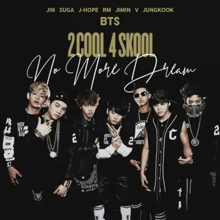
BTS is a South Korean band featuring a total of 7 members namely, Jin, Suga, J-Hope, RM, Jimin, V and Jungkook.
The boy band debuted in 2013 with their single album, 2 Kool 4 Skool (their swag was just on another level.)
They actually had a number of names they were previously known for, such as, the Bangtan Boys, Bangtan Sonyeondon, Beyond the Scene and Bulletproof Boy Scouts.
If you’re a recent fan of the K-Pop mega stars it might be because of their hit single that claimed the No.1 spot on the US Billboard Hot 100, ‘Dynamite’
And whilst all the diehard fans were too busy staring at the beauty of the handsome boy band they might’ve missed something that might make them love BTS even more, the beauty of their logo.
The History & Meaning of the BTS and BTS ARMY logo
Now for the question on everyone’s mind, “What’s so special about the BTS logo?”
Firstly, let’s take a look at the logos BTS have had:
The above is a timeline of all the logos that the famous Korean band have gotten designed and I see a lot of improvement in the logo with a passage of time.
Now, let’s break them down one by one…
BTS Bulletproof Vest Logo (2013 – 2016)
The original logo was debuted with their first album ‘2 kool 4 skool’ and went well with the overall image they were trying to go for as they’re band name was ‘Bangtan Sonyeondon’ which in Korean means, ‘Bulletproof Boy Scouts.’
However, the logo itself does not look great from a designer’s point of view (That’s Me!)
The logo is too cluttered and not very versatile, as it’s very detailed and may lose it’s details when scaled up and down. However, there are some design elements that put emphasis on the vibe that BTS was going for which is to show some ‘firepower.’ These can be the lines around the vest, which, you might have seen in comic books or cartoon illustrations that are drawn to show some impact and also you can see something that looks like a flash bang on the left of the vest to give a ‘police’ appeal to it.
The typeface also suggests some manpower as it uses the same kind of bold, stencil typeface used to represent military action (like some Army Boot Camp Signs.)
BTS Wings 4 Circles Logo (2016 – 2017)
In 2016 BTS introduced their ‘Wings’ logo and this was known as their Wings Era.
Out of the 4 logos I’ll be discussing in this post, this one is the most complex, this is due to it’s abstract nature and totally unique patterns. Many fans used to think this was just another random mix of circles that didn’t mean anything.
However, BTS reassured it’s fans that nothing they do was ‘normal’ and they did this after they released a list of their individual logos;
So, from the above image we come to know that the wings logo actually represents each band member in a abstract form.
However, there’s more to this theory as the amazing fan base of BTS don’t stop there and actually go ahead to make a number of theories on the creation of the logo.
BTS 2nd Wings Logo (2017 – 2017 summer)
Still roaming around the wings era a new logo design was introduced in 2017 featuring 4 blue empty ellipses overlapping with each other and meeting at the middle.
The typeface changed just slightly with the font becoming much more bold. The font also got rid of the rounded edges on the letters and opted for a square cap. They added in their tag line, “You Never Walk Alone” and changed the font color to blue.
BTS Trapezoid Logo (2017 – Present)
In the summer of 2017 BTS released a very modern and clean looking logo.
The logo includes 2 trapezoids that look like doors opening on the inside and a condensed, bold font with sharp caps which makes it look modern with a slight touch of futurism.
However, the biggest change might not be the logo but the name that enforced this design. BTS used to stand for Bangtan Sonyeondon but after the release of this branding identity they changed it to mean ‘Beyond the Scene’ which really shows in the logo itself.
The logo is actually meant to show the bond between BTS and their loyal fan base known as the ARMY. BTS said that it’s mission was to “protect the youths from prejudice” and to encourage young people to “follow their dreams” other than giving in to the reality of this world they find unfitting.
The Beauty of the BTS ARMY Logo
The BTS logo features 2 trapezoids that look like 2 half open doors opening on the inside and the BTS ARMY logo has 2 trapezoids that are 2 half open doors opening on the outside. This symbolizes the Army meeting the Korean band “at the door.”
Both these logos come together to make a bulletproof shield. The joint logo represents the bond between BTS and their loyal Army as when they join hands, coming together, they are one as a shield, an unbreakable force. BTS on twitter said that the logo shows “us and army becoming one together.”
This shows the love BTS has for it’s Army.
Who designed the Emblem?
In a press release, Big Hit Entertainment stated that the visual identity was being developed by Korea’s top design consulting firm, but does not disclose it’s name.
However, when considering the branding of the logo many of BigHit’s staff had coordinated with the band in order to research for the logo. BigHit assures people that the wishes of the fans were also taken into consideration.