Art Nouveau, also translated as “New Art”, was an art movement from the late 19th century to the early 20th century that influenced the fields of art, architecture, applied arts, and decorative arts.
Its main aim was to move away from traditional forms of art and in doing so, they took inspiration from the natural organic lines and forms seen in nature. The Art Nouveau style is quickly recognized due to its long flowing lines, asymmetrical layouts, and in architecture, its use of industrial materials.
For students of graphic design, it’s important to learn about this historic movement. By getting an insight into the Art Nouveau movement, you’ll learn how its aesthetic values can be applied to branding, typography, poster design, and illustrations – which is where you may spot the style.
Not only does this movement carry significance in and of itself, but it went on to influence other graphic design movements including Art Deco and Bauhaus.
In this article, we’ll explore the history of Art Nouveau, its characteristics, key artists, influence on graphic design, and challenges.
Origins of Art Nouveau
The term Art Nouveau was first seen in a Belgian journal called L’Art Moderne which aimed to bring reform through art. Since the style developed into an international style, its naming varied from country to country.
So, what ignited the Art Nouveau graphic design movement? First, let’s try to understand where it started from.
The Art Nouveau movement emerged as a reaction to the Industrial Revolution. The Industrial Revolution brought with it machinery that was able to produce material at a faster rate and a cheaper price. Instead of rejecting this new technology, like the Arts & Craft Movement, Art Nouveau embraced the disruption and made effective use of industrialization.
Another reason for the development of Art Nouveau was rooted in its opposition to historicism and academic art. With this reaction against such forms of art, Art Nouveau aimed to modernize art and design.
Characteristics of Art Nouveau Design
Art Nouveau aimed to modernize art and move away from traditional art forms and designs – this gave rise to some unique pieces of art and craftsmanship.
Below we discuss the unique aspects of Art Nouveau design.
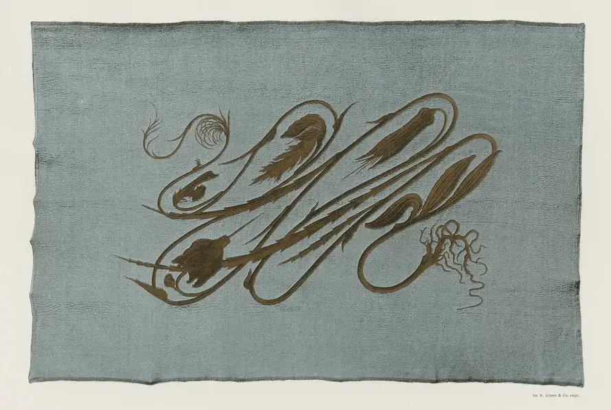
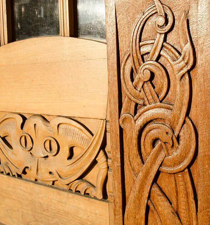
Organic Forms and Flowing Lines
Artists from the Art Nouveau era used organic, natural forms to depict their art pieces. They took inspiration from the shape and form of lilies, vines, flower stems, rosebuds, swans, peacocks, clouds, water, etc. The main purpose was to imitate nature and create an overall harmonious piece of art.
“Those who look for the laws of Nature as a support for their new works collaborate with the creator”
Antoni Gaudi, Spanish architect and designer
Alongside the use of organic forms, the artists from this movement used long curvy lines. These lines were used to represent the natural curves found across nature – as seen in the curves of grapevines and branches.
This also brought attention to the iconic design element, whiplash. The whiplash line was a stylized S-curve line to depict movement. It was described by the designer, Hermann Obrist in 1894 in the German-based Pan magazine. He described it as “sudden violent curves generated by the crack of a whip.”
V&A’s article on the whiplash states it as:
“An ornamental S-curve that writhes and coils, the whiplash is a force of energy that drove the art world into a new Modern era. Derived from studies of the natural world, including deep-sea organisms and botanical gardens, it may seem nothing more than a flowing line, but the whiplash marked a break from the constraints of old-world traditional art forms and heralded the coming of modern design.”
Intertwining Motifs
Motifs are designs or patterns used for decoration. Since Art Nouveau emphasized the decoration of designs, seeing artists use motifs was common. So, intertwining motifs basically mean repeated patterns that twist or twine together while maintaining harmony.
Being partly inspired by Romanticism, it was common to see intertwined motifs to represent femininity, more specifically the curls of hair in depictions of women.
These intertwined motifs are also commonly used in today’s designs. Whether it’s for making decorative borders for a wedding invitation or when designing the header for a formal document.
Asymmetry
The Art pieces produced during the Art Nouveau were an imitation of nature. If you observe nature closely, you’ll notice there isn’t much symmetry as everything around it evolves and takes a natural course rather than a predefined one.
So, it’s no surprise that the artists’ paintings and designs also developed the same asymmetrical designs.
Hector Guimard, a prominent member of the Art Nouveau movement, said it best:
“That which must be avoided in everything that is continuous is the parallel and symmetry. Nature is the greatest builder and nature makes nothing that is parallel and nothing that is symmetrical.”
Hector Guimard, French architect and designer
Ornate Patterns
Ornate patterns were used to decorate paintings, interiors, and designs during this phase of Art Nouveau history.
“I believe that before everything a painting must decorate […] The choice of subjects or scenes is nothing. It is by the value of tones, the colored surface, and the harmony of lines that I can reach the spirit and wake up the emotions.”
Maurice Denis, French painter, decorative artist, and writer
Japonism
Siegfried Bing, a German-French art dealer, can be credited for bringing Japonism, a branch of Japanese art and design, to Europe – leading to the rise of Japanese art elements in Art Nouveau designs. Below, you can see the influence of Japonism on the Artist’s pieces.

Art Nouveau’s Impact on Graphic Design
Art Nouveau profoundly influenced graphic design by introducing flowing lines, floral motifs, and a harmonious blend of typography and imagery, inspiring a new level of elegance, aesthetic beauty, and innovative creativity in visual communication.
Graphic designers took inspiration from Art Nouveau by incorporating its design principles and using them to convey their messages better. The decorative style along with its expressive form managed to depict the emotions behind the designs better.
At the same time, Art Nouveau died down quickly, so although there weren’t any formal graphic designs per se, designers did get inspired by the movement and incorporated the style in contemporary times. You can still see the Art Nouveau style commonly used in posters, illustrations, and packaging.
Let’s look at some examples.
Typography
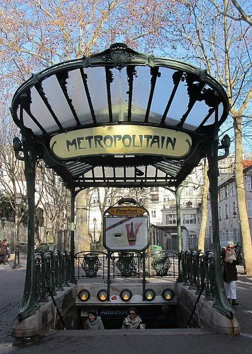
The curvilinear forms alongside the floral patterns seen across Art Nouveau designs managed to harmoniously intertwine with typographical elements. A perfect example of Typography during that era could be seen from the design of Hector Guimard which he made for the Paris Metropolitan.
Also, during that time, poster design was flourishing. This made developing typography in this era even more important. So, as a result, we see some unique typefaces and layouts in the posters of that time.
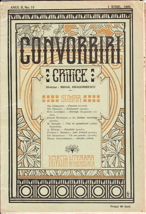
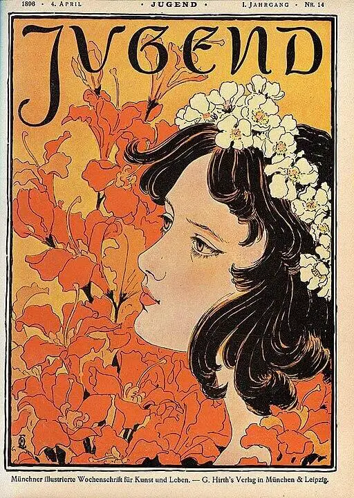
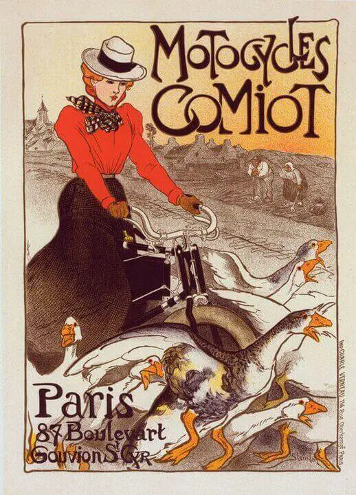
Poster Design and Illustration
Pictorial depictions of the Art Nouveau style were enchanted by the floral and organic forms, flowing lines, and whiplash motifs.
The main reason behind the development and success of Art Nouveau posters was due to the introduction of print technology. New technologies of color lithography and color printing enabled designers to highlight the movement’s unique style outside of art exhibitions and galleries.
This gave rise to a multitude of illustrations being featured on magazine covers, posters, and other forms of graphic design.
The illustrations that came forth mainly focused on women and femininity and were decorative in nature – as can be seen from their stylized imagery and floral patterns. Also, being highly influenced by Japonism, the illustrators gauged inspiration from the Japanese style of flat design.
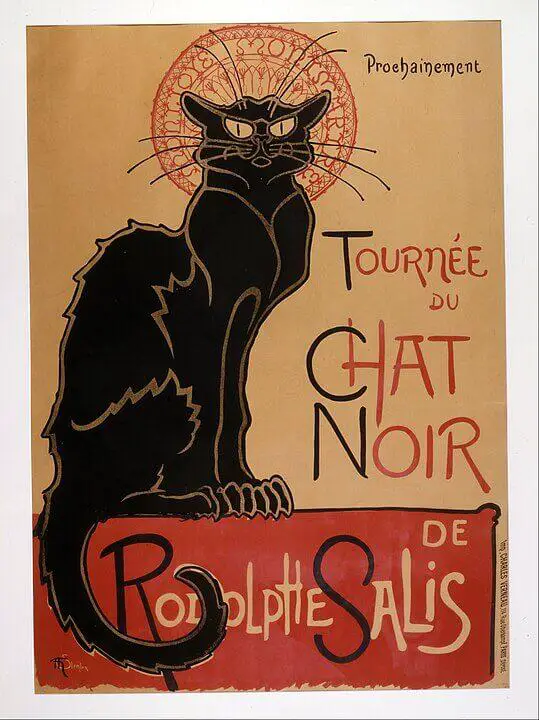
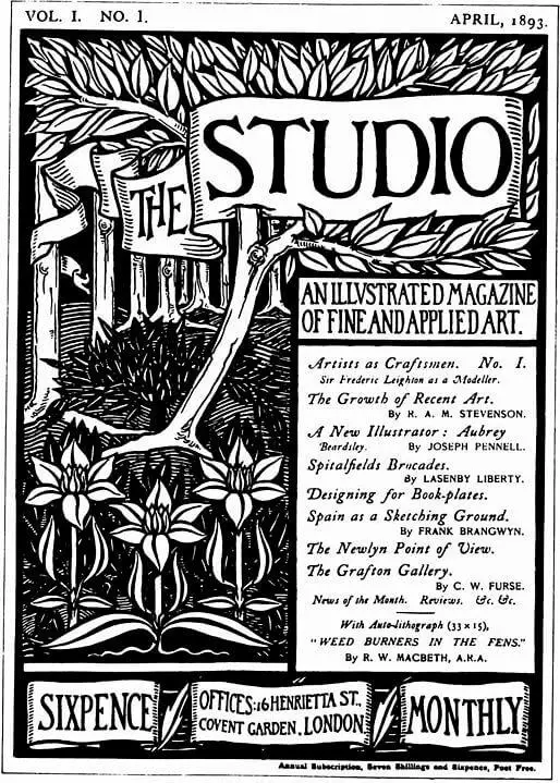
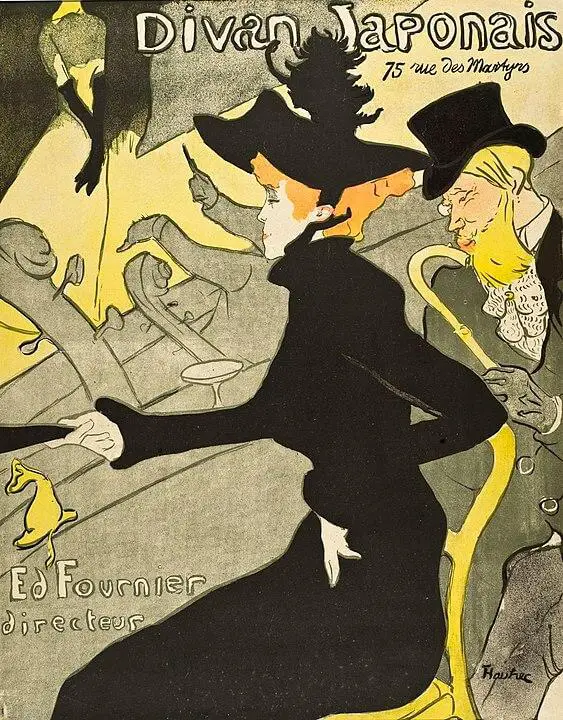
Below are some of the unique posters and magazine covers that came forth during the period of early printing.
Book Cover Design
When speaking of graphic design, Aubrey Beardsley can be deemed one of the first graphic artists of the Art Nouveau style. Aubrey’s illustrations made their way to book cover design with his most famous works being for the Salome by Oscar Wilde and Le Morte d’Arthur (The Death of Arthur) by Sir Thomas Malory.
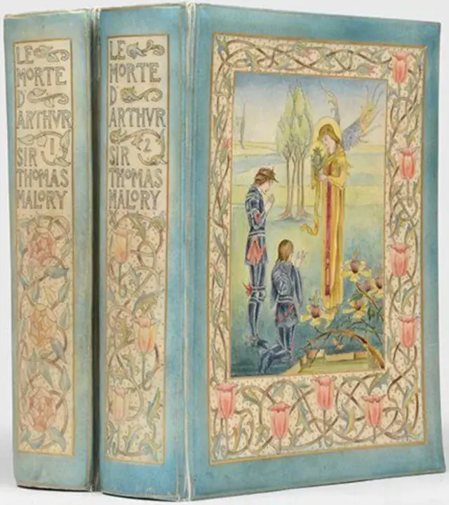
Many publications started to adopt the book cover designs produced by Art Nouveau, and it’s still common to see these designs today. Defined by their floral borders, ornamental patterns, and stylized layout, working in harmony with the flat illustrations, made for spectacular book covers that seemed more enticing than the book itself.
Art Nouveau Artists & People You Should Know About
As Art Nouveau traveled all around the globe, many artists from different regions of the world contributed to the growth and success of this movement. Below we highlight the key artists, architects, graphic designers, and people who developed the Art Nouveau style.
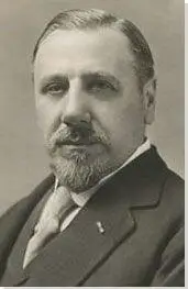
Siegfried Bing

Siegfried Bing can be credited as one of the most influential people to introduce Art Nouveau to Paris. Bing was a German-born French art dealer who brought different cultures and artists together to develop the principles of the Art Nouveau style.
His main contribution was to introduce young artists in Europe to the concept of Japanese Art which in France was known as Japanisome. He then even gave a platform for many of these artists to showcase their talents in the center of Europe, Paris.
To spread the ideas of Japanese art, Bing created an arts magazine called Le Japon Artistique. The magazine was also translated in languages of English and German which led to attracting famous artists such as Vincent Van Gogh, Claude Monet, Auguste Renoir, Alphonse Munche, and many more.
Since Japanese art followed nature, it was natural for Art Nouveau designs to take inspiration from them, sharing some of its characteristics like irregularity, floral patterns, and asymmetry.
Apart from being fascinated with Japanese arts and artifacts, Bing also emphasized on the production of decorative art. He got this idea after his company, Leullier Fils et Bing, gained traction by winning a gold medal at the Paris World’s Exhibition of 1867 for its production of high-quality ceramic. This was the main driver behind the idea of mass-producing high-quality decorative art.
William Morris
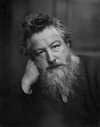
William Morris was a master of ornamentation and decorative patterns. His main design work includes designing floral patterns and prints for textiles and wallpapers as well as his intriguing illustrations for books and covers.
His designs for literary work such as the illustrations designed for The Nature of Gothic by John Ruskin and Troilus and Criseyde by Geoffery Chaucer. Both these books had enchanting decorations which made them more interesting than the text they contained.
Morris also had a lot of other accomplishments to his name. In 1891, he founded the printing company, Kelmscott Press with which over 50 works were published using traditional printing methods and hand-made paper. He even created 3 distinct typefaces namely, Golden, Troy, and Chaucer featuring old-style serifs surrounded by ornamental patterns and borders.
Victor Horta
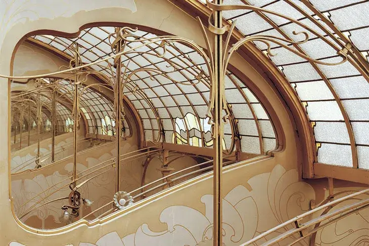
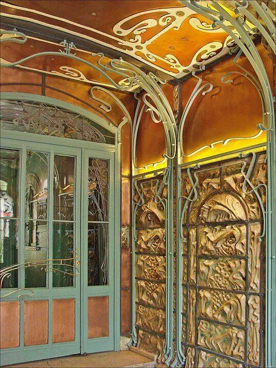
Victor Horta was a Belgian architect and one of the founders of the Art Nouveau movement. Many of his works represented the true Art Nouveau style and his Hôtel Tassel in Brussels is often cited as the first Art Nouveau house.
Horta’s work featured stylized vegetal forms and curvilinear shapes. He was also a forerunner in modern architecture, as he was quick to embrace the use of industrial materials and paved the way for innovative uses of iron, steel, and glass for his projects.
He had also influenced the works of Hector Guimard who went on to create one of the first Art Nouveau buildings in Paris and signage for the Paris metro.
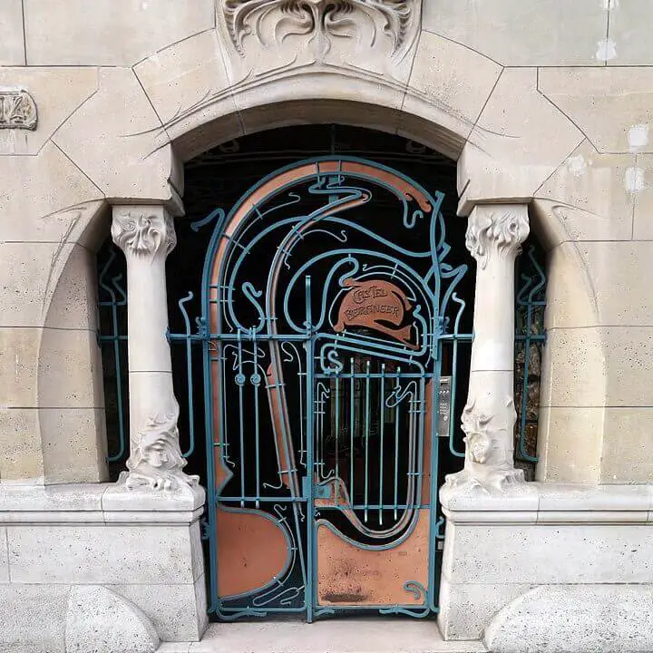
Hector Guimard
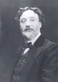
French architect and designer Hector Guimard was perhaps the most influential Art Nouveau artist in Paris. His unique approach made the words Art Nouveau synonymous with the expression “Style de Guimard”.
His architectural works were mostly influenced by the principles laid down by Victor Horta. Horta had emphasized the use of the stem, and to ignore the flowers and the leaves, which was valuable advice that was reflected in Guimard’s designs.
He got early recognition with his first Art Nouveau design of the Castel Beranger, a 36-apartment residential building in Paris. From there, he went on to produce other buildings including the Villa La Bluette, Castel Henriëtte, and Hôtel Guimard.
“Guimard has created a new type of biomorphic abstract form. It is a symbolic form that expresses the original rhythms of nature…”
Alfred Barr, Art Historian and Director of the Museum of Modern Art
His work can be considered “Gesamtkunstwerk” or complete works of art as he designed everything. From the exterior to the interior, he had proposed the furniture design, the textiles, the doorknobs, wallpapers… no stone was left unturned.
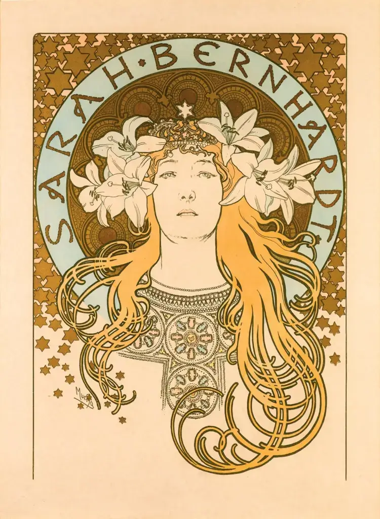
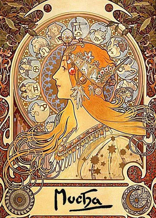
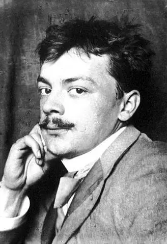
Alphonse Mucha
Alphonse Mucha was a spectacular illustrator who had expanded the horizon of Art Nouveau. His story of becoming the artist he’s known as today is inspiring and all too familiar for the starving artist.
We won’t get into too much detail in this post, but Mucha’s start to his journey started when he volunteered to produce a lithographed poster for the play Gismonda by Victorien Sardou featuring the most famous French actress at the time, Sarah Bernhardt.
The poster he designed was unlike something seen in that era. It featured a multitude of colors, a high level of detail, very few text, and large decorative illustrations. Compared to the 1-2 colors and text-heavy posters people were used to seeing, this poster came out as a revolution. Also, it had a unique vertical format, with a tighter width compared to the original poster size.
After this success, he signed a contract with the theater to produce more posters and later joined movements such as the Salon des Cent. This was the prime of Mucha where he started developing the Art Nouveau style producing a range of paintings, illustrations, advertisements, and posters. He also designed jewelry, furniture, costumes, carpets, wallpaper, and theater sets.
His works were so influential that the style got dubbed the Mucha style but later transitioned into Art Nouveau. Due to his illustrative works and poster design, he could also be credited as the first Art Nouveau graphic designer.
Kolomon Moser
Kolomon Moser had a massive influence over the Art scene in the 20th century. He was at the forefront of developing the Vienna Secession, a movement that took its roots in Art Nouveau. Moser had designed a wide range of artworks across multiple mediums including graphic works, books, postage stamps, stained glass, magazines, jewelry, and furniture.
The leading Austrian Art journal at the time, Ver Sacrum, gave Moser a platform to feature his works. His work was inspired by Greek and Roman art and architecture which incorporated Art Nouveau techniques such as the use of the whiplash and intricate motifs.
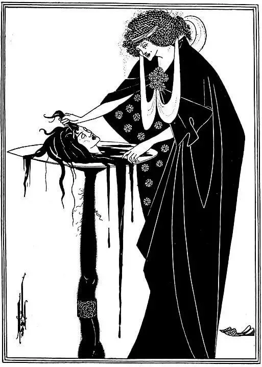
Aubrey Beardsley
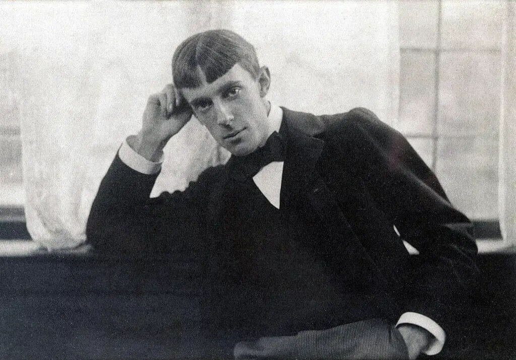
Aubrey Beardsley made significant contributions to the Art Nouveau movement despite his death at the early age of 25.
His work started to take shape when he traveled to Paris and was exposed to Japanese Art and the works of Henri de Toulouse-Lautrec. His first commissioned work was doing illustrations for the book Le Morte d’Arthur, and then he progressed to creating black and white illustrations inspired by Japanese block art.
Beardsley, though, had generated quite the controversy in his home country, England. His works mostly featured dark and perverse images that explicitly showed themes of grotesque erotica and large genitals. He also made satirical art regarding the Victorian moral values of sex, leading him into further controversy.
Apart from his work, Beardsley had an unconventional private life. He says about himself:
“I have one aim—the grotesque. If I am not grotesque, I am nothing.”
Aubrey Beardsley
However, he seemed to have turned a new life in a sense, after converting to Catholicism and had requested his publisher Leonard Smithers and friend Herbert Charles to burn all the copies of Lysistrata, an ancient Greek comedy for which Beardsley had created erotic imagery, and all other “bad drawings”.
His letter read:
“Jesus is our Lord and Judge | Dear Friend, I implore you to destroy all copies of Lysistrata and bad drawings … By all that is holy, all obscene drawings. | Aubrey Beardsley | In my death agony.”
But his request was ignored by both and his publisher even continued selling the reproductions and even forged some of his work.
Critiques and Challenges of Art Nouveau in Graphic Design
While Art Nouveau was a breath of fresh air in the world of design, it wasn’t without its fair share of critiques and challenges.
Some critics argued that its ornate and complex style made it inaccessible as it was typically seen as a style reserved for the elite. This exclusivity sometimes overshadowed the movement’s desire to bring beauty to everyday life.
Another debate revolved around the balance between aesthetics and functionality. Although Art Nouveau was keen to adapt to the Industrial Revolution, many felt that Art Nouveau’s emphasis on artistic expression occasionally overshadowed the practicality of the designs.
This tension between beauty and usability sparked discussions about whether form should always follow function, and how far aesthetics could be pushed without compromising purpose.
Despite these criticisms, Art Nouveau’s proponents saw its ornate details and flowing lines as an important step away from the rigid norms of the past. It dared to challenge conventions and embrace a world where design was a marriage of creativity and craftsmanship, an idea that continues to shape modern graphic design philosophies.
Comparing Art Nouveau with Other Design Movements
As we explore design history, we meet different styles that shaped art. Among them, Art Nouveau stands out. Let’s compare it with other styles to understand its uniqueness and its impact on graphic design.
Art Nouveau vs. Arts and Crafts Movement
The Arts and Crafts movement came before Art Nouveau. Both cared about combining art and everyday life. However Art Nouveau added more complex and nature-inspired designs. Think of it as decorative patterns compared to simpler, practical designs.
Art Nouveau vs. Bauhaus
Art Nouveau and Bauhaus have different views. Art Nouveau loves detailed decorations, while Bauhaus likes things simple and useful. Picture intricate lines in Art Nouveau versus clean lines in Bauhaus – they create opposite feelings.
Art Nouveau vs. Art Deco
Art Nouveau’s flowy designs meet Art Deco’s sharp shapes. Art Nouveau loves nature, while Art Deco is into modern looks. Think of smooth lines versus bold angles – they show different energies.
Art Nouveau vs. Today’s Design
Today, the design mixes Art Nouveau’s old style with new ideas. Imagine Art Nouveau patterns in modern websites and detailed drawings on screens. This blend keeps Art Nouveau alive in today’s graphic design world.
These comparisons help us see Art Nouveau’s special place in the history of design. By learning from the past, we can create fresh designs for the future – an exciting journey for all of us, especially as students stepping into the world of graphic design.
Conclusion
As we say goodbye to the captivating world of Art Nouveau graphic design, we’re left inspired by its timeless charm. This movement, also called “New Art,” made a big impact on design, architecture, and creativity.
Art Nouveau’s break from tradition and its embrace of nature’s shapes changed design in the late 1800s and early 1900s. For graphic design students, it’s a treasure of ideas.
With flowing lines, asymmetry, and new materials, Art Nouveau’s effect on graphic design is still big. Its mark lives on in modern design, changing writing, and drawings, and mixing words with pictures.
Art Nouveau’s designs are still liked, seen in today’s drawings and writing style. When we think about its problems, we see that even great things can have mistakes. But the talks it started helped design change, finding the middle spot between beauty and use.
Comparing Art Nouveau to other times, its special place in history is clear. As we step into a new time of design, we take with us Art Nouveau’s beauty and new ideas, showing respect to a time that remade creativity and nature’s part in graphic design.
References & Resources
Art Nouveau, Wikipedia
Art Nouveau posters and graphic arts, Wikipedia
About Art Nouveau blog, Olga Harmsen
At home with Victor Horta, the master of art nouveau, Apollo Magazine
People
Siegfried Bing (1838-1905), About Art Nouveau blog, Olga Harmsen
Hector Guimard: How Paris got its Curves, About Art Nouveau blog, Olga Harmsen
The Modernism of Hector Guimard, Yale University Press